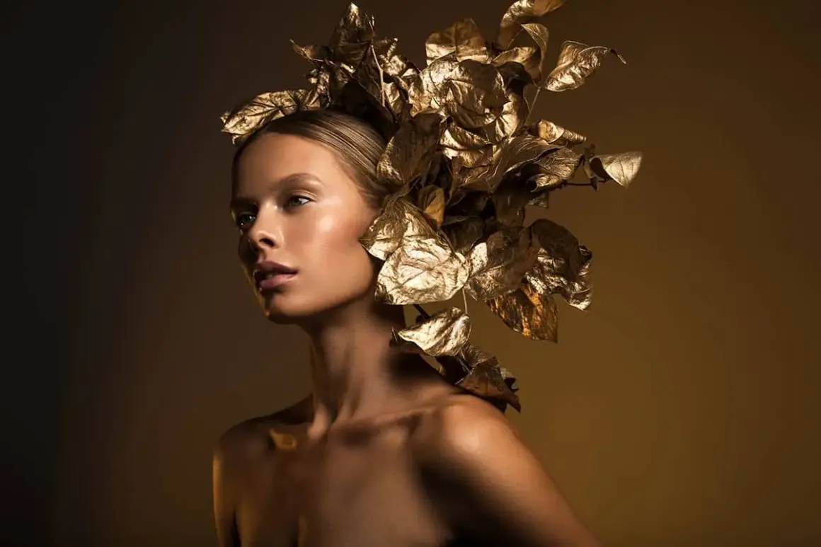
Strong fashion imagery depends on more than expensive gear or a sharp lens. In fashion lighting photography, the real job of the light is to flatter the model, preserve fabric texture, and guide the viewer’s eye without making the frame feel forced. This article breaks down the lighting choices that actually matter, from softboxes and beauty dishes to ratios, outdoor control, and the mistakes that quietly weaken a shot.
The fastest way to shape a stronger fashion image
- Shape matters more than brightness when you want clothing, skin, and silhouette to look intentional.
- Soft light is safest for polished beauty work, while harder light adds edge, texture, and drama.
- Clamshell, butterfly, Rembrandt, split, high-key, and low-key cover most fashion looks you’ll actually use.
- Modifiers are tools for control: softboxes smooth, beauty dishes crisp up, grids narrow, and flags remove spill.
- One light plus negative fill can be enough for a convincing fashion frame if you place it well.
- Garment texture, background separation, and movement should be checked before you call a setup finished.
What fashion lighting has to do before the camera works
Fashion lighting has three jobs at once: it has to make the person look good, make the clothes readable, and create a mood that supports the brand or editorial idea. If a setup flatters the face but turns satin into a white blob, or if it reveals every stitch but kills the model’s presence, it has failed.
That is why I think of light as a design tool, not a technical afterthought. The best setups control shape, texture, and attention in the same frame. Once you decide which of those matters most for the shot, the rest of the lighting decisions become much easier to make.
The next step is understanding which qualities of light change the result most, because that is where most good fashion images are won or lost.
The light qualities that change the result
Most lighting decisions in fashion come down to a few variables: softness, direction, contrast, and color. Those four things decide whether the image feels clean and commercial, soft and luxurious, or graphic and editorial.
Soft light
Soft light comes from a source that appears large relative to the subject. In practice, that usually means a softbox, octa, umbrella, or window light used close enough to wrap around the face and garment. I use soft light when I want smooth skin, gentle shadow transitions, and a cleaner commercial feel. It is the safest choice for beauty-led work, but it can also look bland if the source is too broad and too frontal.
Hard light
Hard light comes from a smaller or more direct source. It creates sharper shadow edges, stronger texture, and a more graphic mood. That is useful for denim, leather, structured tailoring, and any styling where the material itself should look tactile. The tradeoff is obvious: hard light can make skin less forgiving, so I usually reserve it for looks that benefit from attitude or contrast.
Color and separation
Color temperature matters more than people expect. Flash is often around daylight balance, while practical lamps and tungsten sources sit much warmer. If you mix them without thinking, skin can look inconsistent and the wardrobe can shift color in unpleasant ways. I keep the palette deliberate: either match the sources closely, or let the contrast be clearly intentional.
Contrast is just as important as color. A key-to-fill ratio of 1:1 gives a very even result, 1:2 leaves one stop of shape, and 1:4 or stronger starts to feel noticeably more dramatic. That difference can be the line between a clean ecommerce frame and an editorial portrait with presence.
| Fabric or surface | Best starting light | Why it works |
|---|---|---|
| Silk, satin, sequins | Feathered soft light with controlled highlights | You want sheen, not clipped specular spots. |
| Denim, knitwear, wool | Directional light with enough contrast to show texture | These materials need shadow detail to look rich. |
| Leather and structured tailoring | Harder key light or a tighter modifier | Edges and seams read better when the light has shape. |
| Sheer or translucent fabric | Backlight or side light with careful fill | Transparency needs separation without washing out the form. |
Once you can judge light by how it behaves on different surfaces, it becomes much easier to choose the right setup instead of guessing. That leads directly to the classic arrangements I reach for first.
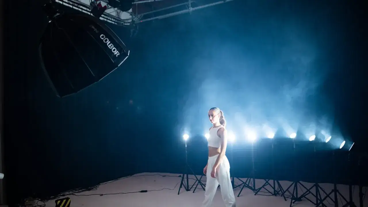
The setups I reach for first
There are many ways to light fashion, but a small number of setups do most of the real work. I keep coming back to these because they are repeatable, understandable, and easy to adjust when the styling changes mid-shoot.
| Setup | Typical starting placement | Look | Main risk |
|---|---|---|---|
| Clamshell | Key light slightly above eye line, reflector just below the face | Smooth, flattering, polished | Can flatten cheekbones and garments if overfilled |
| Butterfly | Key light centered above the lens, angled down | Elegant, classic, beauty-focused | Can deepen under-eye shadows on some faces |
| Rembrandt | Key light 30 to 45 degrees to one side and slightly above the face | Modeled, dimensional, timeless | Can become too portrait-like if the wardrobe needs more energy |
| Split light | Key light far to one side, often with a grid | Bold, graphic, editorial | Can hide garment detail if the shadow side is too deep |
| High-key | Large soft source with bright fill and a pale background | Clean, airy, commercial | Easy to overexpose texture and make everything feel generic |
| Low-key | Tight source with negative fill and darker surroundings | Moody, luxurious, dramatic | Skin and clothing can disappear if exposure drifts too far |
I treat these setups as starting points, not formulas. A clamshell can still feel edgy if the fill is reduced, and a Rembrandt setup can turn into a high-fashion image if the background and styling support it. The important part is knowing what each arrangement buys you before you start adding complexity.
From here, the next decision is not the pose or the camera. It is the modifier, because that is what decides how the light is shaped before it ever reaches the subject.
Which modifiers actually matter
Light modifiers are the tools that make fashion lighting controllable. A modifier is anything that changes the size, softness, direction, or spread of the source, and in fashion work that control matters more than brute power.
- Softbox - my default choice when I want soft, even coverage with predictable edges.
- Octa - similar to a softbox but often a little more flattering on faces, especially in beauty work.
- Beauty dish - gives a creamy but crisp look that keeps cheekbones and fabric structure alive.
- Stripbox - useful for edge light, body separation, and long vertical highlights on wardrobe.
- Umbrella - fast and affordable, though less controlled because spill is harder to contain.
- Grid - narrows the beam so light stays where you want it and stays off the background.
- Reflector - the cheapest way to add fill; it bounces existing light back into the shadows.
- V-flat or flag - black or white boards used to add or subtract light; negative fill is just as important as fill when you want shape.
If I had to build a small kit from scratch, I would start with one good softbox or octa, one grid, and one way to create negative fill. That combination handles far more fashion situations than a drawer full of unused accessories.
Once you know what each modifier does, the next challenge is sequencing the setup so the light lands where it should in the first place.
How I build a shoot that looks deliberate in minutes
When I am setting up a fashion frame, I move in a strict order. I decide the mood first, then place the key light, then add fill only if the shadows need it, and only after that do I worry about background detail. That keeps the setup from turning into a rescue mission.
- Choose the mood - clean and commercial, soft and romantic, or hard and editorial.
- Place the key light - start with one source and make the face and outfit work before adding anything else.
- Test the garment - check whether seams, folds, embroidery, or shine are actually visible.
- Add fill or negative fill - fill lifts the shadows; negative fill deepens them. Use both carefully.
- Control separation - if the subject blends into the background, add a rim light, change angle, or darken the backdrop.
A simple one-light recipe
I often start with a single soft source placed slightly above eye level and feathered across the face instead of pointed straight at it. Feathering means aiming the center of the light past the subject so only the softer edge hits them, which usually looks more refined. Then I add a reflector or a black flag depending on whether I need more lift or more shape.
Read Also: Green Screen Lighting - Get Perfect Chroma Keys Every Time
A reliable two-light recipe
The second light is usually not there to make the frame brighter. I use it for separation, background control, or a narrow rim on the shoulders and hair. In fashion work, a second source should earn its place by changing the silhouette or the depth of the image, not just by filling in empty space.That same discipline matters even more outside the studio, where the sun is already doing half the job for you.
Outdoor light and when to overpower it
Natural light can be beautiful for fashion, but it is rarely simple. Open shade gives you softness and consistency, backlight gives you glow and separation, and direct sun gives you energy only when you control it well enough to keep the subject from looking harsh.
- Open shade is ideal when you want even skin tones and a clean commercial feel.
- Backlight is strong for movement, hair separation, and translucent fabrics.
- Golden hour can be gorgeous, but the window is short and the contrast changes quickly.
- Harsh midday sun works only when you want a graphic, editorial look and are willing to shape it with a scrim, reflector, or flash.
When the sun is too strong, I prefer to modify it rather than fight it blindly. A scrim softens direct daylight, a reflector opens the shadows, and a strobe one to two stops above the ambient exposure can bring the face and clothing back into balance without making the scene look fake. The trick is deciding whether the environment should feel natural, stylized, or intentionally confrontational.
Once you know how to handle daylight, the remaining problems are mostly self-inflicted, and they are easier to avoid than most photographers think.
The mistakes that flatten fashion images
Most weak fashion lighting fails for a few predictable reasons. The good news is that every one of them is fixable once you learn to see them.
- Too much fill removes contour and makes the image feel cheap or overprocessed.
- A source that is too large and too frontal can erase garment texture and make the subject look pasted onto the background.
- No negative fill leaves the frame with nice highlights but no structure.
- Background spill competes with the clothes and pulls attention away from the subject.
- Mixed color temperatures create accidental color shifts in skin, fabric, and whites.
- Testing only a static pose misses what happens when the model turns, sits, walks, or moves fabric through the light.
- Ignoring shiny materials lets specular highlights blow out on satin, patent leather, and sequins.
My practical fix is simple: I check the clothing at the same time I check the face, and I never trust the first test frame. A setup is only finished when it still works across pose changes, garment motion, and the actual mood of the styling. That brings us to the part many people skip too early: the gear plan.
A gear plan that makes sense before the budget gets silly
You do not need a huge studio to get strong results, but you do need a sensible kit. In the U.S. market, I think in tiers rather than shopping lists, because the right purchase depends on whether you shoot mostly portraits, ecommerce, editorials, or location work.
| Tier | What I would prioritize | Typical result | Rough U.S. spend |
|---|---|---|---|
| Starter | One light, one softbox or medium octa, reflector, stand, sandbag, and a black/white V-flat | Clean beauty and simple catalog work | Low hundreds to around $800 |
| Two-light | Second light, beauty dish or stripbox, grid, trigger, and stronger background control | More separation and far more editorial flexibility | About $1,000 to $3,000 |
| Editorial | Three lights, multiple modifiers, flags, scrims, and portable power for location work | Full control over shape, mood, and movement | $3,000 and up |
For location-heavy work, battery strobes usually make more sense. For controlled studio work, AC-powered monolights are often the smarter value because they let you build repeatable looks without worrying about runtime. My rule is simple: spend on control before you spend on wattage.
That idea leads cleanly into the final habit that separates a usable lighting setup from one you can repeat under pressure.The habits that keep fashion light repeatable
The best lighting setups are not the flashiest ones. They are the ones you can rebuild, adjust, and trust when the outfit changes or the schedule gets tight. I keep a mental checklist for that reason: save the angle, mark the floor, note the modifier, and remember what the shadows were doing on the fabric.
- Keep a reference frame from each setup that worked.
- Mark light stands and subject positions on the floor.
- Check texture at 100% zoom before moving on.
- Judge the outfit and the face together, not separately.
- Change one thing at a time so you know what actually improved the frame.
If I had to reduce the whole process to one rule, it would be this: start with the mood, shape the face, and then confirm that the garment still looks like itself. Do that consistently, and fashion lighting stops feeling like guesswork and starts feeling like a reliable part of the creative process.