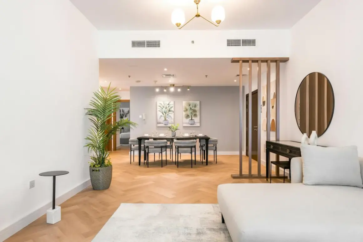
Property photos live or die on light. In this guide, I break down how I control brightness, color, and contrast so rooms feel spacious without looking fake, and so windows, walls, and finishes all read cleanly. The focus is practical: what to use, when to use it, and where real estate shoots usually go wrong.
The best listing images come from controlled light, not the brightest room in the house.
- Start by reading the property itself: window direction, bulb color, contrast, and reflections.
- Use the lighting method that fits the room, not the one that sounds most advanced.
- Window light, bounce flash, HDR, and LED fill each solve different problems.
- Most weak property photos fail because of mixed color temperatures, blown windows, or over-lit corners.
- A tripod, consistent white balance, and RAW capture usually improve results more than a more expensive camera.
Begin with the light already in the house
Before I bring in any gear, I walk the room and decide what the existing light is doing. That means checking which windows are dominant, whether daylight is direct or diffused, and which bulbs are adding a color cast that will be annoying to clean up later. A south-facing living room in bright afternoon sun needs a different approach than a north-facing bedroom that feels flat all day.
My first move is usually simple: open blinds, straighten curtains, and switch off any light that fights the scene instead of helping it. In many homes, the overhead cans, warm lamps, and cool daylight are all mixing at once, which is exactly how you get muddy walls and strange shadows. If I need a room to feel inviting, I want one clear lighting story, not three competing ones.
- Bright, even daylight is ideal for airy spaces, but it still needs control at the windows.
- Harsh sun is usually better handled by waiting, diffusing, or changing angle rather than forcing it.
- Mixed bulbs are the fastest way to make a room look cheap, even if the furniture is excellent.
- Reflective surfaces like glass, stone, and polished floors need to be checked before I trigger the shutter.
Once I know what the room is already giving me, I can decide whether to shape that light or supplement it, which is where the real work starts.
Choose the right mix of natural light, flash, and HDR
I rarely treat lighting for property work as a single technique. In practice, I am choosing between methods that solve different problems: window light for realism, flash for control, LED fill for small spaces, and HDR when the brightness range is too wide for one exposure. The key is to understand what each method does well and what it breaks if I push it too hard.
| Method | Best use | Strength | Trade-off | Typical U.S. cost |
|---|---|---|---|---|
| Natural window light | Bright living areas, simple rooms | Realistic and fast | Limited control in dark spaces | $0 to $100 |
| Bounce flash | Most interiors | Balanced, natural-looking fill | Requires practice and placement | $150 to $600 |
| Off-camera strobe | Large rooms, premium listings | Strong control over direction and depth | Slower setup | $400 to $1,500 |
| LED fill | Closets, bathrooms, video crossover | Continuous preview of the effect | Can be weak or color-shifty | $100 to $600 |
| HDR bracketing | Rooms with bright windows | Preserves highlight and shadow detail | Looks artificial if overprocessed | $0 if the camera already supports it |
I think of HDR as a capture strategy, not a lighting source. It does not add quality light to the room; it just helps me combine exposures when the scene exceeds what one frame can hold. That distinction matters, because a badly lit room with HDR still looks badly lit.
For most homes, bounce flash is the most useful middle ground. It gives me enough fill to keep interiors readable without making the image look like a studio set. When the room is especially bright or very large, I may add a second light or bracket exposures, but I still want the final image to feel like the property itself, not a lighting demo.
Once the method is chosen, I move room by room, because each space asks for slightly different decisions.
Match the lighting to the room, not the other way around
Rooms do not respond to light in the same way. A living room can usually tolerate a softer, broader treatment, while a kitchen or bathroom exposes every mistake in color and reflection. I get better results when I adjust for the room’s purpose and surface materials instead of applying one blanket setup to the whole house.
Living rooms and open-plan spaces
In living areas, I want depth more than brightness. I usually let the main windows define the direction of light, then add just enough fill to keep furniture, corners, and wall texture visible. If I over-light these rooms, they stop feeling comfortable and start looking staged in a bad way. A little shadow is useful here because it gives the room shape.
Kitchens
Kitchens punish color mistakes. Stainless steel, white cabinets, glossy counters, and mixed under-cabinet lights can make even strong images look chaotic. I either standardize the bulbs or turn off the ones that do not belong, then I watch for reflections in appliances and cabinet doors. The goal is to keep surfaces crisp without turning every highlight into a glare hotspot.
Bedrooms and bathrooms
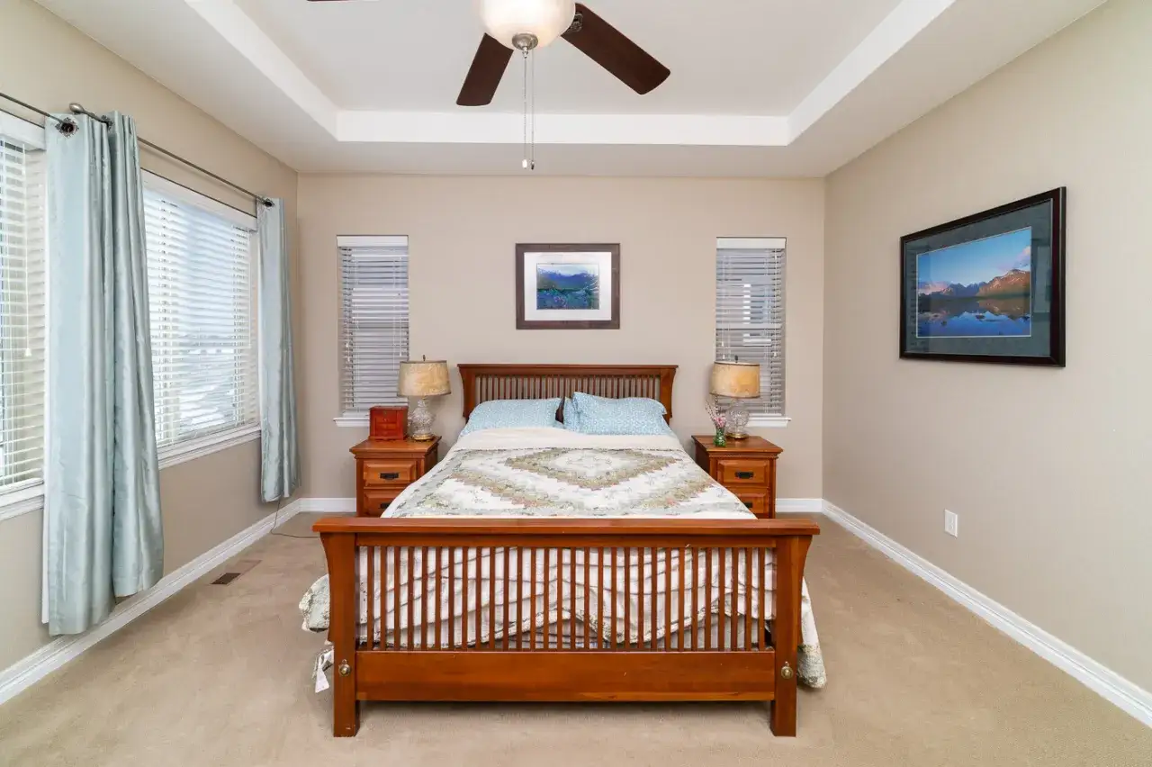
Bedrooms usually benefit from softer contrast and calmer color. I avoid lighting them so hard that the bedspread and walls lose texture, because buyers want comfort, not a showroom blast. Bathrooms are the opposite problem: mirrors, tile, chrome, and glass force me to think about what the camera is reflecting before I worry about exposure. If my light source shows up in the mirror, I have not finished the setup.
Read Also: Green Screen Lighting - Get Perfect Chroma Keys Every Time
Exteriors and twilight
For exterior shots, I prefer soft daylight or blue hour when the schedule allows it. Blue hour usually lands about 20 to 40 minutes after sunset, depending on season and location, and it gives the sky enough richness to balance warm interior windows. That is why twilight front elevations often feel more premium without requiring dramatic editing. If the house is a simple daylight listing, I still avoid harsh noon sun whenever I can.
Different rooms only look convincing when the camera and gear can keep up, so the next step is making the setup consistent and controllable.
Use gear and settings that make the light predictable
I want equipment that gives me repeatable results, not just more options. For most property work, the essentials are a tripod, a controllable flash or strobe, a way to soften the light, and a method for keeping color stable from room to room. A bigger kit can help, but it is usually not the first thing that improves the file.
| Tool | What it solves | Typical price range |
|---|---|---|
| Tripod | Sharp frames, bracketed exposures, consistent composition | $80 to $300 |
| Speedlight or strobe | Shadow fill and balanced interiors | $120 to $600 each |
| Light stand with softbox or umbrella | Spreads light so it feels less harsh | $40 to $250 |
| Reflector | Cheap daylight bounce in tighter spaces | $20 to $60 |
| Gray card or color checker | Faster white balance correction | $20 to $150 |
For settings, I usually stay conservative. ISO 100 to 400 keeps noise low, especially in shaded interiors. Apertures around f/7.1 to f/11 are a practical sweet spot because they preserve enough depth of field for rooms without forcing the image into a soft, mushy look. On a tripod, I let shutter speed do the rest. If I am bracketing for HDR or blending, I often shoot three frames at 2 EV apart, though the exact spacing depends on how bright the windows are.
White balance matters more than beginners expect. A custom balance or a consistent Kelvin value keeps the entire set coherent, and shooting RAW gives me room to fine-tune without destroying wall color. That is also why I do not trust a room that looks “fixed” only because it was over-edited later. Good color starts in the capture, not in the export.
With the technical base in place, the final step is avoiding the mistakes that quietly ruin otherwise good shoots.
Avoid the lighting mistakes that make listings look cheaper
The most expensive-looking homes can still photograph badly if the lighting is careless. In my experience, the biggest damage usually comes from inconsistency, not lack of gear. A room becomes distracting when the light source, color temperature, and contrast all pull in different directions.
| Mistake | What it does to the image | Better move |
|---|---|---|
| Mixing warm and cool bulbs | Walls turn patchy and skin tones or finishes look odd | Standardize bulbs or switch off the ones that conflict |
| Pointing flash straight at the room | Flat, obvious lighting with harsh shadows | Bounce it or soften it off-camera |
| Blowing out windows | The exterior disappears and the room feels unfinished | Expose for highlights first, then lift the interior |
| Lighting every corner equally | The room loses depth and starts to look fake | Keep a natural falloff and let the space breathe |
| Ignoring mirrors and glass | The camera, stand, or light source shows up in reflections | Check angles before you commit to the frame |
| Overprocessing HDR | Glowing edges, halos, and plastic-looking texture | Blend more naturally and keep the contrast believable |
I would rather leave a little darkness in a far corner than flatten the entire room. Buyers are surprisingly good at spotting images that feel too engineered, even if they cannot explain exactly why. Real-world interiors have some falloff, and a good photograph keeps just enough of it to feel honest.
Once those errors are under control, the workflow becomes much faster because I am no longer fixing the same problems in every room.
What I protect when the schedule is tight
When I only have a short window on site, I focus on three things: natural color, clean windows, and one clear light direction. Those three choices do more for the final gallery than trying to make every surface equally bright. If a shoot is moving fast, I would rather finish with a consistent, believable set of images than a scattered collection of over-lit frames.
- Natural color keeps the property trustworthy.
- Window detail gives the room context and depth.
- One clear light direction makes the space feel intentional.
- Consistent processing keeps the gallery from jumping between moods.
That is the standard I keep coming back to in lighting for property photography. If the room feels bright, balanced, and believable, the technique has done its job; if it only looks dramatic in one frame but inconsistent across the set, I usually dial it back and make the light serve the home instead of the other way around.