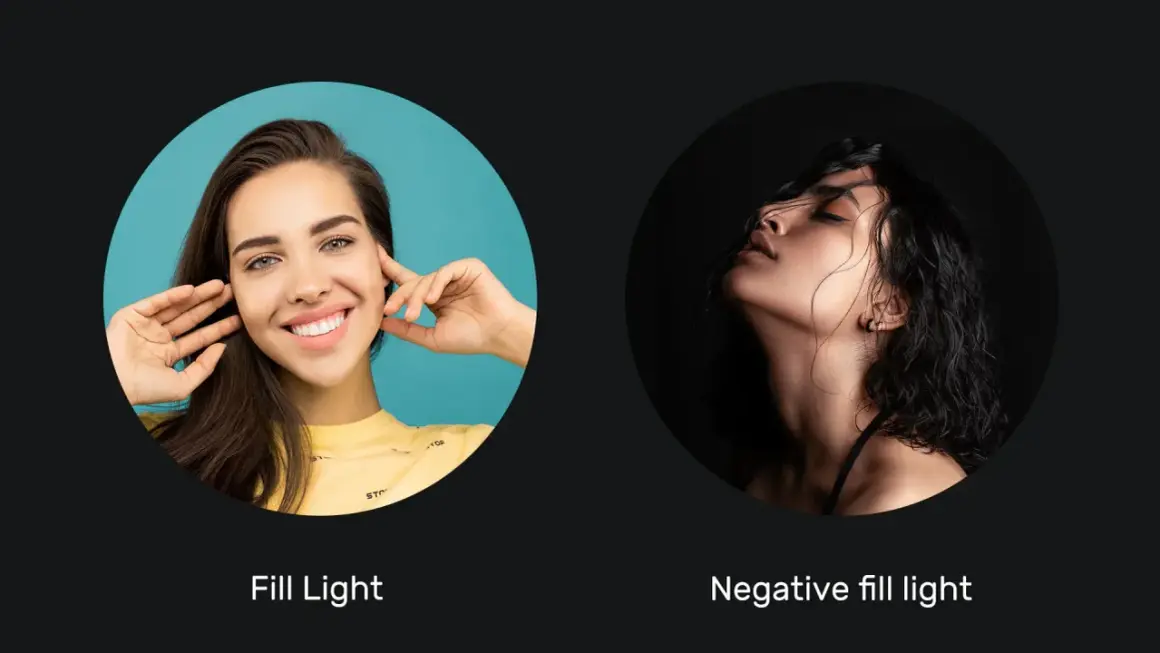
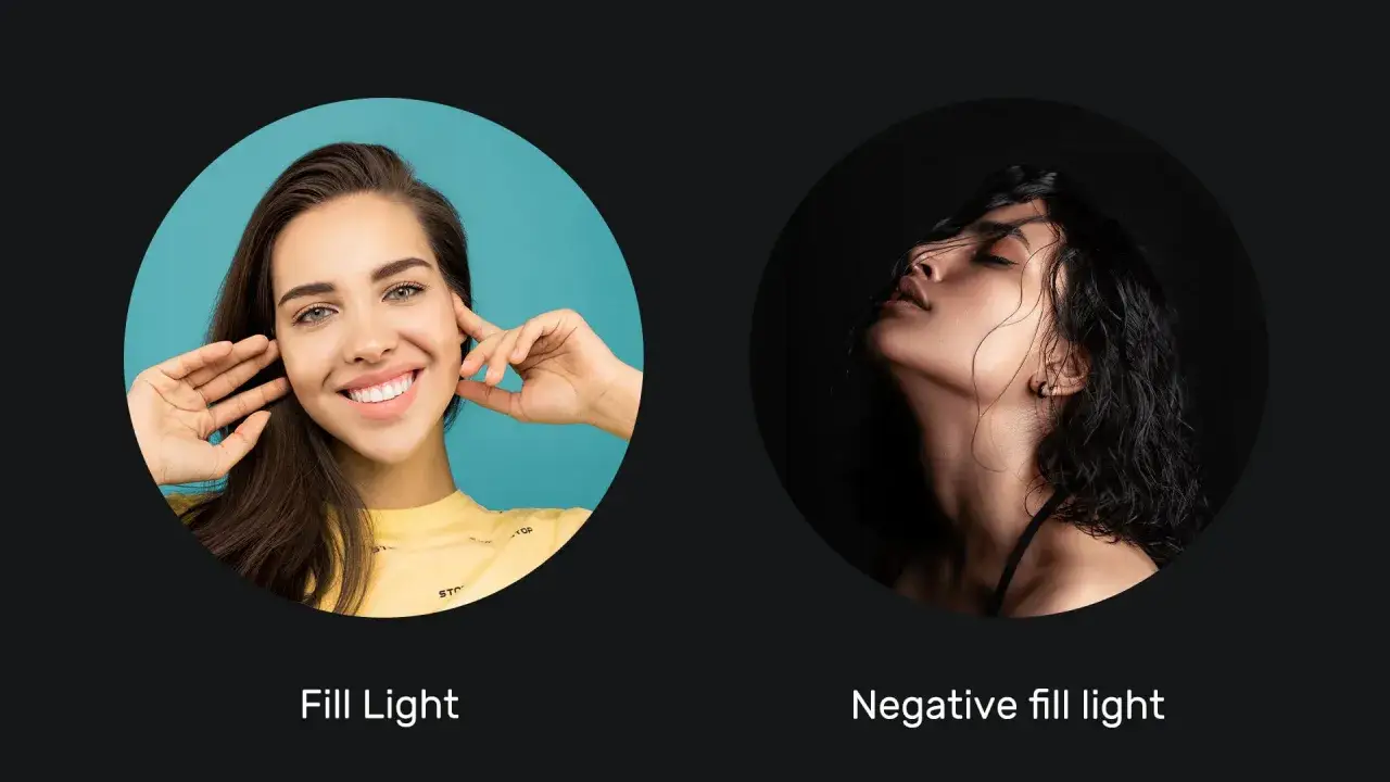
Negative fill is one of the cleanest ways to add shape to a face, product, or interview frame without adding another light source. In practice, it is about absorbing stray bounce so the shadow side stays rich, controlled, and believable. I’ll walk through what it actually changes on camera, when it matters, how to set it up, and which materials are worth carrying.
The short version before you shape the shadows
- It deepens shadows by removing reflected light, not by creating more of it.
- It matters most in bright rooms, white studios, and any setup that feels too open or flat.
- Black foam core, duvetyne, v-flats, and flags are the most practical tools.
- Placement is usually more important than size alone; closer often works better.
- It is easy to overdo in small spaces, so you need to judge contrast, not just darkness.
What negative fill actually does to a frame
The easiest way to think about it is subtraction. A key light gives you the exposure and direction, but the room can quietly undo that work by bouncing light back into the shadows. A black surface placed near the subject absorbs that spill, which raises perceived contrast and gives the image more modeling.
I like to describe it as putting a “light eater” next to the subject. The effect is subtle in a dark studio, but in a white room, near a window, or under broad soft light, the difference can be immediate. Cheeks become more sculpted, jawlines read more clearly, and product edges stop looking washed out.
The important part is that it does not create darkness on its own. It protects the shadow side from being filled back in by the environment. That is why the technique is as much about controlling the set as it is about controlling the lamp.
Once you see it that way, the next question is where this kind of light subtraction is most useful.
When subtractive light control earns its place
I reach for this method whenever the environment is doing too much work for me. It is especially useful when I want the frame to feel more dimensional without changing the key light direction or adding more power.
- Portraits: It defines the shadow side of the face, which helps skin and bone structure read with more authority.
- Beauty work: It prevents the light from wrapping too far around the face, which can flatten cheekbones and soften texture too much.
- Interviews: It gives a talking head more separation from a bright wall or window-heavy room.
- Product shots: It keeps reflective surfaces from picking up unwanted white bounce that makes the object look sterile.
- Low-key scenes: It helps you keep the contrast ratio where you want it instead of letting ambient light quietly lift the blacks.
In practice, the technique is less about a genre and more about a problem: the frame looks too open, too soft, or too evenly lit. When that happens, removing light is often faster and cleaner than adding another source. That is why setup matters so much.
How I set it up on a real shoot
I usually start by lighting the scene the normal way, then I look at the shadow side and ask what is filling it. If the answer is a white wall, a bright ceiling, or a large soft source bouncing around the room, I add a black surface on the side I want to deepen.
- Place the key light first and decide the direction of the shadow.
- Stand where the camera is and watch the shadow side of the face or object.
- Bring a black card, v-flat, or fabric panel in close enough to influence the spill.
- Move it in small increments, usually 6 to 24 inches at a time, until the shadow has the texture you want.
- Check the frame for unwanted reflections in skin, glasses, jewelry, or glossy product surfaces.
- Lock the position only after you have looked from both the camera angle and the subject angle.
The most common mistake is placing the black surface too far away. If it is several feet off to the side in a bright space, the room may simply keep bouncing light back into the shot. Close placement usually works better because it interrupts the bounce before it reaches the subject.
For a solo portrait setup, a 2x3 foot card can be enough. For interviews or half-body framing, I find 4x4 or 4x8 foot panels far more reliable because they cover a larger part of the subject’s environment. Bigger does not just mean darker; it also means more consistent.That leads naturally to the question of which materials are worth trusting on set and which ones only look useful in theory.
Tools that work better than others
Not every black object performs the same way. Density, size, rigidity, and how close you can place it all affect the result. I prefer tools that are easy to move fast, because the right tool is often the one you can position precisely before the moment passes.
| Tool | Best for | Strength | Limitation |
|---|---|---|---|
| Black foam core | Portraits, close product work, small teams | Cheap, light, easy to angle | Too small for broader interview setups |
| Black v-flat | Beauty, fashion, half-body portraits | Covers a lot of area and gives strong control | Bulky and awkward in tight spaces |
| Duvetyne or black fabric | Location shoots, irregular rooms, wall control | Flexible and easy to clamp or drape | Can wrinkle and needs careful support |
| Black flag or cutter | Precise edge control near a light source | Fast to place and very directional | Less coverage for full shadow-side shaping |
I find that foam core is ideal when I need speed, while duvetyne wins when the problem is a bright wall or ceiling that keeps throwing light back at the subject. The v-flat is the workhorse when I want coverage and repeatability, especially in fashion and interview work. Picking the tool is really about the space, not the label.
Where it beats bounce and where it does not
This is the part people often miss: the goal is not “more contrast at all costs.” Sometimes a little bounce is exactly what the image needs. If the subject’s face is turning too dark, the room is already low key, or the product needs clean separation, then a black panel can be too aggressive.
Here is how I separate the common tools in my head:
- Black panel: absorbs spill and tightens the shadow side.
- Flag: blocks a specific path of light, usually from the source or a reflection.
- Gobo: shapes the beam or creates a pattern, which is more about design than shadow control.
- Bounce: does the opposite by returning light into the scene and softening contrast.
- Dark backdrop: reduces background distraction, but it does not always control the face unless it is close enough to affect bounce.
The distinction matters because a backdrop can look black and still fail to change the subject much. A black surface behind the talent is not the same as a black surface beside the shadow cheek. If I want facial sculpting, I place material near the face. If I want separation from the background, I handle the background separately.
That difference becomes even more important when the setup starts breaking down, which is usually where the most expensive mistakes happen.
Common mistakes that make the effect disappear
The main failure mode is simple: too much ambient light. If the room is bright enough, black surfaces can only do so much. White walls, pale ceilings, and reflective floors all act like passive fill sources, and they can erase the contrast you were trying to build.
- Using panels that are too small: A tiny card may only affect a sliver of the frame, especially in wider shots.
- Placing the black surface too far away: The room starts reintroducing bounce before the card can matter.
- Ignoring glossy subjects: Skin with shine, glass, chrome, and lacquered products show spill fast.
- Over-darkening the face: You can lose detail and end up with a frame that feels muddy instead of dimensional.
- Forgetting the background: Sometimes the subject looks right, but the room still feels lit in a way that weakens the mood.
My rule is to check the image at normal viewing size, then zoom in only to confirm reflections. If the face still reads well and the shadows have texture, I stop there. More subtraction is not automatically better; the useful range is usually narrower than people expect.
Once the common errors are under control, the whole process gets much faster, which is why I keep a simple repeatable workflow for it.
A compact kit I keep returning to on bright sets
When I know a location will fight me with bounce, I bring a small kit that can solve most cases without slowing the shoot down. I do not want to improvise this part from scratch while talent is waiting.
- One 4x8 black v-flat for interviews and wider portraits.
- One or two black foam core boards for close work and quick tweaks.
- A few clamps and a C-stand so the material stays where I put it.
- Black fabric or duvetyne for irregular spaces and wall control.
- A dimmable key light, so I can balance shape before I start adding subtraction.
My workflow is simple: light the scene, study the shadow side, remove the bounce that weakens it, then step back and judge the frame as a whole. That order keeps the look intentional instead of accidental. If the image feels flatter than it should, I usually do not need more power; I need less spill. That is the quiet advantage of learning how to shape contrast with restraint.