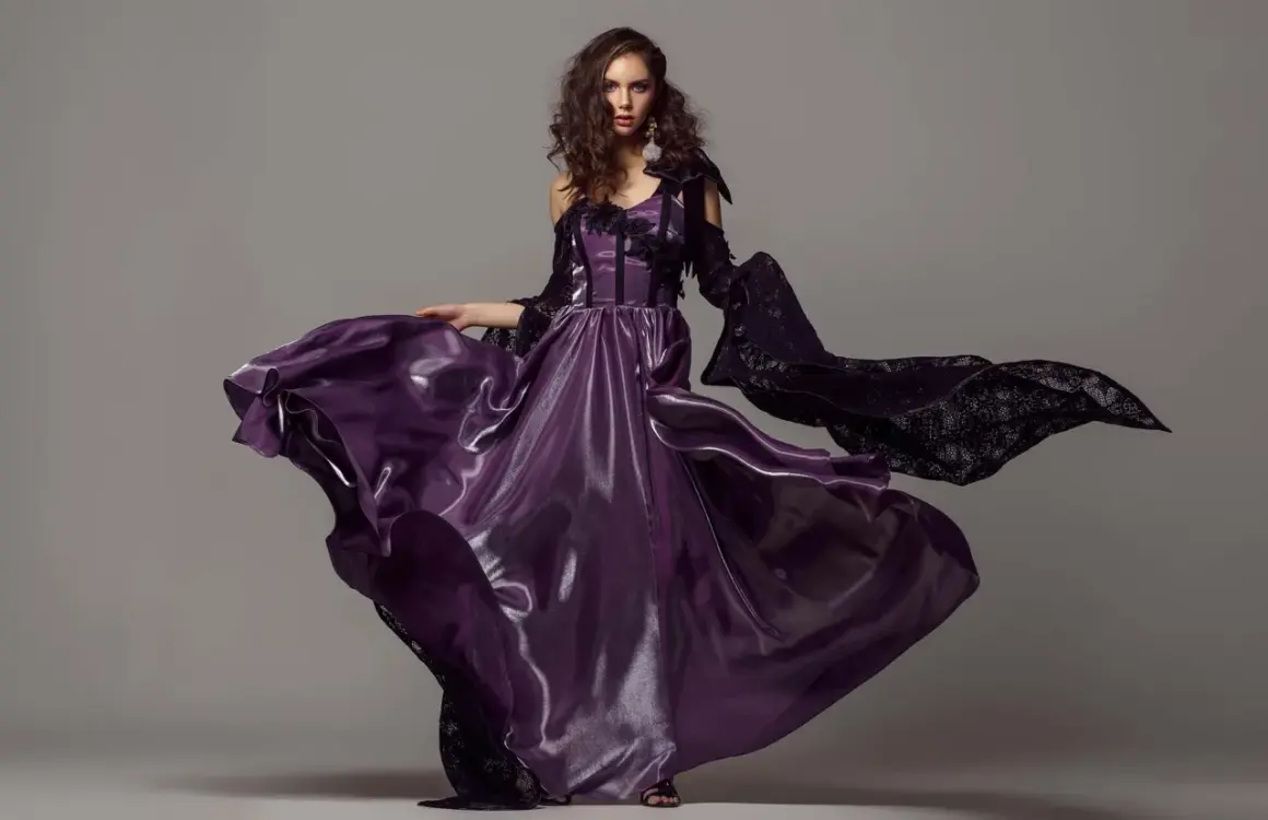
Studio fashion photography sits at the point where control matters as much as taste. In a controlled set, every decision is visible: the shape of the light, the tension in a pose, the drape of fabric, and whether the final image feels premium or merely polished. This article breaks down how I plan the shoot, choose the right lighting, direct models, and deliver images that actually work for e-commerce, lookbooks, editorial features, and social campaigns.
The short version is that strong studio work comes from matching the image style to the job
- Start with the use case. Product pages, lookbooks, and editorial campaigns need different levels of drama, texture, and retouching.
- Build the room for the garment. Background distance, lens choice, and tethered review matter more than expensive gear.
- Use light to reveal shape. Soft light is flattering, but too much softness can erase seams, texture, and fit.
- Direct with purpose. The best poses help the clothing read clearly while still giving the model energy and presence.
- Retouch with restraint. Clean color and consistent crops are more valuable than heavy smoothing.
- Plan for deliverables early. U.S. brands often want web, social, and marketplace crops from the same shoot.
Know which result you are actually shooting for
I always begin by deciding what the image is supposed to do. A catalog frame, a lookbook image, and a campaign shot may all feature the same dress, but they solve different problems. If I get that wrong, the lighting and posing can be beautiful and still miss the brief.
| Shot type | Best for | What to prioritize | What to avoid |
|---|---|---|---|
| E-commerce | Product pages, marketplaces, conversion-focused listings | Color accuracy, fabric detail, clean background, repeatable framing | Over-stylized lighting, extreme poses, heavy retouching |
| Lookbook | Brand websites, seasonal collections, styling references | Consistency, posture, full garment visibility, controlled movement | Too much drama that hides the clothing line |
| Editorial | Magazines, brand storytelling, creative campaigns | Mood, composition, attitude, visual tension | Flat light that makes the image feel generic |
| Beauty-led fashion | Makeup, accessories, close portrait campaigns | Skin texture, catchlights, clean facial shape, precise styling | Lighting that flattens the face or dulls the product |
In the U.S. market, I see a lot of shoots fail because the client wanted two things at once but only budgeted for one. If the deliverables need to serve e-commerce and social media, I plan for at least one clean master frame, one tighter crop, and one vertical composition before the subject even steps on set. That decision makes the rest of the shoot faster and less reactive. Once the goal is clear, the next step is building the set so it supports the image instead of fighting it.
Build the set around the garment, not the gear
When I work in a studio, I care less about how much equipment is on the floor and more about whether the set lets me control fabric, shape, and separation. A polished result usually comes from a simple setup that is arranged deliberately, not from a crowded studio full of unused modifiers.
Background and spacing
I like enough distance between the subject and the backdrop to keep shadows from getting muddy. In a small studio, even a few extra feet can make the image feel cleaner and give me more control over spill. Neutral backgrounds are still the most flexible choice, but the right color or texture can add personality when the clothing needs a stronger mood.
Camera and lens
For full-length fashion frames, I usually reach for a portrait-friendly focal length rather than a wide lens, because wide angles distort proportions fast. A lens in the 70-105mm range is often a safe starting point for body work, while tighter fashion portraits can go a little longer if the room allows it. I also keep my camera on tether when possible, because it is much easier to spot a twisted hem or a bad shoulder line on a larger screen than on the rear display.
Read Also: Moonlit Photography - Capture Stunning Landscapes
A practical exposure baseline
For studio flash work, I generally stay near ISO 100, keep shutter speed around the camera’s sync range, and use aperture to control depth of field and texture. For clothing that needs to show construction, I often stop down more than I would in beauty work, because seams, weave, and trim need to read clearly. I also like a gray card or calibrated color target at the start of the session; it saves time later when the client needs consistent color across an entire collection.
Once the frame is structurally sound, lighting becomes the real creative lever, because light is what turns a clean setup into a fashion image with character.
Use light to shape texture instead of hiding it
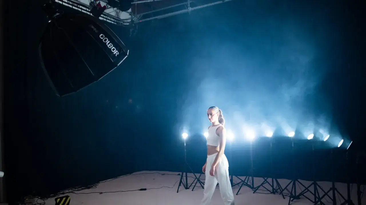
Lighting is where studio fashion work either becomes intentional or collapses into sameness. I want the light to do two jobs at once: flatter the model and reveal the garment. Those goals do not always overlap, so I choose my setup based on what matters most in the frame.
| Lighting setup | Look | Best use | Main risk |
|---|---|---|---|
| One soft key light | Clean, minimal, forgiving | Lookbooks, simple e-commerce, quick turnaround shoots | Can go flat if there is no shape or separation |
| Key plus fill | Balanced and commercial | Most studio fashion portraits and catalog work | Can lose drama if fill is too strong |
| Key, fill, and rim | More dimensional and polished | Campaigns, editorial work, glossy beauty-fashion hybrids | Easy to overcomplicate and slow the set down |
Two terms I use a lot on set are feathering and flagging. Feathering means aiming the edge of the light across the subject instead of blasting it straight on, which softens the falloff and gives me more control. Flagging means blocking spill with a black card or similar tool so the background, lens, or nearby surfaces do not pick up unwanted light.
I also pay attention to the quality of the modifier. A large softbox or octabox gives a smoother rolloff and is usually friendlier to skin, while a harder source can make tailoring, leather, metallic trims, and structured garments look sharper. The trick is not to choose soft or hard light as if one is always better. I choose the one that makes the fabric believable. That leads naturally into posing, because light alone does not sell the clothes if the body language is weak.
Direct poses and styling that make the clothes feel expensive
One of the fastest ways to improve a shoot is to direct the model with more precision. I do not start with a vague instruction like “look fashion.” I start with the shoulders, the hands, the chin, and the relationship between body and garment. Fashion images depend on micro-adjustments, and models usually respond well when the direction is clear and calm.
- Start with posture. A lifted sternum and a long neck often make clothing sit better immediately.
- Watch the hands. Hands that are relaxed but intentional usually look better than stiff, decorative hand poses.
- Create lines. I look for angles in elbows, hips, and knees so the silhouette feels designed rather than accidental.
- Protect the garment. If the fabric has structure, I avoid poses that crush it or hide its shape.
- Use movement sparingly. A small turn, a step, or a coat swing can add life, but too much motion makes the clothing hard to read.
- Give the model a job. I often describe the feeling, audience, or attitude I want rather than reciting technical instructions.
In practice, I think about whether the clothes or the person should lead the frame. If the garment is the hero, I keep the pose cleaner and more vertical. If the model is the hero, I allow more asymmetry, more attitude, and more facial expression. That balance matters because a beautiful pose can still fail if it hides the neckline, distorts the hem, or creates wrinkles where the client wants smooth lines. After the pose is working, the final image depends on how carefully I finish the file.
Edit for realism and consistency, not perfection
Retouching in fashion work should make the image easier to trust, not less human. I keep texture in skin, preserve stitching and weave, and clean only the distractions that pull attention away from the clothing. Over-retouching is one of the quickest ways to make expensive apparel look synthetic.
My post-production priorities are usually straightforward: correct color, keep whites neutral, even out exposure across a set, and remove temporary distractions like lint, stray hair, or a visible clip. If the brand sells online, I also make sure the files are consistent from frame to frame, because customers notice when one image is warmer, darker, or cropped differently from the rest.
For delivery, I usually think in layers. A client may need a web-ready JPEG, a high-resolution master, and separate crops for 4:5, 1:1, and 9:16. I prefer to plan those crops before the shoot rather than trying to rescue composition after the fact. If a marketplace or retailer has strict background requirements, I check those in advance, because retouching cannot reliably fix a bad capture without wasting time and budget.
When the edit is disciplined, the image feels effortless. When it is not, the file may still look polished at first glance but lose credibility the moment someone zooms in. That is why the most useful habit is often not a creative one, but a preventive one: catching problems before they become expensive.
The mistakes that quietly weaken a studio shoot
I see the same problems repeat across many fashion sessions, and most of them are avoidable. The issue is rarely a lack of talent. More often, the team skipped one practical decision that would have made the whole day easier.
- Using light that is too soft for the garment. Soft light can be flattering, but it can also erase seams, texture, and structure.
- Ignoring the background distance. If the subject is too close to the backdrop, shadows and spill become harder to control.
- Directing too late. Waiting until after several weak frames wastes time and drains energy on set.
- Letting styling drift. A collar, hem, or belt that shifts between frames makes a set look sloppy even when the lighting is strong.
- Retouching away all realism. Over-smoothing skin or clothing removes the texture that makes fashion feel tangible.
- Forgetting alternate crops. A composition that works as a wide frame may fail completely once it is forced into vertical social dimensions.
My rule is simple: if a problem can be fixed before the shutter clicks, it usually should be. That keeps the shoot from turning into a retouching project later. The last thing I do before any session is run through a checklist that protects the day from avoidable chaos.
The pre-shoot checklist that keeps the day moving
I keep the final prep list short enough to use under pressure, but specific enough to catch the mistakes that matter. On a fashion shoot, the small details are often the expensive ones.
- Confirm the shot list and which images are mandatory.
- Check wardrobe sizes, backups, steam time, and any required accessories.
- Prepare lint rollers, pins, clips, tape, and a steamer before talent arrives.
- Set the background, lights, and camera position before styling starts.
- Test exposure, color, and focus on a tethered screen if possible.
- Decide which crops and orientations the client needs before the first frame.
- Leave time for reset shots after any major wardrobe change.
When all of that is in place, the shoot feels calmer because the decisions were made early. That is usually the difference between a session that merely produces usable pictures and one that gives a brand images it can build on for months.