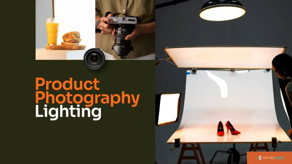
Good product photos are usually won or lost in the light, not in the camera. The right setup can make a bottle look premium, a cream jar look clean, or a piece of jewelry look believable without turning every surface into a mirror. This guide to lighting for product photography at home focuses on the choices that actually move the needle: softness, direction, reflection control, and repeatability.
The fastest way to improve home product photos is to make the light bigger, softer, and more controlled
- Window light is the cheapest place to start, but it changes quickly and can be hard to repeat.
- A daylight-balanced LED or softbox gives more control when you need consistent results.
- Large, diffused sources reduce harsh shadows and make labels easier to read.
- Glossy, metallic, and transparent products need different angles than matte products.
- A reflector and a clean background solve more problems than extra brightness alone.
- Color accuracy matters as much as exposure, so white balance and CRI should not be ignored.
What the light needs to do for product photos
When I light products, I am not trying to make everything bright. I am trying to make three things clear: what the product is, what color it is, and what it feels like. That means the light has to reveal shape, preserve detail on the label or packaging, and avoid ugly reflections that flatten the object into a shiny blob.
The simplest rule is also the one beginners overlook most often: the larger the light source is relative to the product, the softer the shadows will be. A bare bulb is small, so it throws hard shadows and bright hotspots. A window with a curtain, a softbox, or a diffusion panel behaves like a much larger source, which is why those tools make home setups look more polished. This is also where distance matters, because light drops off quickly as it moves away from the subject, so even a small shift can change the balance between the product and the background.That is why I pay attention to specular highlights, which are the bright reflections you see on glossy surfaces. A little reflection can make plastic, glass, or metal look realistic. Too much of it makes the product unreadable. Once that balance is clear, the next decision is whether you need the free flexibility of daylight or the control of artificial light.
Natural light or artificial light
For home product shoots, I usually start by asking one question: do I need this setup to be cheap and simple, or do I need it to be repeatable? Natural light is hard to beat for cost, especially if you have a soft window and enough time to work with changing light. Artificial light costs more up front, but it gives you consistency from one frame to the next, which matters a lot for ecommerce, catalogs, and brand content.
| Option | Best for | Strengths | Limits | Typical U.S. cost |
|---|---|---|---|---|
| Window light | Low-budget setups, soft lifestyle shots, one-off products | Free, naturally soft, easy to understand | Changes with weather and time of day, harder to repeat | $0 |
| LED panel | Small to medium products, evening shoots, controlled setups | Continuous preview, easy to move, good for learning light | Can look harsh if it is too small or undiffused | About $40 to $150 |
| Softbox kit | Cleaner ecommerce images, packaging, general product work | Soft, even illumination, familiar studio look | Bulkier than a bare lamp, takes more space | About $80 to $250 |
| Light tent | Jewelry, cosmetics, small glossy items | Wraps the product in diffusion and reduces harsh reflections | Can flatten texture if you rely on it too much | About $30 to $120 |
| Flash or strobe | Sharper commercial work, fast shooting, more power | Very bright, color stable, excellent control with modifiers | Harder to preview, less intuitive for beginners | About $150 to $400+ |
If I were choosing based on frequency, I would use window light for occasional photos and buy a simple artificial setup for anything I shoot more than a few times a month. Once you choose the source, the real gain comes from how you build the setup around it.
A simple home setup that works for most products
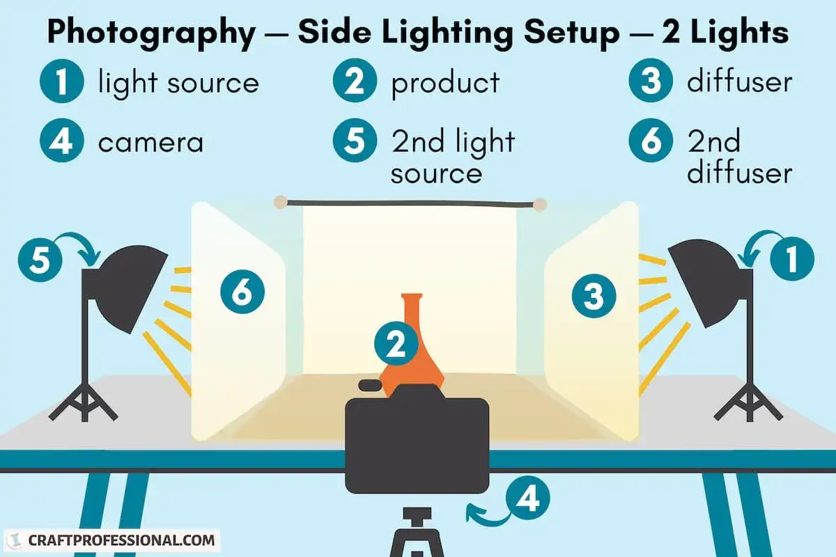
The first setup I would build is boring in the best way. Put the product on a table near a window or in front of a daylight-balanced LED. Place a large white foam board or reflector on the shadow side, and put a second white surface behind or under the product if you want a clean sweep background. That alone solves a surprising number of home lighting problems.
- Start with one light source only. It is easier to understand the shadows when nothing else is competing with them.
- Place the key light about 30 to 45 degrees to one side and slightly above the product.
- Diffuse the light with a curtain, softbox, shower curtain, tracing paper, or a proper diffusion panel if the highlights look too sharp.
- Use a white card opposite the light to bounce fill back into the shadow side.
- Keep the product a bit away from the background if you want separation, or move it closer if you want a white sweep with less visible shadow.
- Use a tripod so your framing stays fixed while you adjust the light.
For small objects like skincare, candles, watches, or packaged snacks, this setup is often enough to produce clean ecommerce images. For larger products, I keep the same logic but scale up the diffusion and reflector size. If the product has a lot of hard edges or chrome details, I sometimes add a black card just outside the frame to create shape through reflection, because pure white can make reflective surfaces look flat. Once the base setup works, the next challenge is matching the light to the material.
How I shape light for matte, glossy, and transparent products
Not every product wants the same treatment. The lighting that flatters a candle jar is not the same lighting that works for a perfume bottle or a glass dropper. I think about the surface first, then choose the direction and softness of the light around it.
Matte products
Matte items such as boxes, fabric, ceramics, and many food-packaging products are the easiest to work with. They tolerate broader, more direct light, and they usually look best when the shadows are soft enough to preserve shape without becoming dramatic. A 45-degree key light with gentle fill is usually enough. The risk here is not reflection, but flatness, so I still want a little directional contrast to keep the product from looking like a cutout.
Glossy products
Glossy packaging, skincare jars, bottles, phones, and anything with a coated finish need more careful control. I move the light farther off-axis and make the source bigger before I make it brighter. If I can see the lamp in the product surface, the customer usually can too, and that almost never looks clean. The trick is to let the product reflect something attractive, like a white diffuser or a soft window shape, instead of a bare bulb.
Transparent products
Glass and clear plastic need contrast more than brightness. A backlight or edge light can define the outline, while a dark card just outside the frame helps the edges read clearly. If I light a transparent object evenly from the front, it can disappear into the background. If I add just enough contrast, the shape becomes visible again without making the liquid or glass look dirty.
Read Also: Negative Fill - Sculpt Light & Deepen Shadows Effectively
Textured products
Fabric, leather, wood, and anything with grain or weave usually benefit from side light. Side light pulls texture forward, which is useful when the detail is part of the sale. The warning here is simple: too much side light can make a product look harsher or older than it really is. I usually nudge the source forward or add more diffusion until the texture is visible but still flattering.
Once the material is under control, the mistakes become easier to spot, because most bad home setups fail in the same few ways.
The mistakes that usually ruin home setups
The biggest problems are rarely exotic. Most of the damage comes from small choices that make the light harder, more mixed, or less predictable than it needs to be. If you fix these early, your editing gets much easier.
- Mixing light sources. A window, a ceiling bulb, and a desk lamp all have different color temperatures. That mix creates weird shadows and color shifts, especially on white packaging.
- Using the camera flash straight on. Built-in flash tends to flatten the product and create harsh glare. It is usually the fastest way to make a home setup look cheap.
- Making the light too small. A bare bulb or uncovered LED often looks harder than expected. Diffusion usually improves the image more than extra power.
- Putting the product too close to the background. That makes shadows harder to remove and can create a gray cast on white paper or foam board.
- Leaving white balance on auto. Auto white balance can shift between frames, which is annoying when you are trying to build a consistent product set.
- Chasing brightness before fixing direction. More light does not solve a poor angle. Often I get a better result by moving the lamp two inches than by buying another one.
The easiest habit to build is to turn off unnecessary household lights and let one source do the work. A clean, single-color light path is much easier to control than a room full of competing bulbs. That is why the first shopping decision should be practical, not aspirational.
What I would buy first and what can wait
If I were building a home product lighting kit from scratch, I would keep it small and focused. The goal is not to collect gear. The goal is to make a predictable image with the fewest moving parts possible.
- White foam board or poster board. Cheap, light, and useful for bounce fill, background sweeps, and flagging reflections. Usually $5 to $15.
- One daylight-balanced light source. That can be a window, a clamp light with a good bulb, an LED panel, or a softbox. A decent LED or softbox setup often lands somewhere between $40 and $250 depending on quality.
- A diffuser. This can be part of a softbox or a separate panel. Diffusion matters because it makes the source larger and more forgiving.
- A tripod. Not glamorous, but it keeps framing and focus stable. A basic one can be $25 to $150.
- A color-accurate light source. I usually look for CRI or TLCI around 95 or higher when color matters, because it gives me a better chance of accurate product color without heavy correction.
What can wait? Expensive multi-light kits, specialty modifiers, and complicated triggers. Those tools are useful later, but they are not where most home product photos fail. If you are deciding between a better camera body and better light, I would choose the light almost every time, especially for web-sized images where clean color and shape matter more than raw resolution. Once the gear is in place, the final improvement comes from repeatable workflow, not from buying more objects.
A repeatable setup pays off more than a perfect one
The setup I keep coming back to is simple: one soft key light, one white fill card, one clean background, and one camera position I can repeat. I take a test frame, check the reflections, then move the light before I touch anything else. That order matters, because it keeps me from solving lighting problems with editing later.
For repeat shoots, I tape the table position, note the distance from light to product, and save the camera settings that already worked. A gray card or white card shot at the start of the session saves time in post, because it gives me a reliable reference for exposure and color. If I am shooting a group of products for the same brand, consistency matters more than dramatic style, so I would rather keep the setup restrained than make each frame look different.
Once that base system works, you can push it in either direction, softer for beauty, more directional for texture, or tighter and cleaner for marketplace listings. That is the real advantage of good home lighting: it gives you control without forcing you into a studio you do not need.