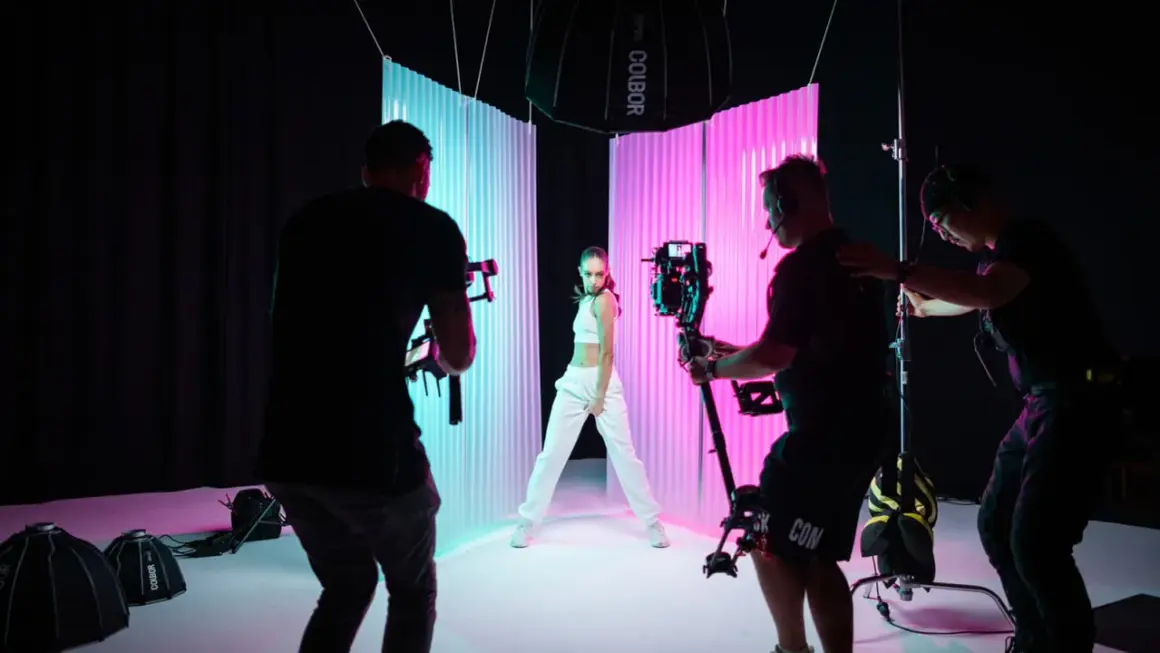
When I build a scene with color, I start by asking what role the hue should play. The practical answer to how to color lighting is to decide first whether the color should live in the key, the edge, or the background. Once that choice is clear, the rest of the setup becomes much easier: you can pick the right source, protect skin tones, and avoid the muddy look that comes from too many competing colors.
This guide breaks down the main ways to introduce color into a lighting setup, how to choose between gels and RGB fixtures, and how to keep the result clean on camera. I am focusing on decisions that work for interviews, branded content, music-video looks, and small production environments where control matters more than gear count.
The fastest way to get better color is to decide where it belongs before you touch the fixture
- Gels and filters are the cheapest, most predictable way to tint a light when the look will not change often.
- RGB and RGBWW LED fixtures are better when you need fast color changes, presets, or animated effects.
- Keep the key light neutral if the face has to stay believable, then move color to the rim, walls, or background.
- One dominant hue usually reads cleaner than a room full of unrelated colors.
- White balance and spill control matter as much as the light source itself.
What colored light is supposed to do on camera
Color is rarely the subject by itself. Most of the time, it has one of four jobs: shape mood, separate a subject from the background, suggest a time or place, or create a stylized brand look. If the color is trying to do all four at once, the frame usually gets noisy.
- For mood, keep the palette narrow. One dominant hue is enough.
- For separation, place color on the rim, wall, or background instead of the face.
- For motivation, let the color feel like it comes from a lamp, neon sign, monitor, or practical source inside the scene.
- For style, repeat the same color logic across the frame so it feels designed, not accidental.
I think this is where a lot of beginners overcomplicate the shot. The more saturated the light, the more selective you should be about where it lands. That leads straight into the tools that can actually produce the look without fighting the camera.
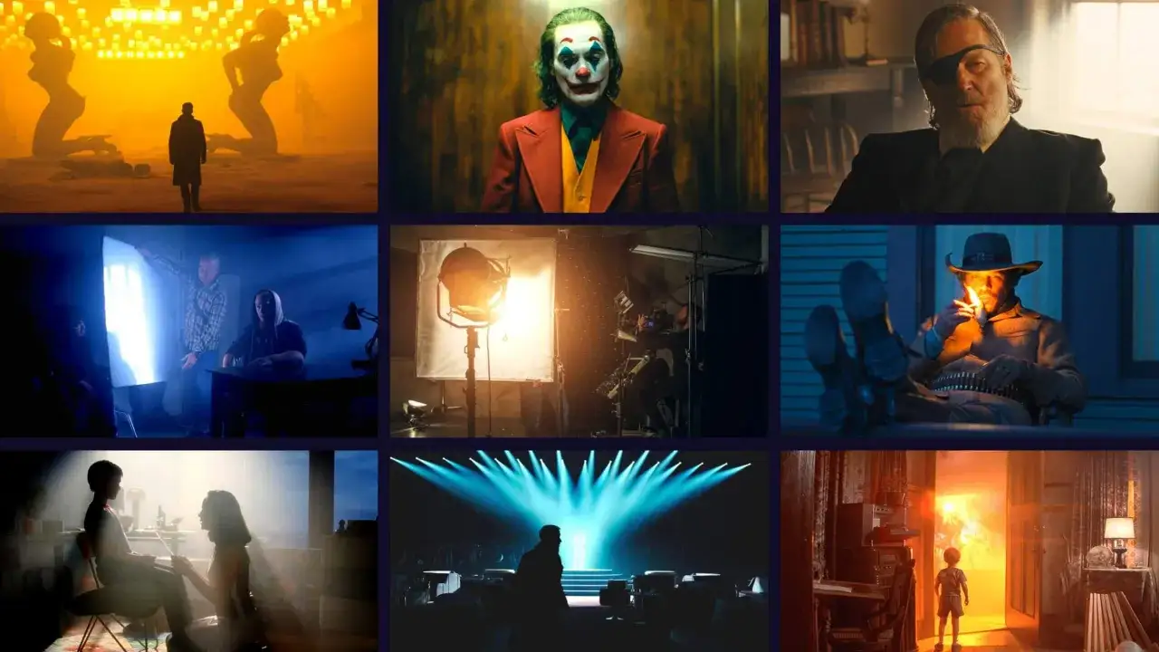
The main ways to add color to a setup
There is no single best tool. Gels are still useful when you want a predictable shift and high output, while RGB and RGBWW fixtures make color changes faster and more repeatable. Many modern fixtures also offer HSI control, which stands for hue, saturation, and intensity, so you can dial color in a repeatable way instead of guessing with presets.
| Method | Best for | Strengths | Limits | Typical cost |
|---|---|---|---|---|
| Gels and filters | Fixed looks, budget setups, color correction, strong output | Cheap, predictable, easy to swap, no menu diving | Physical changes take time, hot fixtures can be an issue, output can drop slightly | Starter packs often cost a few tens of dollars; larger sets cost more |
| RGB and RGBWW LED fixtures | Fast color changes, presets, app control, animated looks | Flexible, repeatable, good for small crews, easy to store looks | Cheaper units can lose punch at high saturation and may skew skin tones | Compact creator lights can start around the low hundreds; pro fixtures can run much higher |
| Practical bulbs and tubes | Motivated color that appears in frame | Believable, useful for atmosphere, adds production value quickly | Limited output, spill can contaminate the scene, placement matters a lot | From inexpensive bulbs to specialized tubes, depending on the look |
| Projection, gobos, and bounce | Texture, shape, patterned color, cinematic background work | Adds depth, can feel sophisticated, works well with haze or shadow | Needs space, control, and careful aiming | Variable, usually medium to high depending on fixtures |
| Neutral light plus post color | Polish, consistency, subtle finishing | Safe starting point, easy to correct later | Cannot rescue a poorly designed lighting plan | Cheap on set, expensive if you rely on it too much in post |
I still reach for gels when the look is fixed, the budget is tight, or I need more punch than a small RGB panel can give me. Rosco's filter families are a good reminder that a physical gel can be simpler than a menu, especially when I need the same result across every take. RGBWW adds warm and cool white emitters, which usually gives smoother skin tones than basic RGB, so it is worth the extra spend when people are in frame. Choosing between them is mostly about the scene and the constraints, not a single universal winner.
How to choose the right method for your scene
The best choice depends on four constraints: how much output you need, how much movement the color has to make, how much control you have over the room, and how natural the final image should feel. If one of those is strict, it should decide the tool.
| Scene | Best fit | Why it works |
|---|---|---|
| Interview or talking head | Neutral key, colored background, subtle rim | Skin stays believable while the background carries the style |
| Music video or performance clip | RGBWW tube, panel, or pixel light | Fast shifts and animated looks are easy to repeat |
| Product or social ad | Gels or tightly controlled LED color | The product remains accurate while the frame still feels designed |
| Stage or event coverage | High-output RGB or gelled fixtures | Color has to read at distance and survive moving subjects |
| Broadcast or virtual production | Calibrated fixtures with strong color rendition | Consistency across cameras matters more than a single flashy look |
ARRI's current LED guidance is a good reminder that hue is only part of the story. Fixtures that let you adjust hue, saturation, source matching, and white balance range make it much easier to keep the same look across cameras and takes. As a rough baseline, I prefer fixtures with strong color rendering, and I treat CRI or TLCI above 90 as a useful starting point rather than a final guarantee. That keeps the scene flexible without letting the spec sheet do more work than the light itself.
Once the method is chosen, the setup has to be built in a way that keeps the color predictable. That is where the workflow matters more than the gear.
A workflow that keeps color under control
- Start with a neutral key. Set the main subject light to a clean white before adding any color. This gives you a reference.
- Choose one dominant hue. Pick the main color the frame should carry. Two strong colors are usually enough; three is where things often get messy.
- Place color where it does the most visual work. Backgrounds, edges, practical lamps, and haze catch color better than faces.
- Set white balance intentionally. Decide what should stay neutral, then lock it. White balance is a reference point, not a creative afterthought.
- Control spill. Use grids, flags, barn doors, negative fill, or a tighter beam if the color is bleeding into places it should not reach.
- Check a test clip on the final camera settings. Exposure, codec, and lens choice can all change how saturated the light feels.
My own rule is simple: if the color still looks good after I reduce saturation a little, it is probably balanced. If it only works when it is pushed to the edge, the setup needs better placement, not more intensity. The next thing to watch for is the cluster of small mistakes that make colored light feel cheap.
Common mistakes that make colored light look cheap
- Overloading the frame with too many hues. The scene starts to look random instead of designed.
- Putting saturated color directly on skin. Unless that is the point, keep the face more neutral and move the color to the edge or background.
- Ignoring mixed sources. A daylight window, a warm practical, and a neon LED can fight each other if you do not isolate them.
- Trusting low-end RGB fixtures too much. Budget LEDs can lose output at high saturation and create ugly color gaps that show up on skin and fabric.
- Letting the room reflect the wrong color. White walls, glossy tables, and shiny floors can multiply spill faster than expected.
The fix is usually not to make the color weaker; it is to make the composition simpler. A single clean rim or background wash often looks more expensive than a fully saturated room. That idea becomes clearer when you see it in a few real production setups.
A few setups that consistently work
| Setup | What I would do | Why it works |
|---|---|---|
| Clean interview | Neutral soft key, subtle teal or blue background, warm practical in the room | Skin stays natural while the background creates depth |
| Stylized portrait | Soft white key, magenta or cyan rim, darker background | The subject separates quickly without needing a busy set |
| Product clip | Controlled neutral key, colored bounce card, color kept off the product face | The product remains accurate and the color feels intentional |
| Music or performance shot | RGB tube in frame, moving background wash, optional haze if the room allows it | The color gains motion and the frame feels more dimensional |
| Brand spot | Repeat one brand hue in the background, practicals, and edge light | The look reinforces identity instead of just decorating the set |
These examples work because each light has one job. The key stays readable, the color has a purpose, and the frame has enough structure to keep the palette from feeling random. That leaves one last question: what should stay in every kit, no matter the style?
The color choices I would keep in every kit
If I had to narrow the whole topic to a few habits, I would keep these: use one trustworthy neutral source as your baseline, one controllable color source for accents, and one way to cut spill. That combination solves most small-set problems without adding complexity.
- A neutral key or fill light with dependable skin-tone rendering
- One RGB or gelled fixture for background, rim, or practical emphasis
- Flags, grids, or barn doors to keep color from flooding the frame
- A gray card or reference shot so the edit starts from a known point
The most reliable colored lighting looks designed, not decorated. Keep the base clean, place color where it shapes the image, and let the camera see only the hues that actually earn their place.