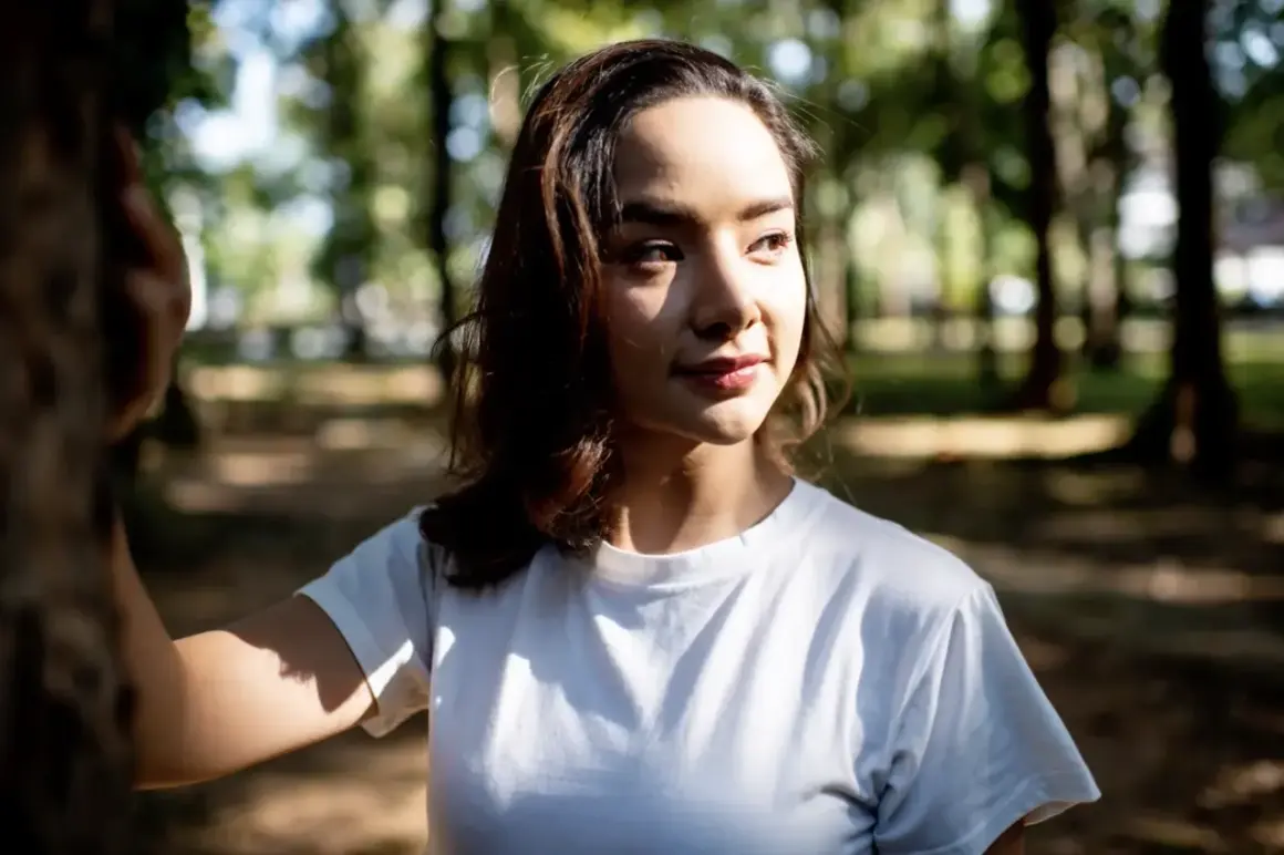
When I decide how a portrait, product shot, or branded frame should feel, I usually start with the quality of light before anything else. The practical difference behind soft lighting vs hard lighting is not just “gentle” versus “dramatic”; it changes shadow shape, texture, contrast, and how much attention the viewer gives to the subject. In this article, I break down what each look does, when it works best, and how to control it without overcomplicating the setup.
What matters most is how the light wraps, how the shadows fall, and what the image needs to say
- Soft light comes from a source that reads large relative to the subject, so shadows fade gradually.
- Hard light comes from a source that reads small or more direct, so shadows stay crisp and contrast rises.
- Distance changes the look as much as the modifier does.
- Soft light is usually easier on skin, products with subtle surfaces, and clean brand visuals.
- Hard light is stronger for texture, tension, graphic shapes, and editorial impact.
- You rarely need one perfect look; a mixed setup is often the most professional choice.
How soft and hard light behave differently on camera
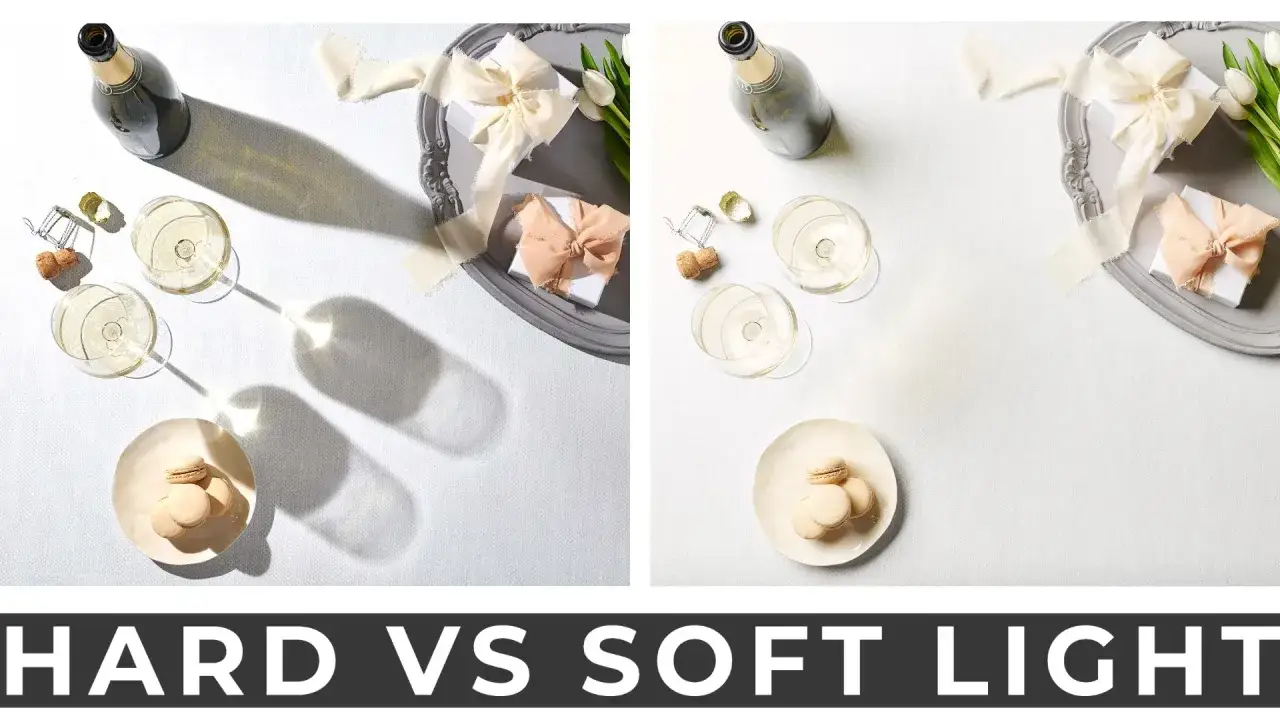
Soft light spreads across the subject and creates a broad transition from highlight to shadow. I think of it as light that gives you margin: skin looks smoother, facial planes feel less severe, and the frame tends to read as calmer or more polished. Hard light does the opposite. It draws a sharper edge between lit and unlit areas, which reveals texture, creates deeper shadow pockets, and gives the scene more bite.
| Characteristic | Soft light | Hard light |
|---|---|---|
| Shadow edge | Gradual and feathered | Sharp and clearly defined |
| Contrast | Lower and more forgiving | Higher and more graphic |
| Texture | Less aggressive on skin and surfaces | Shows pores, wrinkles, grain, and surface detail more strongly |
| Mood | Calm, clean, intimate, polished | Dramatic, edgy, tense, bold |
| Typical use | Beauty, portraits, interviews, lifestyle, product work | Fashion, editorial, texture-heavy subjects, moody storytelling |
The difference is visible immediately, but the real cause sits in the source itself. That is where the next decision becomes useful: what makes light feel soft or hard in the first place.
Why source size and distance control the result
The simplest rule I trust is this: the larger the source appears to the subject, the softer the light reads. The smaller it appears, the harder the light gets. That is why a 4x6-foot diffusion frame close to a portrait can look silky, while the same frame pulled farther back starts to behave more like a harder source. Distance matters because the apparent size changes, and intensity falloff matters because light loses power as it travels; the inverse square law is the technical explanation, but the practical takeaway is simple: moving the light changes both quality and exposure.
- Closer and larger usually means softer shadows and a smoother roll from highlight to dark.
- Farther and smaller usually means harder shadows and a more directional feel.
- Diffusion material helps only when it becomes the effective source, not when it merely sits in front of a tiny lamp.
- Reflective bounce can create a soft look without making the setup feel obvious or overbuilt.
- Grids and snoots tighten the beam, which helps preserve a harder, more controlled look.
A diffuser is not magic by itself. If the source behind it is still small relative to the subject, you may get wider spread, but not the kind of soft wrap people expect. Once you understand that relationship, choosing the right look for a given job gets much easier.
When I reach for each look in portraits, products, and branded content
In portrait work, soft light is my default when the brief asks for approachable, flattering, or premium. It helps the subject feel clean and controlled, which is why it shows up so often in beauty, skincare, corporate headshots, and lifestyle campaigns. Hard light earns its place when the image needs more character: think fashion edge, athletic intensity, documentary realism, or a portrait that should feel visually sharper and less protected.
| Use case | Better fit | Why it works |
|---|---|---|
| Headshots | Soft light | It reduces harsh facial transitions and keeps the subject approachable. |
| Beauty and skincare | Soft light | It supports clean skin texture and controlled highlights. |
| Fashion editorial | Hard light or mixed light | It creates shape, contrast, and a more stylized look. |
| Product photography | Depends on the surface | Glossy products often need softer, more controlled reflections; textured products can benefit from harder side light. |
| Food and tabletop | Usually soft light | It keeps surfaces appetizing and prevents specular highlights from taking over. |
| Architecture and interiors | Often harder or directional light | It preserves structure, lines, and material detail. |
In branded content, I often combine them. A soft key light can make the subject feel polished, while a harder rim or background accent adds separation and keeps the frame from looking bland. The choice is creative, but the setup is practical, and that is where the next section becomes useful on a real set.
How to shape the look on set without buying more gear
You do not need a massive kit to control either style. I usually start by asking what the existing source already is: a window, a sun patch, a bare bulb, or a flash. Then I decide whether to make that source feel larger, smaller, more directional, or more contained.
For a softer look
- Place a subject 2 to 4 feet from a large window with no direct sun for a clean, natural soft source.
- Use a 3x4-foot or larger softbox close to the face if you want wrap without making the frame flat.
- Set a diffusion panel between the lamp and subject only if the panel is large enough to become the visible source.
- Bring in a white wall or ceiling bounce when you want softer edges but do not want obvious light equipment in frame.
Read Also: Master White Balance - Get Natural Color Every Time
For a harder look
- Use a bare flash, small reflector, or gridded source when you want edge and shadow separation.
- Pull the light farther back if you want the source to feel smaller and the shadows to sharpen.
- Use negative fill, which simply means black material placed near the subject to absorb spill and deepen the shadow side.
- Keep an eye on spill, because hard light gets messy fast when it bounces off bright walls.
A beauty dish sits in the middle ground: punchier than a big softbox, gentler than bare flash. That middle zone is useful when you want structure without losing too much smoothness. The hard part is not creating the look once; it is keeping it from slipping into something weak or accidental.
Common mistakes that make the light feel wrong
The most common error I see is confusing soft with flat. Soft light still needs shape; if it comes from too many directions, the subject can lose dimension and start to look pasted onto the background. The second mistake is treating hard light like a technical problem to be fixed. Hard light is not automatically ugly. It only becomes a problem when the contrast is so severe that the viewer can no longer read the subject comfortably.
- Using diffusion without making the source meaningfully larger relative to the subject.
- Pulling the light too far away and then wondering why the scene reads harder than expected.
- Ignoring the background, which can either swallow the subject or reflect too much spill back into the frame.
- Choosing a light quality that clashes with the surface in front of you, such as harsh frontal light on shiny skin or delicate product packaging.
- Forgetting that direction matters as much as softness; a soft source from the wrong angle can still look unflattering.
Once those pitfalls are out of the way, the real question becomes how to decide quickly when the brief is vague. That is the part I rely on when time is short and the client wants a clear answer, not a theory lesson.
The rule I trust when the brief does not say enough
When I am deciding under pressure, I use three questions. What should the viewer notice first, how much texture should they feel, and how much shadow can the composition afford before it starts to fight the message? If the answer leans toward polish, comfort, and low distraction, I go softer. If it leans toward edge, form, or tension, I go harder. In practice, the strongest results often come from mixing both: a soft key with a little harder rim, or a hard key balanced by controlled fill. That balance gives the frame structure without making it feel generic, and it is the version of the choice that usually survives a real client review.
In most shoots, soft lighting vs hard lighting is less a binary than a range you can tune. If you treat the source size, distance, and spill control as tools instead of rules, you can move confidently between clean and dramatic looks without rebuilding the entire setup.