LEDs are useful because they let me see the mood before I commit to the shot. The best LED light photography ideas are usually the simplest ones: one soft key, one accent, and a clear background that lets the light do the shaping. In this guide, I’ll cover the setups I use most often, the gear traits that matter, and the mistakes that usually make LED lighting look cheap.
The fastest way to make LED photos look intentional
- Start with one soft key light and one accent light instead of trying to use every color mode at once.
- Look for strong color rendering, stable dimming, and a usable color-temperature range before chasing special effects.
- Place LEDs closer to the subject when you want softness; moving them back makes the same fixture look harder.
- Use negative fill, flags, or a dark background to make colored light stand out instead of washing the frame out.
- Panels work best for clean portraits and tabletop work, while tubes are stronger for rims, edges, and motion.
- Most cinematic results come from contrast and placement, not from brightness alone.
Why LEDs are easier to shape than flash
Flash is powerful, but it forces you to work in bursts. LED stays on, so I can judge facial shadows, background separation, and color balance in real time. That matters most when I’m changing the position of the light by a few inches and want to know immediately whether the cheekbone looks clean or the background is falling off too fast.
When I choose a light, I care less about marketing language and more about four things: color accuracy, dimming behavior, modifiers, and output.
- Color accuracy - Look for CRI and TLCI around 95 or higher if you care about natural skin tones and believable product color.
- Color temperature range - Bi-color lights that move from roughly 2,700K to 6,500K cover warm interiors and daylight-matched scenes.
- Stable dimming - Some cheaper LEDs use PWM, or pulse-width modulation, which can create banding or flicker at certain settings.
- Modifier support - A good LED is really a light head plus diffusion, grids, barn doors, or flags; the accessory matters as much as the lamp.
Portrait setups that make LED light look polished
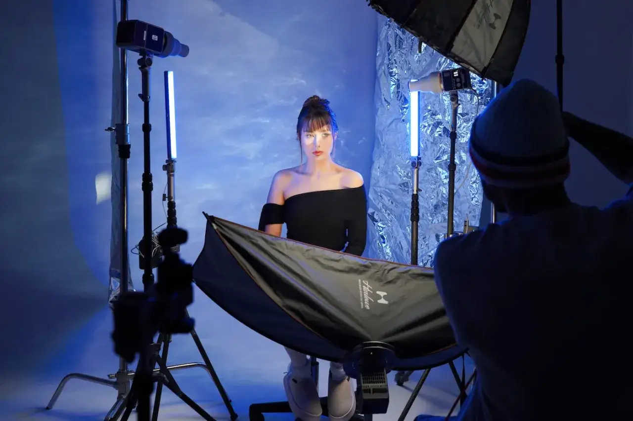
For people shots, I lean on four reliable looks. They are simple enough to build at home, but they still leave room for a deliberate style. The trick is to treat the LED as a sculpting tool, not just a bright rectangle.
Soft front light for clean headshots
Place a bi-color panel slightly above eye level and about 2 to 4 feet from the subject, then diffuse it if the source feels too hard. This gives even skin tone, gentle shadow under the chin, and a look that works for creator portraits, speaking-head videos, and polished headshots. If the face starts to look flat, move the light a little farther off-axis instead of dimming it all the way down.
Side light for shape and texture
Put the light 45 degrees to the side and just above the subject’s eye line. I like this when I want more cheek structure, visible hair texture, or a slightly editorial feel. Side lighting becomes even better when the background is darker than the subject, because the shadow side gives the image depth instead of making it look underexposed.Rim light for separation
A tube light or narrow panel behind the subject can outline shoulders, jawline, or hair. The goal is not to light the whole person; it is to create an edge that separates them from the background. This is especially effective with dark clothing or dark walls, where a thin halo of light makes the silhouette feel intentional.
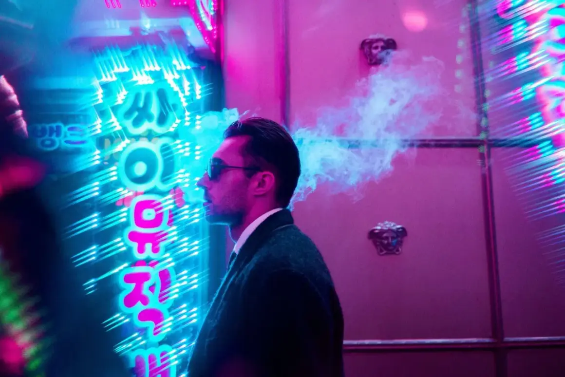
Colored edge light for mood
When I want a more stylized portrait, I keep the key light neutral and use a colored tube behind the subject or off to one side. Blue, teal, amber, and magenta are the safest choices because they read clearly on camera without feeling chaotic. One strong accent is usually enough. Two can work, but three colors often start to look like a demo instead of a photograph.These portrait setups are the easiest place to learn LED control because each move is visible instantly. Once you can shape a face cleanly, the same logic transfers to smaller subjects where reflections and edges matter even more.
Product and still-life scenes that benefit from direction
LEDs are excellent for tabletop work because you can watch the reflections behave in real time. For products, I’m usually trying to do one of three things: show texture, control reflection, or make a surface look premium without overlighting it.
- Side-strip lighting for bottles and glass - A narrow source creates a clean vertical reflection that defines the shape without washing out the label.
- Top-down soft light for flat lays - A panel or mat above the set gives even coverage for food, cosmetics, and branded still lifes.
- Backlighting for translucent objects - Drinks, perfume, acrylic, and thin fabrics all look better when the light passes through them.
- Double-side lighting for jewelry and small objects - Two controlled sources help reveal detail without creating a bright hotspot in the center.
- Practical light in frame - A small LED visible in the scene can make a lifestyle image feel less staged, as long as it does not overpower the subject.
My biggest rule here is simple: if the subject is shiny, reduce spill before you increase power. Black foam board, or negative fill, is just a dark surface used to absorb light and deepen shadows, and it usually matters more than buying a brighter lamp. For table-top work, I also prefer a partially dark frame over a fully even one, because the shadows help the product feel dimensional instead of clinical. That is also why reflective products become the fastest test of whether your LED setup is truly under control.
Use color, patterns, and practicals with restraint
LEDs can make a scene feel cinematic very quickly, but they can also become messy fast. I try to pick one dominant color story and let the rest of the frame support it. If everything is saturated, nothing feels designed.
Mix warm and cool light on purpose
A warm key light with a cool rim can separate a subject nicely, especially in interiors that already contain tungsten practicals. The warm/cool split works because the eye reads the temperature contrast as depth. It is less about “moody” color and more about clear visual hierarchy.
Use patterns instead of more colors
Sometimes I would rather project stripes from blinds, window-frame shadows, or a gobo than add a second colored source. A gobo is just a pattern placed in front of a light to shape the beam, and it can do more for a frame than another saturated hue. The image feels intentional when the light has a shape, not just a tint.
Read Also: Available Light Photography - Master Natural Light Now
Let practical lamps do part of the work
Desk lamps, neon signs, and household bulbs can sit inside the frame while an LED quietly supports them from outside the shot. That combination makes the scene feel lived-in. I use this a lot for desk setups, small interiors, and creator portraits because it prevents the lighting from looking too perfect.
Color is powerful when it reinforces the subject. If it starts competing with the subject, the image gets loud instead of cinematic, which is a good place to move into motion-based ideas where the beam itself becomes the subject.
Turn motion into part of the image
LED tubes and sticks are especially useful when I want streaks, trails, or hand-drawn shapes. Because the source is continuous, I can see the path I’m making and adjust the movement instead of guessing after a flash-pop test.
- Put the camera on a tripod and switch to manual exposure so the frame stays consistent.
- Start with a shutter speed between 1/2 second and 5 seconds for visible trails, then shorten it if the motion gets too chaotic.
- Lower the ISO to keep noise down, then open the aperture only as much as needed to keep the subject readable.
- Move the LED deliberately around the subject, behind them, or through the frame in arcs and lines rather than random waves.
- Keep the subject still if you want a sharp portrait, or accept blur as part of the design if the light painting is the point.
I like this approach for abstract portraits, music-inspired images, and social content that needs energy. I also keep effect modes off unless I’m intentionally using them, because strobe and color-cycle presets usually add distraction instead of control in still photography. It is not magic, though. The scene still needs contrast, a dark-enough environment, and enough practice to make the movement feel planned rather than accidental.
What I would buy first for a small LED kit
If I were starting from zero in the U.S. market, I would build the kit in this order: one reliable bi-color light, one modifier or diffuser, one flexible fill tool, then one accent source for color. That sequence keeps the setup useful for portraits, products, and social content without locking money into gimmicks. In 2026, I consider app control and magnetic mounting useful, but they are secondary to light quality and stability.
| Light type | Best use | Typical U.S. price in 2026 | Main trade-off |
|---|---|---|---|
| Bi-color panel | Headshots, interviews, tabletop work | $40-$250 for compact models, $400-$1,000+ for stronger studio panels | Can look flat without diffusion and flags |
| RGB tube or stick | Rim light, color accents, motion, frame-in shots | $60-$300 | Usually less useful as a primary key light |
| Flexible LED mat | Tight spaces, overhead table setups, travel kits | $100-$500+ | Needs rigging and takes a little more setup time |
| Compact LED spotlight or COB | Dramatic portraits, projection, harder shaping | $120-$800+ | Requires more control to avoid spill and hotspots |
I would rather own one decent panel and a couple of black-and-white foam boards than three lights I never trust. Good accessories are not glamorous, but they are what turn a bright source into a usable image. If the budget is tight, that is where I would spend first, along with a stand that does not wobble when the head is tilted. Once the kit is stable, the real gains come from shooting one controlled setup at a time.
The first LED setup I would test this week
I would start with one diffused bi-color panel placed 45 degrees off the subject, just above eye level, and I would keep the background darker than the face. Then I would add one accent source only if the image needed separation or mood. That simple structure teaches more than chasing every color mode in the menu, because it shows exactly how light placement changes shape, contrast, and skin tone.
After that, I would test the same setup on three subjects: a portrait, a reflective product, and a slow-shutter frame with a tube light. If the lighting feels deliberate in all three, you know the setup is flexible enough to keep using. Once you can make one LED arrangement look controlled, every other variation gets easier to judge, because you can tell whether the change improved the image or just made it louder.