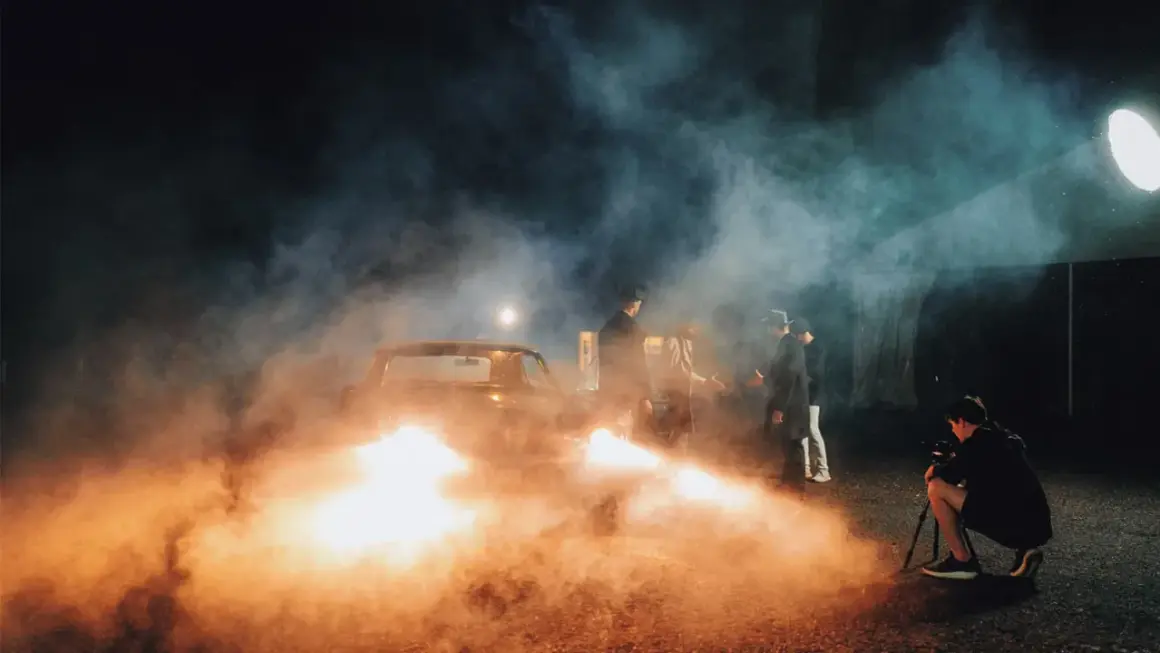
Artificial lighting is everywhere, but the source matters more than most people think. A warm lamp in a living room, a harsh fluorescent tube in an office, and a soft LED panel on a video set all behave differently, even though each is a human-made light source. In this guide, I break down the most useful examples, show where each one shows up, and explain the details that change how a space or image feels.
What matters most when you compare human-made light sources
- LEDs are now the default for most homes, sets, and commercial spaces because they are efficient and flexible.
- Incandescent and halogen still matter when you want a warm look or very familiar dimming behavior.
- Fluorescent, neon, screens, and streetlights are common examples that behave very differently from one another.
- For photos and video, color temperature, CRI, and flicker often matter more than wattage alone.
- The right light is not always the brightest one; it is the one that fits the task, the mood, and the space.
What counts as artificial light
In practical lighting terms, artificial light is any light produced by a human-made source instead of the sun. That includes everything from electric bulbs and fixtures to screens, flash units, neon signs, and streetlights. Strictly speaking, candlelight and gas lamps belong here too, but when most people ask about lighting today, they usually mean electric sources.
I usually sort these sources by purpose, not just by technology. Some are built to illuminate a room, some are meant to guide traffic, some are designed to sell attention, and some are there to shape a shot. That distinction matters because the same light can look great in one setting and wrong in another. Once you think about it that way, the examples become much easier to understand.
That is also why the best answer is rarely a single label like “bright” or “efficient.” The useful questions are: what is this light for, what does it do to color, and how does it behave when people actually look at it or film it?
Once you sort the sources by purpose, the differences become much easier to spot in real rooms and on set.
The most useful artificial light examples in everyday spaces
If I were teaching this quickly, I would start with the sources people see most often in homes, offices, streets, and production spaces. These are the examples that shape daily life and visual content the most.
| Source | Common setting | Why it is useful | Main limitation |
|---|---|---|---|
| LED bulbs | Homes, offices, studios, retail spaces | Efficient, long-lasting, available in many color temperatures and brightness levels | Cheap models can flicker or render color poorly |
| Incandescent bulbs | Older homes, decorative lamps, warm accent lighting | Soft, familiar glow with smooth dimming and pleasant skin tones | Waste heat and high energy use |
| Halogen lamps | Task lights, display lighting, some studio fixtures | Crisp output and strong highlight detail | Run hot and use more power than LEDs |
| Fluorescent tubes | Offices, classrooms, utility areas, older commercial spaces | Wide, even coverage over larger areas | Can feel flat, hum, or flicker, especially in older systems |
| Neon signs | Storefronts, nightlife, branding, wayfinding | Visually distinctive and memorable | Better for atmosphere and identity than general illumination |
| Streetlights | Roads, sidewalks, parking lots, neighborhoods | Improve visibility and public safety outdoors | Poor shielding can create glare and light spill |
| Screens and monitors | Phones, laptops, TVs, tablets, digital signage | Directly emit light and strongly affect how images are perceived | Not designed to light a room evenly |
| Camera flash, LED panels, ring lights, and softboxes | Photography, livestreams, interviews, product shoots | Give controlled, repeatable light for image making | Can look harsh if the source is too small or too close |
The main takeaway is simple: artificial lighting is not one look. A neon sign, a tube fixture, a smartphone screen, and a softbox all solve different problems. I find that people usually understand lighting much faster when they compare real examples instead of memorizing definitions.
But the same source can behave very differently on camera, which is where color and flicker start to matter.
How artificial light changes a room and a camera frame
When I evaluate a light source, I look at four things first: color temperature, color rendering, direction, and stability. Those four factors decide whether a room feels cozy, clinical, dramatic, or flat. On camera, they also decide whether skin tones and products look believable.
Color temperature is usually described in Kelvin. In everyday use, 2700K to 3000K feels warm, 3500K to 4100K reads neutral, and 5000K to 6500K feels more like daylight. That does not make one better than another; it just means each one supports a different mood and task.
| Lighting trait | What it changes | Practical rule |
|---|---|---|
| Color temperature | Mood and perceived warmth or coolness | Use warm light for comfort, neutral light for general use, and daylight-like light for task visibility or a cleaner look |
| CRI | How accurately colors appear | A higher CRI usually helps when you care about skin tones, food, products, or wardrobe |
| TM-30 | A more detailed read on color rendering | Useful when you need a better technical picture than CRI alone can give |
| Flicker | Comfort and camera stability | Watch for visible flicker, especially when filming, panning, or shooting slow motion |
| Beam spread and diffusion | Shadow softness and highlight shape | Larger, diffused sources create softer light; small bare sources create harder edges |
CRI, or color rendering index, is a rough measure of how faithfully a light source shows color. TM-30 is a more detailed method that many lighting professionals prefer because it gives a fuller picture of how a source renders a scene. In practice, I would rather have a well-designed LED with good color quality than a brighter fixture that makes everything look slightly off.
Mixed lighting can be useful if you want contrast, but it becomes a problem when it is accidental. A warm practical lamp beside a cool overhead fixture can add depth, or it can make a room look confused. The difference is usually intent.
That makes the next question obvious: which source should you use for a given job?
Which source fits which job best
For most U.S. homes, LED is the obvious baseline. The U.S. Department of Energy estimates that lighting accounts for around 15% of an average home’s electricity use, and that switching to LED lighting can save about $225 a year while using up to 90% less energy and lasting up to 25 times longer than incandescent bulbs. That is not a small efficiency gain; it changes how people buy and use light.
| Use case | Best fit | Why I would choose it | Watch-out |
|---|---|---|---|
| Living room or bedroom | Warm dimmable LED bulb or lamp | Comfortable, efficient, and easy to control | Too-cool white can feel sterile |
| Desk or kitchen task lighting | Neutral-white LED task lamp or under-cabinet strip | Improves visibility and contrast | Exposed fixtures can create glare on glossy surfaces |
| Portraits and talking-head video | High-CRI LED panel, softbox, or flash | Gives predictable skin tones and controlled shadows | Low-quality LEDs can flicker or shift color |
| Product photography | Soft LED panel or strobe with diffusion | Makes highlights easier to shape and control | Reflections show every problem in the setup |
| Storefront or signage | Neon or LED signage | Draws attention and reinforces identity | Can overpower the facade if it is too busy |
| Outdoor safety | Shielded LED streetlight or floodlight | Improves visibility with lower energy use | Poorly aimed light can disturb neighbors and wildlife |
In production work, I still reach for soft sources often because they make the result more forgiving. A softbox, for example, does not just add light; it enlarges the apparent size of the source, which softens shadows and flatters skin and product surfaces. That is why a good interview setup usually looks calm instead of harsh.
Even with the right fixture, a few common errors can still ruin the result.
Mistakes that make artificial lighting look worse
Most lighting problems do not come from the source itself. They come from how it is used, where it is placed, or what it is competing with.
- Mixing warm and cool sources without a plan. This is the fastest way to make a room feel accidental instead of designed.
- Buying brightness instead of shape. A very bright bare LED can still look ugly if it is too small and too direct.
- Ignoring flicker in video. A light can look fine to the eye and still pulse on camera.
- Relying on overhead light alone. It flattens faces, products, and interiors because the shadows fall from the wrong angle.
- Forgetting shielding and direction. Light that lands where it is not needed creates glare before it creates value.
- Leaving spill light untreated. Uncontrolled spill can wash out contrast in photos, hallway scenes, or window views.
When I fix a bad setup, I usually do less, not more. I turn off competing sources, choose one clear color temperature, and add diffusion or bounce only where the scene needs it. That approach is slower to improvise but faster to control.
When I am planning lighting, these are the specs I check first.
The specs I check before I call a light good
- Lumens tell you how much light you get, but not how usable or flattering it will feel.
- Color temperature tells you whether the light leans warm, neutral, or daylight-like.
- CRI or TM-30 tells you how trustworthy the color rendering is.
- Flicker performance matters more once a camera enters the picture or when someone will sit under the light for hours.
- Beam angle and diffusion decide whether the source feels hard, soft, focused, or broad.
- Dimming compatibility matters because a light that dims poorly often becomes annoying in daily use.
If I had to reduce the whole topic to one working rule, it would be this: choose the source for the job, then shape it for the look. The best lighting is not necessarily the brightest, the cheapest, or the most modern. It is the one that fits the space, protects color, and gives you control when the scene changes.
That is why the most useful examples are not just labels on a page. They are practical tools: LEDs for flexibility, incandescent and halogen for warmth, fluorescent for broad utility, neon for identity, streetlights for safety, screens for self-emitting content, and creator lights for controlled image-making. Once you can name them and understand their limits, choosing the right light gets much easier.