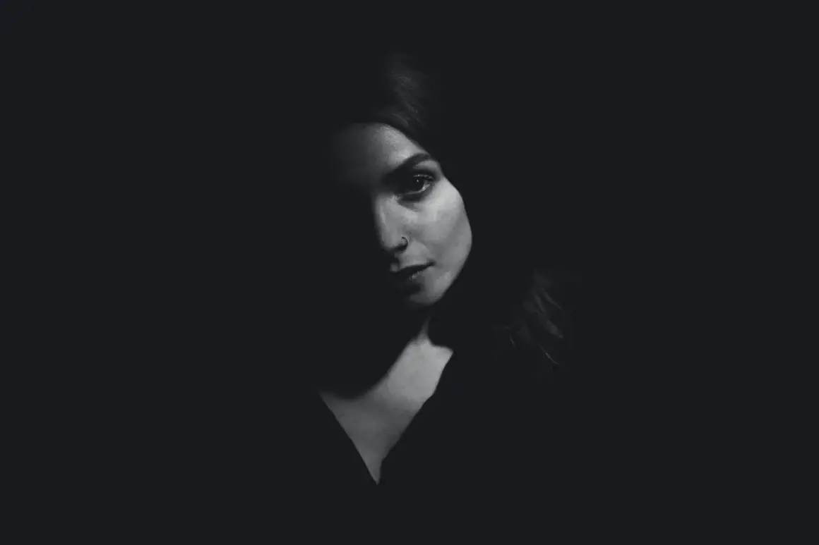
Directional side lighting is one of the fastest ways to turn a flat frame into something with depth. It reveals texture, separates light from shadow in a controlled way, and gives you a mood range that can feel clean, cinematic, or intensely dramatic without changing your whole setup. Here I’m breaking down how it works, where it earns its place, how I build it in practice, and the mistakes that usually make it look harsh or muddy.
The practical version in a few points
- Light from the side adds form. It creates shadow transitions that help faces, objects, and surfaces read as three-dimensional.
- The modifier matters as much as the direction. A window, softbox, bare bulb, or bounced source can all work very differently.
- Reflectors are often the difference between elegant contrast and lost detail. A white board gives gentle fill; silver adds more punch.
- It works especially well on texture-heavy subjects. Portraits, food, fabric, wood, metal, and product close-ups all benefit.
- Too much fill flattens the image. The goal is readable shadow, not shadow for its own sake.
What side light does to shape, texture, and mood
When I place the main source off to one side, the subject stops reading like a cutout and starts reading like a real object in space. That transition happens because the light hits one plane first, rolls across the surface, and then falls away into shadow. Our eyes interpret those shifts as contour, so the image feels more dimensional almost immediately.
That is why I reach for this setup when I want cheekbones, jawlines, fabric weave, wood grain, or surface imperfections to show up clearly. The shadow is not the point by itself; the shadow is what lets the form make sense. If the contrast is managed well, the result feels rich and intentional. If it is pushed too far, you lose information and the frame starts to feel underexposed rather than expressive.
I also think this is the most misunderstood part of the technique: it is not automatically dramatic. A soft source from the side can look calm and polished, while a hard source from the side can feel gritty or editorial. The direction gives you structure; the source quality decides how sharp that structure feels. Once that distinction is clear, the next question is where this approach actually helps most.
Where it works best in portraits, products, food, and video
I use side light whenever the image needs texture or a sense of depth that front light would erase. In portraits, that means cleaner separation in the cheeks, chin, and hairline. It can make a subject look more serious, thoughtful, or cinematic, which is useful for editorial work, artist portraits, and brand visuals that want a premium feel.
For products and still life, the benefit is even more obvious. Bottles, watches, jewelry, cosmetics, and packaged goods often look better when one side catches a highlight and the other side falls away gradually. That small contrast helps materials feel tactile. If I’m shooting for a campaign or ad creative, I often use this to make a surface feel more premium without over-styling the frame.
Food is another obvious win. A tomato, loaf of bread, pastry, or piece of grilled meat usually looks more appetizing when one side catches shape and the other side keeps some shadow. That is why I like this approach for content where texture sells the story. For softer commercial work, I keep the shadow side open with a reflector so the food still looks fresh instead of heavy.
For video, the same logic applies. A side-lit face usually reads as more dimensional on camera than a fully frontal one, especially when the background is simple. I like it for interviews, tutorials, and branded content where I want the subject to feel grounded but not overlit. If the message is supposed to feel polished, this is often the right balance between clarity and atmosphere.
The one place I slow down is clean catalog work. If the viewer needs every detail immediately and the look must be neutral, too much contrast can work against the goal. That is where control, not drama, becomes the priority.
How I build the setup step by step
I usually start with the subject rather than the light. First I decide what needs to be emphasized: a face shape, a product edge, a material texture, or a specific detail that should catch the eye. Then I place the subject a little away from the background so the shadows have room to read instead of collapsing into a wall.
- Place the source off-axis. A good starting point is roughly 30 to 60 degrees to the side of the subject, with the light a little above eye level. Around 45 degrees is a reliable middle ground when I want a clean, balanced look.
- Decide how hard you want it to feel. Move the source closer for softer wraparound light, or farther away for a crisper, more defined edge.
- Add fill only when the shadow side needs support. A white reflector gives gentle lift, while a silver reflector gives a stronger bounce. If I want more contrast instead of less, I sometimes use black foam core on the shadow side as negative fill.
- Check the shadow line on the face or object. On a portrait, I look at the nose shadow first. If it becomes too long or starts cutting across the mouth, the source is usually too low or too far off to one side.
- Control the environment. If the background competes with the subject, I move the subject forward, flag spill, or simplify the scene. When working outdoors, a scrim or diffusion panel can tame harsh sun without destroying direction.
I like this setup because it is simple enough for a one-light shoot, but it still gives me room to shape the result. That matters in production work, where speed is useful but consistency matters more.
Hard light, soft light, and the fill decision
The same side placement can produce two very different moods depending on how the source is built. Hard light comes from a smaller, more direct source, like bare sun, a spotlight, or a light without diffusion. It gives you sharper shadow edges, more visible texture, and a stronger sense of drama. That is useful for gritty portraits, architectural details, and anything where surface character matters more than smoothness.
Soft light comes from a larger or diffused source, like a window with a curtain, a softbox, or bounced light. I lean on it when I want the side placement to feel elegant rather than severe. Skin looks more forgiving, product surfaces feel less aggressive, and the transition into shadow becomes smoother. For beauty work, food, and clean brand imagery, that softer version is usually the safer choice.
The fill decision is where the look is really tuned. If I add too much fill, the image starts to look like front light with a slight angle, which defeats the purpose. If I add too little, the shadow side can go dead and lose detail. My rule is simple: fill should support the shape, not erase it.
That is also why I keep a black card nearby. Negative fill is just a dark surface used to absorb stray light and deepen shadows. It sounds minor, but in practice it can be the difference between a frame that feels flat and one that feels carefully designed. Once the hardness is set, the next step is understanding how this approach differs from other familiar lighting patterns.How it compares with front, back, broad, and short lighting
When I’m choosing a setup, I find it easier to compare the patterns side by side instead of treating them as separate styles. Here is the quick model I use on set.
| Pattern | What it looks like | Best use | Main trade-off |
|---|---|---|---|
| Front light | Low shadow, clean and even | Simple portraits, neutral product work, clear instruction visuals | Can flatten texture and reduce depth |
| Side light | More contour, more visible shadow transition | Editorial portraits, food, texture-heavy products, cinematic frames | Needs careful fill control |
| Backlight | Rim glow, silhouette, separation from background | Atmosphere, motion, outlines, dramatic mood | Detail can disappear if exposure is not handled well |
| Broad lighting | The side of the face facing camera is lit | Brighter portraits, approachable headshots, softer brand images | Can make the face look wider |
| Short lighting | The far side of the face is lit | Moody portraits, slimmer face presentation, more drama | Can feel severe if the contrast is too strong |
That comparison usually makes the creative choice obvious. The trouble, in my experience, is not choosing the pattern. It is avoiding the mistakes that quietly flatten the result after the setup is already in place.
The mistakes that flatten the result
The most common problem is simply putting too much light back into the shadow side. People see the dark half of the subject and panic, so they keep filling until the image looks safe but lifeless. I try to resist that instinct. If the frame needs contrast to work, the shadow side should still exist clearly enough to support the shape.
Another mistake is placing the source too close to the camera axis. Once that happens, the light stops carving the subject and starts behaving like front light with a slight angle. The fix is usually a small move, not a full reset. A few inches can change the shadow line dramatically.
I also watch the background carefully. If the subject is too close to the wall, the shadow can blend into the backdrop and make the composition feel cramped. Pulling the subject forward often solves this faster than changing the light itself. In product work, this matters even more because a shadow merging with a dark background can hide the edges the viewer needs to see.
Finally, I never ignore exposure just because the look is supposed to be moody. If the highlight side clips, or the shadow side sinks too deep, the image stops feeling controlled. I would rather underplay the contrast a little and keep detail than chase a more dramatic frame that falls apart once it is viewed on a bigger screen.
The last checks I use before I keep the frame
Before I call a side-lit shot finished, I check three things: whether the highlight side is doing the storytelling, whether the shadow side still contains readable detail, and whether the background is staying out of the way. If all three work together, the lighting feels deliberate instead of accidental.
I also like to judge the image in grayscale for a moment, either mentally or on the back screen. If the composition still holds when color is removed, the light is usually strong enough on its own. That is a useful test for portraits, product scenes, and motion work alike, because it tells me the structure is real and not propped up by color or styling.
The technique is simple, but it is not simplistic. Used well, it gives a frame depth, texture, and intent without asking for a complicated rig. That is why I keep coming back to it whenever the image needs to feel more dimensional and less generic.