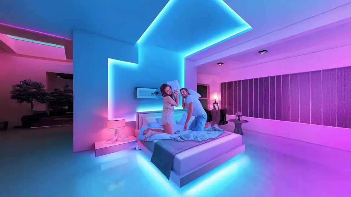
RGB lighting works best when it solves a visual problem: a room feels flat, a backdrop has no depth, or a shoot needs a color accent that reads instantly on camera. The strongest RGB light ideas usually do one of three things: create atmosphere, guide attention, or separate foreground from background without adding clutter. In this article, I focus on the setups that actually earn their place, plus the mistakes that make colored light look more gimmicky than intentional.
Key takeaways for using RGB lighting with purpose
- Use RGB as an accent, not a substitute for good task lighting. Neutral light still matters for work, reading, and accurate color.
- Place the source where you do not see it directly. Hidden strips, backlighting, and bounce surfaces look cleaner than exposed dots.
- Think in zones, not just colors. One background color and one supporting accent usually looks better than five competing hues.
- RGB is especially useful for content creation. It helps shape depth, frame subjects, and create a recognizable visual style.
- Retail and event spaces benefit from controlled color. The goal is to direct attention, not flood every surface with motion.
What RGB lighting is actually good for
I treat RGB lighting as a composition tool first and a decorative one second. It gives you millions of color combinations, which is useful, but the real advantage is control: you can change the mood of a room, make an object stand out, or separate a subject from the background without rebuilding the whole scene. That is why RGB works so well in home setups, studios, retail displays, and temporary event spaces.
What it is not, at least not by default, is a perfect all-purpose light. If I need someone to read, work, cook, or look flattering on camera, I still want a dependable white source doing the heavy lifting. RGB becomes the layer around that base, not the base itself. That distinction matters because it prevents the most common mistake: using color to cover up weak lighting design.
There are three situations where RGB usually performs best. First, when you want atmosphere, such as a lounge corner or gaming wall. Second, when you want direction, such as a glowing edge behind a subject or monitor. Third, when you want branding, because a consistent color palette can make a room or set feel intentional fast. Once you understand that, the rest of the setup choices become much easier to make.
That distinction matters, because once you know what RGB should and should not do, the room-by-room ideas become much easier to judge.
RGB lighting ideas that make rooms feel designed, not noisy
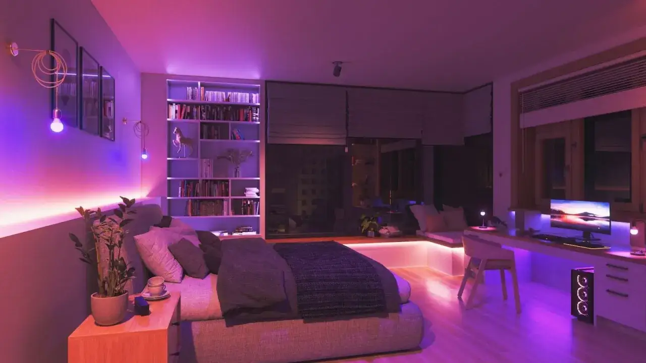
Most people start with color. I start with placement. A good RGB setup should feel built into the room, not pasted onto it, and that usually means hiding the source while letting the glow do the work. If the LEDs themselves are the main thing you notice, the effect often looks cheap, even when the hardware is not.
| Placement | What it does | Best color behavior | What to avoid |
|---|---|---|---|
| Behind a TV or monitor | Adds depth and reduces the “floating screen in a dark room” look | Soft bias light in blue, teal, or warm white depending on the room | Overbright colors that spill onto the screen |
| Under shelves or cabinets | Creates floating layers and highlights decor | Low-saturation tones, especially warm amber or muted magenta | Direct view of LED dots from standing height |
| Behind a desk or headboard | Frames the main furniture piece and makes the wall feel intentional | One dominant color with a dim secondary accent | Fast color-cycling unless the room is meant to feel playful |
| Along the floor or baseboard | Guides movement and gives the room a subtle architectural edge | Soft, low-level wash in a single hue | Bright saturated strips that make the floor look busy |
| Around mirrors or niches | Turns a functional surface into a focal point | Cool white, soft pink, or a controlled neon color | Harsh shadows and visible hotspots |
My rule of thumb is simple: start with one color family and one focal area. A teal wall wash with a warm practical lamp feels deliberate. A teal wall wash, pink shelf strips, a red keyboard glow, and a green ceiling effect usually feels like a demo, not a design. If you want variety, use different intensities before you add more colors.
For a U.S. home office or gaming corner, the cleanest setups usually combine one hidden strip behind the desk, one bias light behind the display, and one neutral lamp somewhere else in the room. That gives you enough depth for photos or video calls without turning the space into a theme park. The same logic applies beyond home interiors, which is where RGB starts pulling real weight in content creation.
How I use RGB in photo, video, and streaming setups
In visual production, RGB is less about decoration and more about shaping separation. A colored edge on the back of a subject can make a frame look layered. A dim background glow can stop a flat wall from swallowing the shot. A practical lamp with a colored accent can make a scene feel cinematic without a big lighting rig. That is why RGB has become so common in creator spaces: it does several jobs at once when it is used carefully.
I usually split RGB into four practical roles.
- Rim light. A narrow color edge behind the subject helps the outline stand off from a dark background.
- Background wash. A soft colored glow on a wall or shelf adds depth without competing with the subject.
- Hero accent. A small colored light near a product makes the object feel premium and draws attention where you want it.
- Scene color. A controlled magenta, teal, or amber wash can establish the mood of an entire setup.
For faces and products, I am cautious with RGB fixtures that have poor color rendering. If a light is going to touch skin, food, or branded merchandise, I want it to preserve detail rather than tint everything into one flat hue. In practice, that means using RGB more as an accent and pairing it with a high-quality white source. My floor is usually high CRI, ideally 90+ when the light is doing real visual work on a subject.
Some of the most reliable looks are also the simplest. Teal and orange still works because the contrast feels strong without becoming chaotic. A single magenta rim on a dark background can feel more polished than three competing color washes. And for product videos, a narrow RGB edge along a reflective surface often gives more energy than blasting the entire frame with color. The point is not to use more light. The point is to make the frame read faster.
When I need a more stylized look, I borrow from cinematic language: neon backdrops, fake window spill, or a subtle “future” glow along the edges of a set. Those effects work because viewers already understand them. The trick is to stop before the effect becomes obvious. If people notice the lighting before they notice the subject, you have gone too far.
Once the setup moves from a desk to a storefront or stage, the goal changes from atmosphere to navigation and attention.
Where RGB adds value in retail, events, and brand spaces
RGB becomes especially useful when a space has to work hard for attention. In retail, trade show booths, pop-ups, and small event stages, color can tell visitors where to look before they read a single sign. It can also reinforce brand identity in a way that feels immediate and visual, which is useful when you only have a few seconds to make an impression.
| Setting | What RGB should do | Best approach | Common mistake |
|---|---|---|---|
| Storefront window | Pull the eye in from the street | Use one bold accent color and keep the merchandise readable | Letting the window become brighter than the product |
| Trade show booth | Define the booth edge and highlight the brand area | Frame the logo wall, counter, or demo zone with controlled color | Using so many colors that the booth looks unfocused |
| Restaurant or bar | Separate zones and create mood | Warm, low-level color with occasional brighter highlights | Overly saturated lighting that changes food color |
| Showroom | Make product displays feel premium and layered | Use soft backlighting behind shelving or display plinths | Color spilling onto every surface with no visual rest |
| Stage or panel area | Frame speakers and support the brand palette | Keep the subject neutral and use RGB in the background or perimeter | Lighting faces entirely with saturated color |
In these spaces, motion is a tool, not a default. A slow shift can be effective in a lobby or booth because it keeps the environment alive. Fast effects, flashing patterns, and rainbow cycles are rarely the best choice unless the brand is deliberately playful or youth-oriented. If the audience has to read text, compare products, or speak to staff, calmer color usually performs better.
I also think about control here. A scene-based controller is more useful than a light that only has on, off, and a single rainbow mode. When staff can switch between “open,” “presentation,” and “after hours,” the lighting becomes operational, not decorative. That is where RGB starts earning its place in a business context.
To keep those benefits without visual clutter, the next step is choosing the right scale, budget, and control method.
How to plan a setup that still looks intentional
In 2026, the strongest lighting setups are less about showing off hardware and more about layering small, controlled sources. That is true in homes, studios, and commercial spaces. I get better results when I plan around the room’s job first and the fixture list second.
| Setup level | Typical U.S. budget | Best for | What to prioritize first |
|---|---|---|---|
| Starter | $20-$60 | One shelf, desk, TV, or headboard accent | A single strip or bulb with dimming and scene control |
| Mid-range | $80-$200 | A full room corner, streaming nook, or small studio | Two to three zones, a diffuser, and a separate white practical light |
| Polished build | $250-$600+ | Creator room, retail display, or multi-zone living area | Layered fixtures, hidden cable runs, and reliable app or hardware control |
If I were building from scratch, I would follow four rules. First, decide what the light is supposed to do: mood, task support, branding, or background separation. Second, choose one dominant color and one supporting accent, not three equally strong ones. Third, hide the source whenever possible so the glow feels integrated. Fourth, use scenes instead of constant movement, because static or slow-changing looks age better and feel less exhausting to live with.
Placement matters just as much as budget. A cheap strip hidden behind a monitor can look better than an expensive panel mounted in the wrong place. A soft reflected glow on the wall usually beats a bright direct strip every time. And if the room gets real daylight, you need enough output to compete with it; otherwise the effect disappears the moment the sun comes up.
The simplest way to keep a setup flexible is to separate layers: one light for the room, one for the accent, and one for the subject if you are filming. That separation makes it much easier to tune the scene later without starting from zero.
The fixes are simple once you know what to look for, and most of them cost nothing.
The mistakes that make RGB look cheap
I see the same handful of problems over and over, and they are usually not caused by the fixture itself. They come from overload, poor placement, or trying to make RGB do a job it was never meant to do. The good news is that these mistakes are easy to correct once you spot them.
- Too many saturated colors at once. If every surface has a different hue, the room stops having a hierarchy.
- Visible LED dots. Direct view of the strip often looks harsh, even when the color is good.
- Ignoring neutral light. A room still needs a clean white layer for daily use and accurate color.
- Overusing music sync. Reactive effects are fun for a demo, but they wear out fast in real life.
- Using RGB on skin without checking color quality. Bad spectrum and bad placement can make people look tired or unnatural.
- Mixing daylight and color without a plan. Uncontrolled window light can flatten the effect or make the color look muddy.
The quickest fix is usually subtraction. Remove one color, lower the brightness, or hide the source better. After that, the room often looks more expensive without buying a single new fixture. I also recommend testing the setup from the viewpoint that matters most: sitting at the desk, standing at the door, or looking through the camera. Lighting often looks fine from one angle and broken from another.
If a setup only looks good when the room is dark, it is probably too dependent on RGB. The strongest results survive daylight, normal use, and a quick camera check. That is the standard I would use before calling any lighting plan finished.
A simple RGB recipe I would start with today
If I were setting up a new room or small studio today, I would keep it lean: one hidden background strip, one neutral light for the actual task, and one accent source that defines the mood. That is enough for most desks, bedrooms, creator corners, and compact retail displays. Add a second color only if it genuinely improves the composition.
My default scene would be simple: a soft white base for daily use, a dim colored backlight for depth, and one stronger accent only when I want the space to feel more cinematic or branded. That combination is easy to live with, easy to shoot, and much harder to outgrow than a flashy setup built around novelty. If you want RGB to last, make it support the room instead of trying to be the room.
Used that way, RGB stops being a gimmick and becomes a practical design layer. It can make a small space feel intentional, help a video frame read faster, and give a room a clear identity without forcing the rest of the decor to change around it.