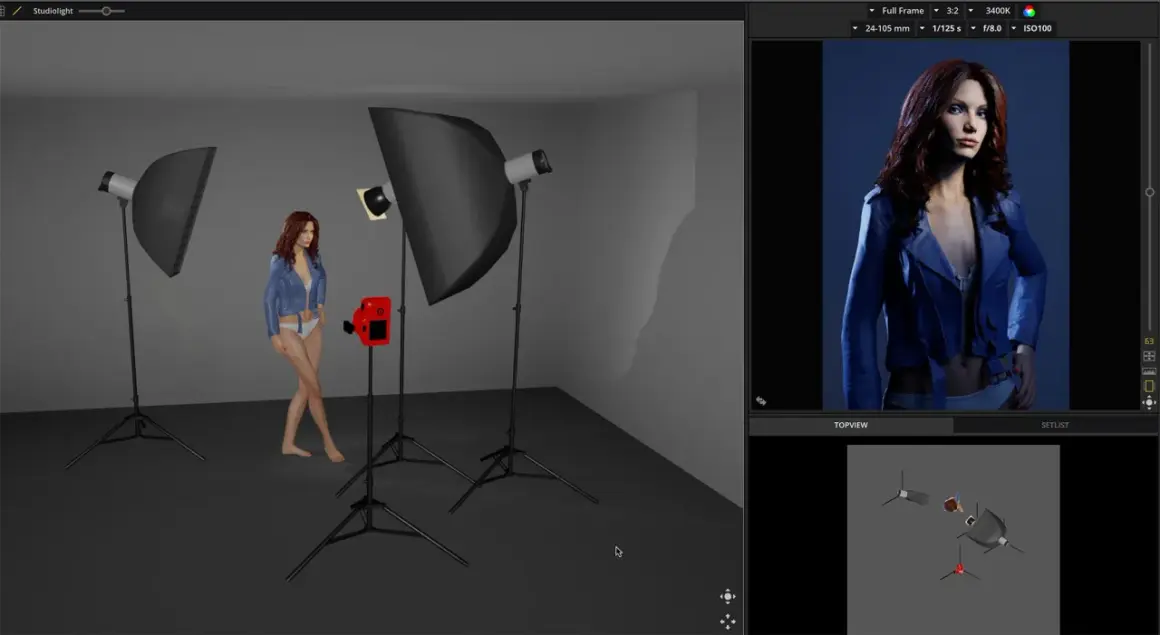
Soft key lighting is one of the fastest ways to make portraits, interviews, and product shots feel polished without losing shape. The goal is simple: use a soft main light to flatter the subject, keep shadows readable, and still leave enough contrast for the image to feel dimensional. In this article, I break down what makes the light soft, where it works best, how to build it with real-world gear, and the mistakes that make an otherwise good setup look flat.
What matters before you place the key
- Softness comes from apparent size, not from low power.
- A soft main light usually sits a little above eye level and off to one side, then gets shaped with fill or negative fill.
- This look is ideal for talking-head video, beauty work, corporate portraits, and clean product visuals.
- The biggest control point is often distance: closer light reads softer, farther light reads harder.
- Too much fill, too much spill, or a modifier that is too small can erase the very shape you wanted.
What makes the light feel soft
The softness of a key light is mostly about how large the source appears to the subject. A big modifier close to the subject wraps around the face or product and creates a gradual transition from highlight to shadow. That transition is what people usually mean when they say the light looks gentle or flattering.
Soft does not mean weak. I can use a powerful light and still make it feel soft if I enlarge the source with a softbox, umbrella, diffusion panel, or bounce surface. The reverse is also true: even a modest fixture can look harsh if the source is small and far away. One of the most useful habits I have is to stop thinking about wattage first and start thinking about shape, distance, and shadow edge.
There is another detail that matters more than beginners expect: softness and contrast are related, but they are not the same thing. A soft key can still be contrasty if I keep fill light low or add negative fill on the shadow side. That is why the same basic setup can feel airy in one shot and cinematic in the next. Once that distinction is clear, it becomes much easier to choose the right setup for the job.Where this look works best
I reach for a soft main light whenever the subject should feel approachable, clean, or easy to read. That is why it shows up so often in portraits, interviews, beauty work, explainer videos, and branded social content. It hides minor skin texture better than harder light, keeps facial structure friendly, and makes it easier for viewers to focus on expression rather than shadow lines.
- Portraits benefit because the face usually looks more natural and less demanding.
- Interviews benefit because the speaker looks calm and trustworthy without losing separation from the background.
- Product shots benefit because the surface reads cleanly and reflections are easier to manage.
- Marketing videos benefit because the frame feels polished without looking overproduced.
There are limits, though. If the creative brief calls for grit, tension, or strong texture, a very soft key can be the wrong choice. The image may become too smooth, and the subject can lose definition. In those cases, I often keep the source soft but control the spill more aggressively or reduce fill so the shadows still do some storytelling. That balance is what leads into the practical setup.
How I would build it from a single light
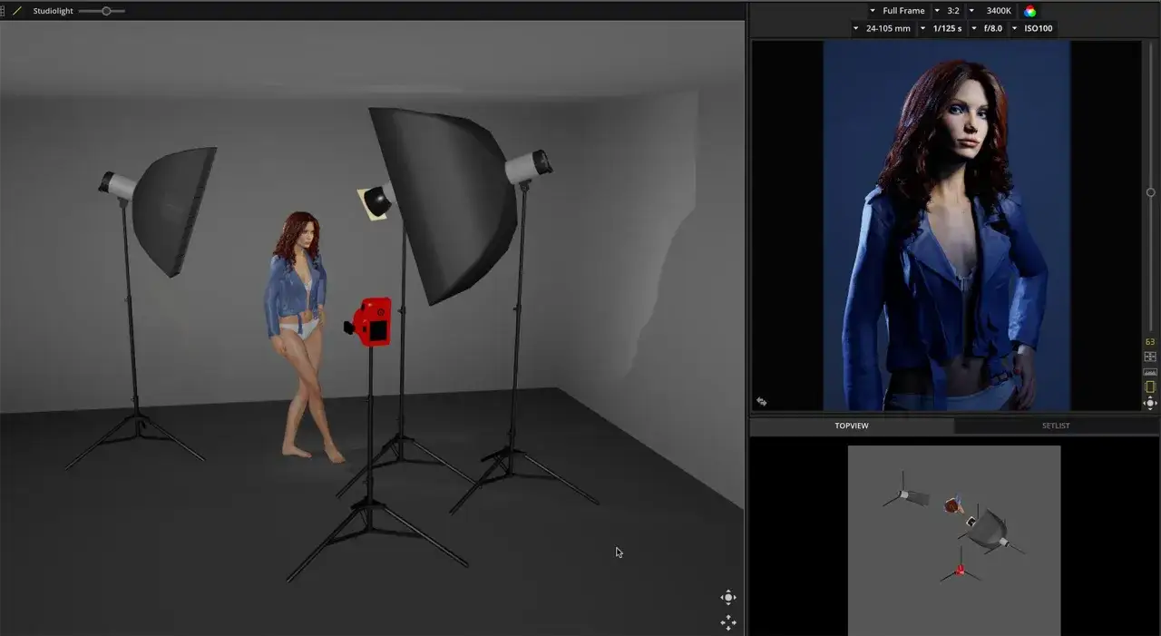
For a clean one-light setup, I start by placing the source slightly above eye level and around 30 to 45 degrees off camera. That angle gives the face shape without creating a harsh split. If I want a little more modeling, I push the light farther to the side; if I want a flatter, more commercial look, I bring it closer to the camera axis.
- Place the subject first, then decide where the light can realistically go in the room.
- Make the source as large as the space allows, using a softbox, diffusion frame, umbrella, or bounced wall.
- Move the source close enough that it still feels soft from the subject’s point of view.
- Use a reflector opposite the key if the shadow side needs a little lift.
- Add negative fill with black fabric, foam core, or a flag if the image starts to look too flat.
If I am working with window light, I treat the window like a giant modifier. A sheer curtain or cloudy daylight can create an excellent key without much extra gear. If the window is too hard, I soften it first, then shape the scene with a reflector or a dark surface. In small rooms, that often works better than trying to overpower the space with more lights.
For video interviews, I usually expose for the key first, then build everything else around it. That order matters. If the key is stable, the rest of the frame becomes much easier to control, whether I am lighting a seated founder, a product demo, or a social ad with a presenter on camera.
Choosing the right modifier and distance
The modifier matters, but the placement matters just as much. A large source placed too far away can behave like a smaller source because it stops filling the subject’s perspective. That is why I care more about the apparent size of the light than the catalog description. In practice, the best option is the one that gives me the softness I need while staying controllable in the room I have.
| Modifier | Look | Strengths | Tradeoffs | Best use |
|---|---|---|---|---|
| Softbox | Controlled, even, familiar | Easy to aim, good control over spill, reliable on set | Can feel generic if used without shaping | Portraits, interviews, corporate video |
| Umbrella | Broad and airy | Fast to set up, wide coverage, good for small crews | Less precise, more spill | Run-and-gun portraits, quick content work |
| Diffusion panel | Very soft, cinematic | Excellent wrap, flexible with fixture choice | Takes space, often needs grip support | Beauty, interviews, stylized video |
| Window light | Natural and flattering | Free, familiar, easy to make believable | Depends on weather and time of day | Indoor portraits, lifestyle scenes, tabletop work |
Common mistakes that make it look flat
The most common failure is overfilling the shadows. A lot of people set up a soft key and then add so much fill that the face loses all depth. That might be fine for a pure beauty or e-commerce shot, but it usually feels bland in interview and portrait work. I prefer to let the shadow side stay a little darker unless the brief clearly asks for a very even, high-key look.- Using a source that is too small for the distance and subject size.
- Placing the light too far away, which makes it behave harder than expected.
- Ignoring spill, so the whole room becomes bright and the subject loses separation.
- Adding too much fill, which removes the modeling that gives the frame depth.
- Forgetting the background, so the subject blends into a surface that should support them.
- Mixing color temperatures carelessly, which makes skin tones and highlights look unsteady.
Another mistake is chasing perfection in the face while forgetting the eyes. If the catchlight is weak, awkward, or missing, the portrait can feel tired even when the exposure is technically correct. A soft setup should still create a clear eye light. That tiny reflection gives the image life, and it is often what separates a competent frame from one that feels deliberate.
My go-to setups for portraits, interviews, and product shots
Portraits
For portraits, I usually start with a large source slightly off camera and a touch above eye line, then I shape the shadow side with either a reflector or black fill depending on the mood. If I want a friendly headshot, I keep fill fairly high and the angle modest. If I want a more editorial look, I lower the fill and let the shadow side carry more texture. That small change can turn the same light into two very different portraits.
Interviews
For interviews, stability matters more than drama. I want the light to be soft enough that the speaker looks comfortable, but not so broad that the face becomes featureless. A common sweet spot is a soft key slightly off axis with enough fill to keep the eyes open and the mouth readable, especially if the person moves a lot while talking. If the background is busy, I will often keep the key soft but reduce ambient spill so the subject stays visually separated.
Read Also: Golden Hour Photography - Master the Light, Not Just the Time
Product shots
For products, softness is useful when the goal is to reveal form without noisy reflections. Glass, glossy packaging, cosmetics, and consumer electronics usually benefit from a large diffused source because it creates cleaner highlight control. Matte objects are easier, but even there I still like a soft key because it reduces harsh edges and makes the image feel more premium. When texture is part of the selling point, I make the source soft but directional so the product does not look washed out.
These setups are different in purpose, but they share the same principle: use a soft source as the base, then shape it with distance, fill, and spill control. Once that clicks, the rest of the lighting decisions become much less mysterious.
The small checks that keep the light consistent from take to take
Once the setup works, I do a quick pass for consistency. I check exposure, white balance, catchlights, shadow density, and whether the subject has drifted far enough to change the apparent size of the source. On a real shoot, those little shifts happen constantly, especially when talent is moving between takes or when the camera framing changes.
- Mark the subject position so the light angle stays predictable.
- Keep the modifier locked down so it does not drift during the shoot.
- Watch the background after any change to the key, because spill can change quickly.
- Recheck white balance if you mix daylight, practicals, and LEDs.
- Look at the shadow edge, not just the histogram, because softness is a visual decision.
If I had to reduce the whole method to one practical habit, it would be this: build the light, then spend a minute judging what the shadows are doing. That is where the real quality shows up. A good soft setup is not just bright and flattering; it is controlled, repeatable, and intentional enough to support the story the image is supposed to tell.