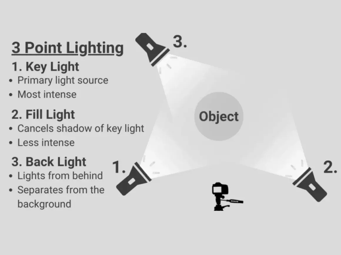
Lighting gets easier the moment you stop treating every lamp as interchangeable. The key light defines the subject, and the fill light decides how much of that shape survives in the final frame, which is why the balance between them changes both mood and clarity. In practice, the key light vs fill light decision controls contrast, shadow detail, and how polished a portrait, interview, or brand video feels.
The main light shapes the subject, and the fill decides how much shadow you keep
- The key light is the primary source; it creates direction, form, and the strongest shadows.
- The fill light is secondary; it lifts shadow detail and keeps the image readable.
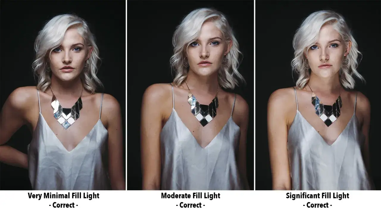
- More fill gives a cleaner, flatter, brighter look, while less fill keeps depth and mood.
- Lighting ratio is the real control knob: a 2:1 look feels soft, 4:1 feels more sculpted, and 8:1 feels dramatic.
- You do not always need a second lamp; a reflector, a white wall, or even negative fill can be the better move.
What each light does on set
I like to think of the key light as the storyteller and the fill light as the editor. The key establishes where the light is coming from, how the face is modeled, and how dramatic the shadows feel. The fill does not compete with that direction; it opens the dark side just enough to keep texture and detail from disappearing.
That is why the two lights are not equal by default. In most real setups, the key is the brightest source, while the fill is softer, weaker, or bounced so it does not erase the shape the key created. A key can be hard or soft, but a fill usually works best when it feels gentle and controlled rather than obvious.
| Aspect | Key light | Fill light |
|---|---|---|
| Job | Creates the subject's main shape and direction | Lifts shadows and preserves detail |
| Strength | Usually the dominant source | Usually 1 to 2 stops lower than the key |
| Placement | Often 30 to 45 degrees off camera and slightly above eye level | Usually near the camera axis or bounced from the opposite side |
| Look | Defines mood, texture, and contrast | Controls how much of that contrast remains visible |
Once that relationship is clear, the next lever is the ratio between the two.
How the ratio changes the mood
The ratio between key and fill matters more than the fixture names. If the fill gets close in power to the key, the image becomes brighter, cleaner, and more even. If the fill drops away, the shadows deepen and the shot feels more cinematic or editorial.
I usually think in stops, not abstract “looks.” A 2:1 ratio is roughly one stop of difference, 4:1 is about two stops, and 8:1 is around three stops. That is not a rigid law, but it is a useful way to make decisions without guessing.
| Approximate ratio | What it feels like | Where it works well |
|---|---|---|
| 1:1 | Very even, almost shadowless, sometimes flat | Beauty, product, upbeat marketing clips |
| 2:1 | Soft, flattering, still dimensional | Interviews, headshots, social video |
| 4:1 | More shape, more separation, more mood | Portraits, premium brand content, documentary work |
| 8:1 or higher | High contrast, dramatic, shadow-heavy | Stylized portraiture, noir-inspired scenes, narrative work |
That range is useful because it reminds me that fill is a creative choice, not a required checkbox. From there, the real decision becomes whether your fill should come from a second lamp, a reflector, or no fill at all.
When a reflector beats another lamp
Not every secondary source needs to be a light fixture. In a lot of small shoots, I can get better results from a reflector, a white wall, or a piece of bounce material than from adding another powered source. Those options are cheaper, faster to move, and often more natural-looking because they spread light instead of announcing themselves.
| Option | Why I would use it | Main tradeoff |
|---|---|---|
| Dedicated fill light | Most precise and repeatable control | More gear, more setup, more power management |
| Reflector | Cheap, fast, and soft | Less control and more dependence on the key |
| White wall or ceiling bounce | Natural-looking fill in small rooms | Color contamination and unpredictable spill |
| Negative fill | Deepens shadows by removing light instead of adding it | Easy to overdo and make the image too heavy |
If the subject is moving, a dedicated fill source usually wins because it stays consistent. If the room already has plenty of soft ambient light, a reflector may be enough. And if the shot feels too polished or washed out, I sometimes skip fill on one side altogether and use negative fill instead to bring the shape back. That choice matters most when the setup has to work fast, which is where placement becomes the real advantage.
How I place the lights for portraits, interviews, and social video
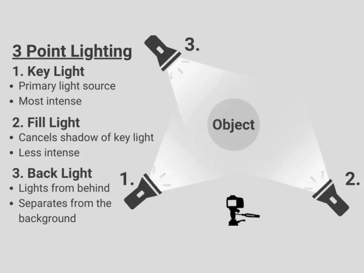
The simplest way to set this up is to start with the key and build the fill only after the face looks right. I usually begin with the key a little above eye level and about 30 to 45 degrees off camera. That gives the face shape without making the shadow side disappear completely.
- Place the key first and decide how hard or soft the shadows should feel.
- Add the fill on the opposite side, closer to the camera axis, or bounce it off a neutral surface.
- Reduce the fill until the shadow side still has shape, but not so much darkness that the subject feels underexposed.
- Check the under-eye area, nose shadow, and cheek shadow, because those are the places where overfill shows up first.
- If the background starts to blend into the subject, add a rim light or separate the subject from the backdrop before increasing fill again.
For portraits, I usually allow a little more contrast because the shape matters. For interviews, I lean toward softer fill because people need to look clear, relaxed, and trustworthy. For social video and brand content, I often keep the ratio modest so the image feels open and easy to read on a small screen. Once the physical setup is right, the last challenge is avoiding the mistakes that quietly flatten the shot.
The mistakes that flatten or muddy the frame
Most bad lighting setups do not fail because the gear is wrong. They fail because the balance is pushed too far in one direction. The most common problem I see is fill that is too strong, which removes the shadow modeling that gives a face structure in the first place.
- Too much fill makes the subject look flat and removes depth from the face.
- A key placed too close to the camera axis creates a front-lit look that feels safe but lifeless.
- Mixed color temperatures can make one side of the face feel cleaner than the other, which is distracting in interviews and beauty work.
- Ignoring spill lets light wash across the background and kill separation.
- Trying to remove every shadow usually makes the image less flattering, not more polished.
I usually solve those problems by moving the key first, not by cranking the fill. If the angle is wrong, more fill only hides the symptom. If the room is bouncing too much light, a black flag or some negative fill can do more for the shot than another lamp ever will. When those issues are under control, the workflow becomes much simpler: set the mood first, then tune the lights to support it.
What I set first when I only have a few minutes
When time is tight, I work in this order: mood, key, fill, then cleanup. I decide whether the shot should feel bright and open or more moody and dimensional, because that choice tells me how far apart the two lights should be. After that, I get the key right, then I add just enough fill to keep the face readable.
- Use a 2:1 starting point if you need a safe, flattering look fast.
- Drop the fill lower if the subject needs more shape or a more cinematic tone.
- Use a reflector first when you want speed and simplicity.
- Use a dedicated fill light when repeatability matters across multiple takes or subjects.
- Check highlights and shadows on the camera so the lighting works in the final image, not just in the room.
The practical rule is simple: let the key do the storytelling and let the fill do only as much work as the scene needs. If you get that balance right, the shot looks intentional instead of merely illuminated.