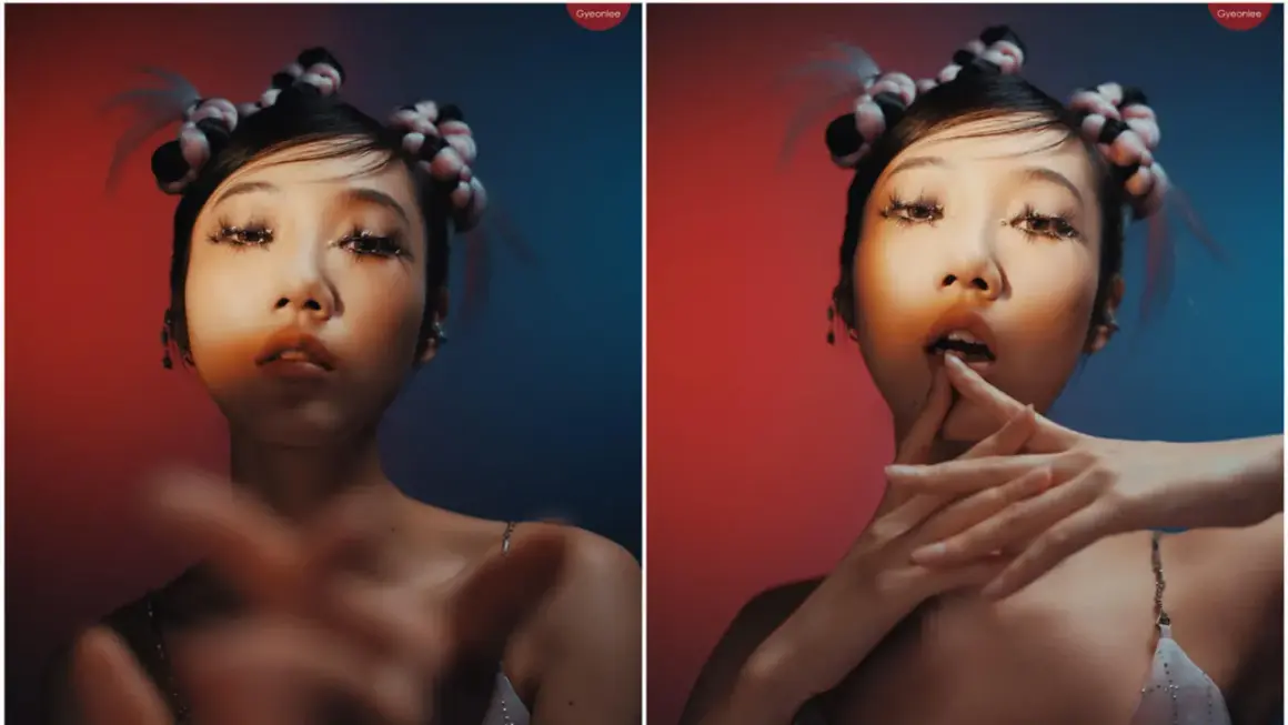
Hard and soft light do more than change brightness. They shape texture, mood, and how a viewer reads a face, product, or scene. The real decision behind harsh vs soft lighting is usually less about style and more about control: what do you want the audience to notice first? In practice, I think in terms of shadow edge, contrast, and how forgiving the setup needs to be.
Key points to keep in mind
- Hard light comes from a source that behaves small relative to the subject, so shadows stay crisp and texture becomes more visible.
- Soft light comes from a larger or diffused source, so shadow transitions are gradual and faces usually feel more forgiving.
- Hardness and contrast are related, but not the same thing; you can build a hard look with controlled fill or a soft look that still feels dramatic.
- Portraits, beauty, and most brand work usually benefit from softer light, while editorial, dramatic, or texture-led images often gain from harder light.
- The biggest lever is source size relative to the subject, followed by diffusion, bounce, distance, and fill.
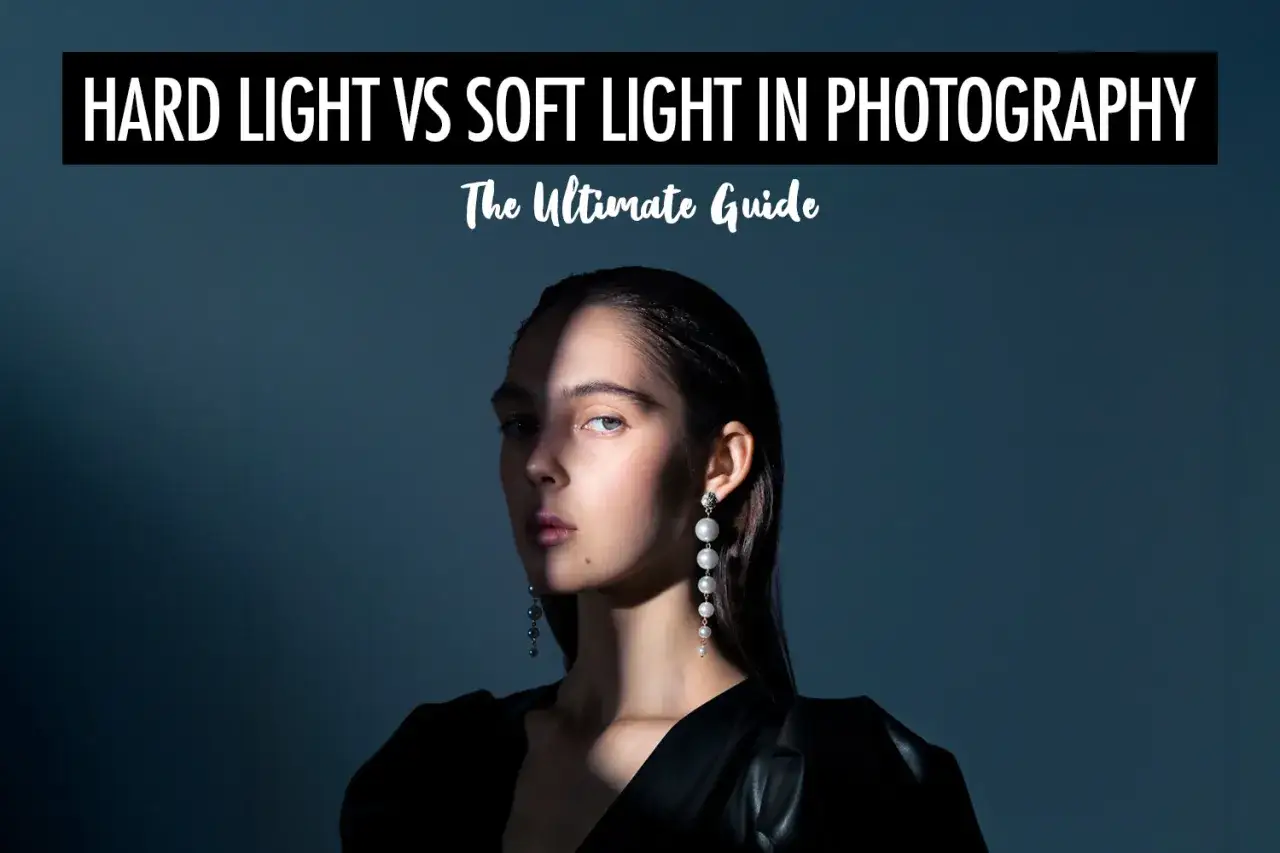
What hard and soft light actually change in an image
I judge light quality first by the shadow edge. When that transition from highlight to darkness is tight, the image reads as hard; when it falls away gradually, it reads as soft. That single difference affects skin texture, background separation, specular highlights, and how much detail the viewer notices before they notice the expression itself.
| What you see | Hard light | Soft light |
|---|---|---|
| Shadow edge | Crisp, defined, and easy to read | Gradual, feathered, and less abrupt |
| Texture | Emphasizes pores, wrinkles, fabric weave, and surface detail | Reduces texture emphasis and feels smoother |
| Mood | Dramatic, tense, graphic, or stark | Calm, polished, intimate, or approachable |
| Contrast feel | Often stronger and more directional | Often gentler and easier on skin tones |
| Best for | Noir, fashion editorial, product texture, architectural detail | Interviews, beauty, lifestyle, corporate, food |
| Common sources | Bare bulb, direct sun, small LED panel, open-faced fixture | Softbox, umbrella, scrim, bounced light, overcast sky |
The important nuance: a hard source does not automatically mean a high-contrast image, and a soft source does not automatically mean a flat one. Fill light, background exposure, and subject-to-background distance still change the final result.
That is why I never choose a look from theory alone. I match it to the job the image has to do.
When hard light earns its place
Hard light is not the enemy. I reach for it when I want structure, confidence, or a little tension in the frame. A hard key can carve cheekbones, make a product feel tactile, and give fashion or music imagery a stronger graphic outline.
- Editorial portraits when I want the face to feel direct and unfiltered.
- Product shots for metal, glass, watches, shoes, or anything where surface detail matters.
- Story scenes that need suspense, isolation, or a rougher visual edge.
- Architecture and interior details where geometry should read clearly.
The tradeoff is simple: hard light is less forgiving. It will expose small styling mistakes, uneven makeup, and texture in a very literal way. That can be exactly what I want, but only when the story benefits from honesty instead of polish. This is also why hard light is easier to use deliberately than casually.
When I want the shot to feel assertive, I start here and only soften it if the subject needs more comfort. But in most people-facing work, I usually move in the other direction.
Where soft light does the heavier lifting
Soft light is the safer default when I need people to look comfortable and credible. It wraps more gently around the face, reduces harsh shadow cuts, and gives me a smoother highlight roll-off, which matters a lot in interviews, beauty work, and corporate portraits where the viewer should focus on the message rather than the lighting itself.
It is also useful in food and product work when the goal is clean, appetizing, or premium rather than dramatic. A glossy package, a skincare bottle, or a plated dish often benefits from broad, even illumination because it keeps reflections under control.
- Headshots and interviews when the subject needs to feel approachable.
- Beauty and skincare content when skin tone consistency matters.
- Food photography when highlight control is more important than hard texture.
- Brand videos that should feel polished, modern, and easy to watch.
Soft does not mean flat. If I want shape, I keep the key soft but add negative fill on one side, or I allow a bit of separation light in the background. Negative fill is simply something dark placed close to the subject to absorb stray bounce and keep the shadows from getting washed out.
Once the look is clear, the next step is building it on purpose instead of relying on whatever the room happens to give you.
How I build each look on set
The easiest way to control light quality is to think about apparent size. A source looks softer when it becomes larger relative to the subject, and harder when it becomes smaller relative to the subject. Distance matters because it changes that relationship, but diffusion, bounce, and the shape of the modifier usually matter even more.
To make light harder
- Remove diffusion and let the lamp strike the subject directly.
- Use a smaller bare source or a tighter modifier such as a reflector dish or focused LED.
- Keep spill under control with flags, barn doors, or a grid so the environment does not dilute the effect.
- Place the source where the shadow direction supports the story, not just where exposure is easiest.
Read Also: LED Light Color Meaning - Decode Any Device's Signal
To make light softer
- Add diffusion with a softbox, umbrella, scrim, or diffusion panel if the setup calls for it.
- Use bounce from a white wall, ceiling, or reflector so the effective source becomes larger.
- Move the light closer when you want a bigger apparent source and gentler wrap.
- Balance the fill separately so softness does not turn into mush.
In real shoots, I often combine these moves: a soft key for the face, a harder rim for separation, or a hard key with controlled fill to keep the image from collapsing. That hybrid approach is where lighting starts feeling intentional instead of generic.
The trouble is that people often misread what they are seeing, so a few common mistakes are worth calling out.
Common mistakes that blur the comparison
- Confusing brightness with hardness. A light can be bright and still soft if it is large and diffused.
- Judging the lamp instead of the shadow edge. The transition tells you more than the fixture does.
- Assuming soft light always flatters. Too much fill can erase cheek shape and make faces feel lifeless.
- Assuming hard light always looks ugly. With good direction, it can look elegant, expensive, and clean.
- Mixing color temperature and quality in the same conversation. Warm or cool is a separate decision from hard or soft.
- Ignoring the background. A soft key with a bright, busy background can still feel harsh overall.
If there is one habit I would fix first, it is this: look at the shadow side, not just the lit side. That habit makes the comparison much faster and far more accurate.
Once those errors are out of the way, the decision becomes simpler: choose the look that supports the scene, not the look that seems universally correct.
A practical way to choose the right light for the scene
When I am deciding quickly, I ask what the image must do. Should it reassure, sell, expose texture, or create tension? The answer usually points to the starting light quality.
| Scene goal | Better starting point | Why it works | Watch out for |
|---|---|---|---|
| Beauty or skincare | Soft light | It keeps skin transitions smooth and reduces distraction. | Too much fill can erase shape and make the face look lifeless. |
| Corporate interview | Soft light with shape | It feels trustworthy and easy to watch. | A pure flat setup can look cheap or overlit. |
| Fashion editorial | Hard light or a mixed setup | It adds edge, structure, and graphic contrast. | It can become unforgiving if styling is not tight. |
| Product detail | Depends on the surface | Hard light shows texture; soft light controls reflections. | Glossy items often need a blend of both. |
| Food | Usually soft light | It keeps highlights appetizing and clean. | Too much diffusion can make food look dull. |
| Drama or suspense | Hard light | It creates decisive shadows and stronger separation. | Skin and background details may become too prominent if you overdo it. |
My rule of thumb is simple: start with the mood, then pick the source quality that supports it, and only then fine-tune exposure. That sequence keeps the image from feeling accidental.
That process leads naturally to one final check, because the real story is usually sitting right on the edge of the shadow.
Why the shadow edge tells the real story
If I had to reduce the entire decision to one test, it would be this: look at the edge where light becomes shadow on the cheek, jawline, product surface, or wall behind the subject. A quick transition means hard light; a slow transition means soft light. Everything else, including how bright the lamp looks to your eye, is secondary.
That is why the best lighting choices are rarely absolute. I use harder sources when I need texture, attitude, or graphic control, and softer sources when I need comfort, polish, or better facial rendering. Most strong images do not live at one extreme for long; they move toward a balance that fits the subject and the message.
If you are building a scene from scratch, choose the light quality first and the modifier second. That order saves time, prevents guesswork, and makes every later decision easier.