Indoor shadows are rarely a camera problem on their own; they usually come from the size, direction, and distance of the light. Learning how to avoid shadows in indoor photography means shaping the light before you start blaming the lens, the sensor, or the edit. In practice, that comes down to softer light, smarter placement, and better control of the background.
The simplest fix is bigger, softer light placed farther from the wall
- Small, direct light creates hard shadows fast, especially in tight rooms.
- Window light, softboxes, umbrellas, and reflectors do most of the heavy lifting indoors.
- Distance matters: moving the subject 3 to 6 feet from the background usually makes shadows less visible.
- Fill light keeps the shadow side open without making the image look flat.
- Mixed lighting from lamps and windows often makes shadows look messier than they need to be.
- Post-processing helps, but it should clean up leftovers, not rescue a bad setup.
Why indoor shadows show up so fast
When I shoot indoors, I usually assume the room will work against me before it helps me. Most household lights are small, high, and fixed in place, which makes them behave like hard light sources. That is why you get deep eye sockets, a sharp nose shadow, and a dark patch on the wall behind the subject even when the room feels bright to the naked eye.
Hard light is the default in many rooms
A bare bulb, a ceiling fixture, or a tiny LED panel can look strong, but brightness is not the same thing as softness. What matters is the apparent size of the source relative to the subject. The bigger the source looks from the subject’s point of view, the softer the shadow edge becomes.
The background is often too close
In small rooms, the subject stands only a foot or two from the wall, and that is enough for a shadow to land where you do not want it. If I can move the subject 3 to 6 feet away from the background, the shadow usually softens or falls outside the frame. For full-length portraits or wider compositions, 5 to 8 feet is even better when the space allows it.
Once you understand that shadows come from placement as much as from power, the next step is choosing a source that gives you control instead of guessing.
The lighting setup that does most of the work
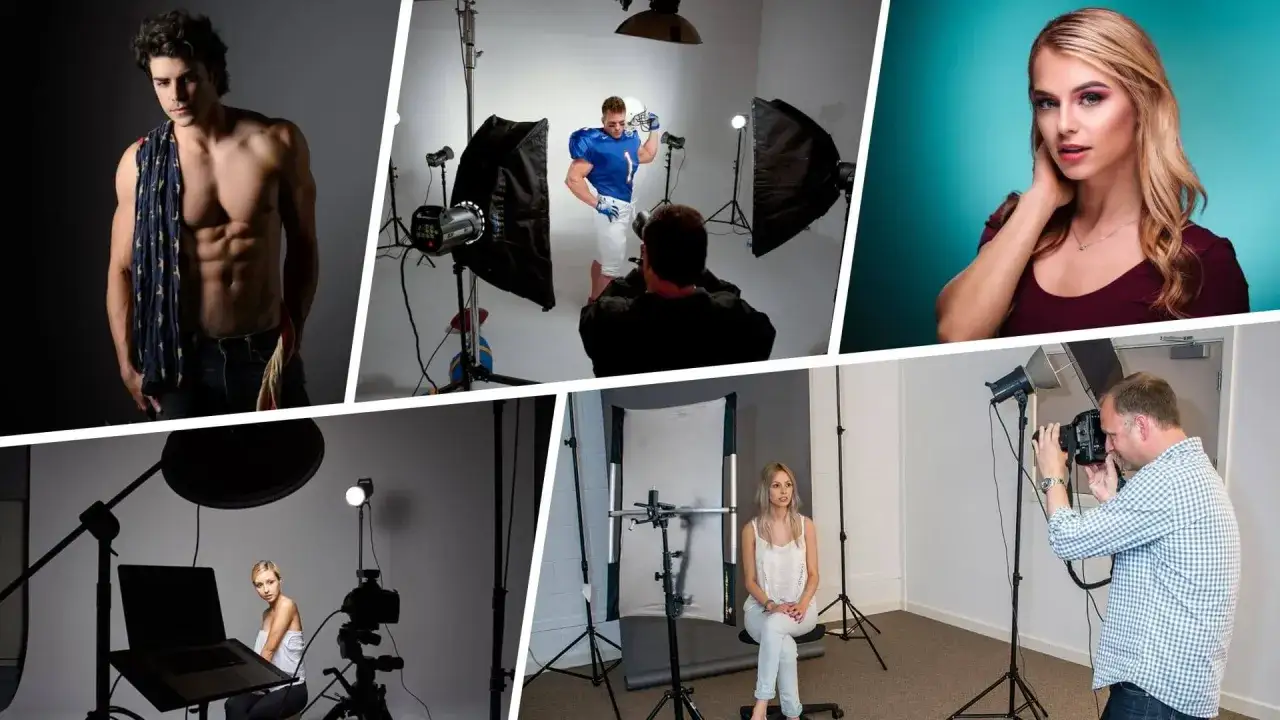
If I had to simplify the whole problem, I would say this: make the light larger, bring it closer, and keep it consistent. That usually solves more indoor shadow problems than camera settings ever will. The right tool depends on the room, but the logic stays the same.
| Tool or method | What it does | Typical 2026 U.S. cost | Best use |
|---|---|---|---|
| Window light with a sheer curtain | Turns daylight into a larger, softer source | $0 to $25 | Lifestyle, portraits, food, editorial work |
| 5-in-1 reflector | Bounces fill light into the shadow side | $15 to $80 | Solo portraits, product shots, small studios |
| Softbox or umbrella | Enlarges flash or LED output for gentler falloff | $20 to $250 | Headshots, interviews, e-commerce |
| Bounce flash | Uses the ceiling or wall as a giant modifier | Often $70 to $400+ for the light | Fast work in rooms with white ceilings or walls |
For most readers, the best first purchase is still a reflector. It is cheap, flexible, and it teaches you how light behaves without locking you into one look. If I am working alone, I often use a reflector before I buy a second light, because it solves the shadow side without adding clutter to the room.
There is one catch: a soft source can still create ugly shadows if it is placed badly. That is why subject placement matters just as much as the light itself.
Place the subject so the shadow has somewhere to go
I think of subject placement as shadow management. If the subject is too close to the wall, the shadow stays visible. If the light is too high and too far off to the side, the shadow gets sharper. If the light is too low, the face can look strange and underlit. The fix is not complicated, but it has to be deliberate.
- Keep the subject away from the background. In a normal room, 3 to 6 feet is a useful starting point.
- Raise the light slightly above eye level. A small overhead angle feels natural, but too much height creates deep eye shadows.
- Angle the subject toward the light. Facing the source more directly opens the face and softens the shadow side.
- Watch the wall, not just the face. A flattering portrait can still be ruined by a hard shadow on the backdrop.
If I need a cleaner background, I usually push the subject farther from the wall first, then add light. That sequence matters. People often try to brighten the wall while keeping the subject pinned against it, and the geometry simply works against them. Once the subject has room, fill light becomes much more effective.
Use fill light instead of trying to erase everything
Fill light is the difference between a controlled shadow and a muddy one. It does not replace the main light; it just lifts the darker side enough that the image still feels dimensional. In other words, I am not trying to remove every shadow. I am trying to keep the shadow side readable.
Reflectors are the easiest form of fill
A white reflector gives the softest, most natural fill. Silver is brighter and more efficient, but it can look harsh if it is too close or too strong. Gold adds warmth, which can be useful in a stylized portrait but usually feels too heavy for neutral indoor work. If I want the safest option, I reach for white first.
Read Also: Side Lighting - Master Depth & Texture in Your Photos
Two-light setups give more control
If I need repeatability, I add a second light instead of relying on bounce alone. A common rule of thumb is to keep the fill light about 1 to 2 stops dimmer than the key light. That keeps shape in the face or product while softening the dark side. If fill matches the key exactly, the photo can go flat very quickly.
For beauty-style portraits, clamshell lighting is worth knowing. It places one light above the subject and another below or in front as fill, which opens the face and minimizes harsh shadows. It is excellent for clean headshots and cosmetics work, but it can feel too polished for a documentary look. That tradeoff is real, and it matters.
Once the light is soft and the fill is under control, the next problem is usually the room itself, especially mixed color temperatures and exposure choices.
Keep color and exposure consistent so shadows stay manageable
Bad shadows often look worse because the light is inconsistent. A warm lamp on one side and cool window light on the other can make the shadow edge feel dirty, even if the exposure is technically fine. I prefer to choose one dominant source and remove or reduce the others before I start adjusting the camera.
- Turn off competing lamps if they are not part of the design.
- Match your white balance to the dominant source instead of letting the camera guess.
- Shoot RAW so you have room to refine exposure and color later.
- Keep ISO as low as practical because noisy shadows are harder to clean up.
- Use exposure for brightness, not for shadow control; the light placement still has to do the real work.
For reference, daylight-balanced setups usually land around 5000K to 5600K, while warm interior bulbs often sit around 2700K to 3200K. Those numbers are not magic, but they are a useful starting point when you want the scene to feel coherent instead of mixed and patchy.
The mistakes that keep indoor shadows stubborn
Most indoor shadow problems come from a handful of predictable mistakes. I see them again and again, and they are usually easier to fix than people expect.
- Shooting under a single overhead bulb. The light is too small and too high, so the shadows are hard by default.
- Pinning the subject to the wall. Even a good light will cast a visible shadow if there is nowhere for it to go.
- Using a bare light source from too far away. Distance makes the source look smaller, which makes the shadow harder.
- Mixing too many color temperatures. The photo starts to feel uneven, and the shadow areas look messier.
- Trying to fix everything in editing. If the shadow is deep and clipped, the detail is already gone.
There is one subtle mistake that matters more than most beginners realize: chasing a completely shadowless image. Clean light is good. Flat light is not always good. That distinction leads directly to post-processing, where the goal is to refine the image rather than flatten it.
Clean up the leftovers in post without flattening the image
I treat editing as the last 10 percent, not the main solution. Lightroom, Photoshop, or similar tools can lift shadow detail, even out a dark corner, or reduce a background shadow that slipped through. They cannot truly rescue a setup that was too dark, too directional, or too close to the wall.
- Use local masks when only part of the frame needs help.
- Lift shadows gently instead of dragging the whole image toward gray.
- Use the Healing or Patch tools only on simple, clean backgrounds.
- Rely on Content-Aware Fill carefully; it works best when the surface is plain and even.
- Stop before the image loses depth; a little shadow still helps the photo feel real.
If I need more than a modest shadow lift and a small retouch, I usually consider it a lighting problem, not an editing problem. That is the point where it is faster to correct the setup and reshoot than to force the file into shape. The good news is that once you have a repeatable indoor setup, the next shoot gets much easier.
The cleanest indoor setup is usually simpler than it looks
For portraits, I start with a single large light source, a reflector on the opposite side, and the subject a few feet away from the background. For product photography, I move the item off the surface slightly, use diffusion, and add fill from both sides if I need a cleaner edge. For cramped apartments or small offices, bounce flash or a softbox close to the camera often beats trying to overpower the room with a tiny light.
The most useful habit I have developed is checking the wall, the floor, and the shadow side before I check the camera screen. If those three areas look controlled, the image is usually close to done already. Indoor shadow control is less about fighting darkness and more about arranging light so it behaves predictably.
That is the real answer: shape the source, separate the subject, add fill only where it helps, and keep the room from working against you. If you do that, indoor photos stop looking accidental and start looking intentional.