Broad lighting is one of those portrait choices that looks simple until you see how much it changes face shape. I use it when I want the side of the face turned toward the camera to feel open, readable, and a little less sculpted. In this article, I break down what the setup does, how to place it without guessing, when it works best, when it falls apart, and how it compares with the more slimming alternative.
The main takeaways before you place the light
- The camera-facing side of the face is the bright side, so the portrait reads wider and more open.
- It tends to feel inviting and straightforward, especially when you use a large, soft source.
- It is not the most slimming portrait choice, so it can work against a brief that asks for drama or contour.
- Pose matters as much as the lamp position; a few degrees of head turn can change the result completely.
- Soft fill helps, but too much fill flattens the face and makes the setup lose its shape.
What this setup changes in a portrait
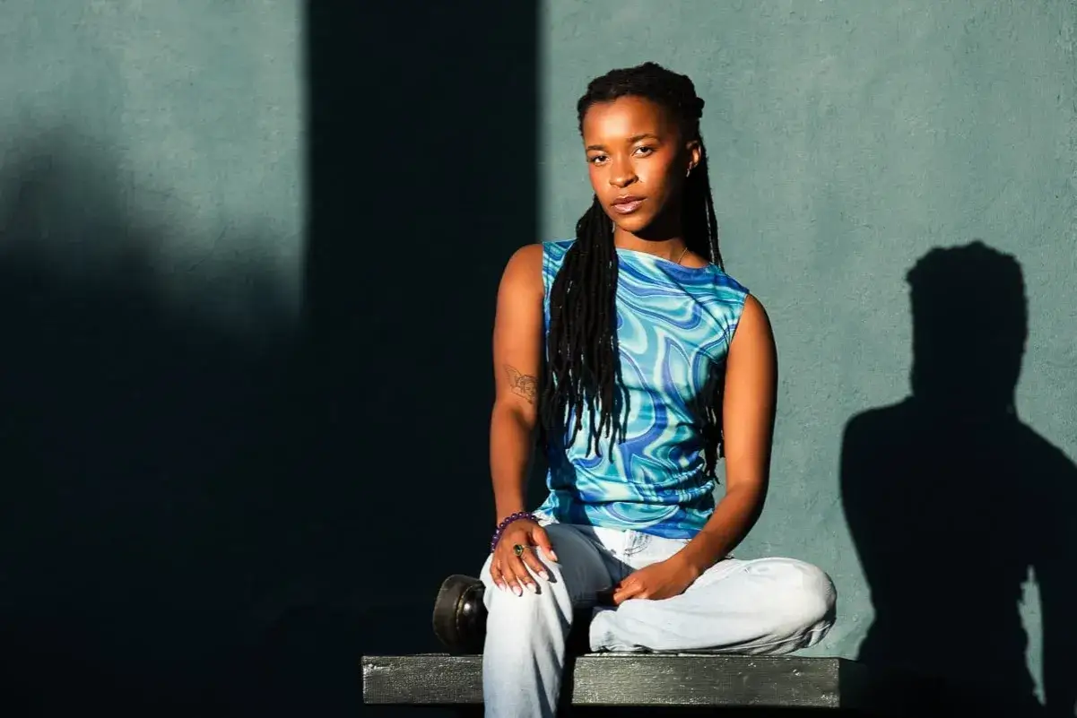
StudioBinder's breakdown of the geometry is the easiest way to understand it: the side of the face turned toward the camera gets the light first. That makes the face read wider, more open, and less carved than a far-side setup. In practice, I think of it as a shape decision, not just a brightness decision.
Adorama's portrait notes line up with what I see on set: the look often feels approachable, and a large, diffused source can make skin texture feel smoother. That does not mean it is automatically flattering for everyone, though. On a rounder face, the extra width can work against you; on a narrow face, it can feel balanced and calm. Once you understand that geometry, the setup itself becomes much easier to place.
How to set it up without fighting the face
- Start with the key on the camera-facing side. The lit cheek should be the one the lens sees most clearly.
- Turn the subject slightly away from the light, not away from the camera. That keeps the bright side visible while still giving the face some structure.
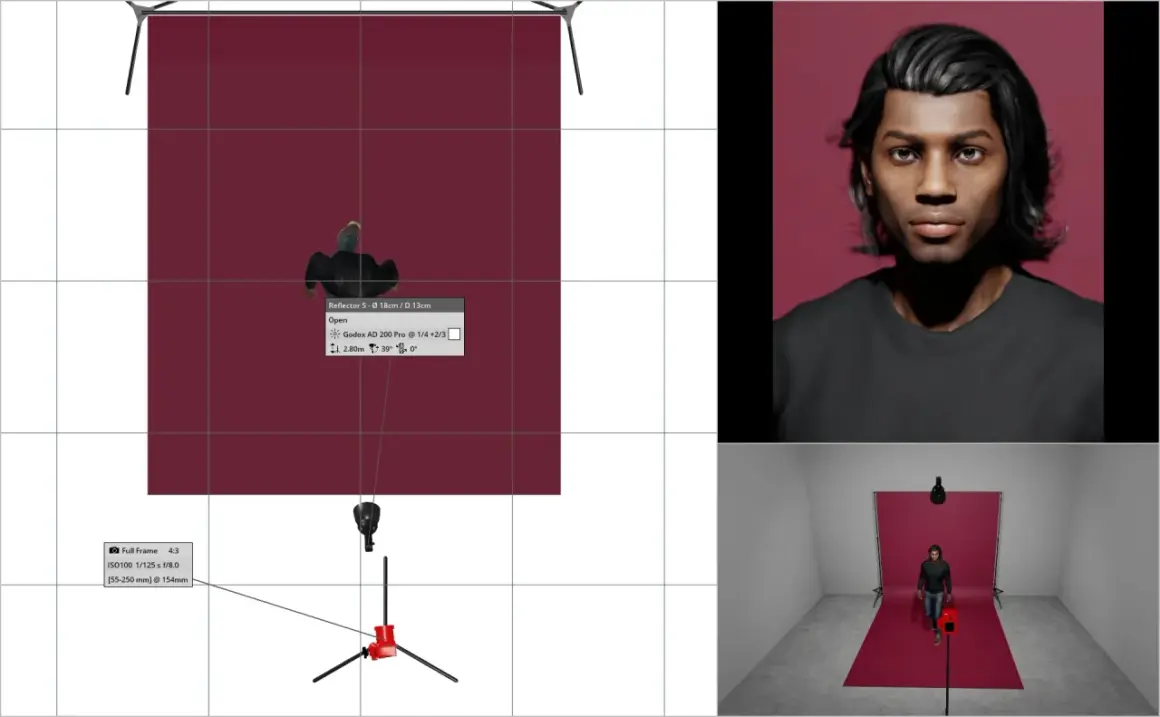
- Begin with the key about 30 to 45 degrees off the lens axis. If you go much farther to the side, the look drifts toward split lighting.
- Raise the source a little above eye level. About 6 to 12 inches is a practical starting point for a head-and-shoulders frame.
- Use a medium-large modifier first. A 3-foot octabox, softbox, or similar source gives you a cleaner transition than a small hard light.
- Add fill only as needed. Too much fill kills the depth that makes the setup work in the first place.
I usually begin with a soft source because the wider edge gives me more control over the cheek and jawline. If the face looks too flat, I move the head a few degrees before I rebuild the whole setup. After that, the real question is whether the look fits the subject and the story you want.
When I choose it and when I avoid it
I reach for this setup when I want a portrait to feel open, clean, and easy to read. It works well for corporate headshots, interview subjects, branded content, beauty work with a relaxed tone, and anyone whose face benefits from a little extra width in the frame. It is also useful when the subject needs to look direct without feeling severe.
I avoid it when the brief asks for a slimmer face, more mystery, or stronger contour. If the person already has a wider face shape and wants definition, the far-side version usually does a better job. I also back away from this look when the expression needs tension or distance, because the open side of the face naturally softens the mood. That tradeoff becomes clearer once you put it next to the shorter, more sculpted alternative.
Broad-side setup versus short-side setup in practice
| Criterion | Broad-side setup | Short-side setup |
|---|---|---|
| Which side is lit | The side the camera sees most clearly | The side farther from the camera |
| Face shape | Reads wider and more open | Reads narrower and more sculpted |
| Mood | Friendly, direct, approachable | Controlled, moody, more editorial |
| Best use | Clean headshots, interviews, softer brand portraits | Most portraits that need contour or restraint |
| Main risk | Can widen the face or flatten the jawline | Can feel too shadow-heavy if fill is overdone |
| My default choice | When the brief asks for warmth and clarity | When the brief asks for shape and depth |
If I only have one test frame, I compare those two looks back to back, because the difference is obvious the moment the subject lands on the monitor. One opens the face to the camera; the other turns the face into a more sculpted object. That comparison naturally leads to the mistakes that can ruin either version.
The mistakes that make the look fall apart
- Light too frontal - the face loses width control and the pattern becomes ordinary flat light.
- Head turned too far - the setup starts drifting toward split lighting or a harsher side profile.
- Too much fill - the shadow side loses all shape, so the portrait feels pasted on instead of dimensional.
- A source that is too small or too hard - the cheek and nose shadows get crunchy fast, which is rarely the goal here.
- No background separation - the lit cheek blends into the backdrop and the face stops reading cleanly.
- Confusing pose with placement - a small head turn often matters more than moving the lamp six inches.
Most of these failures come from trying to make one setup do two jobs at once: flatter the face and create drama. Once you stop asking it to solve every portrait problem, the pattern becomes much more reliable. The fastest way to stay consistent is to use a short checklist before you shoot.
The checklist I use before I start shooting
- Can I clearly see the broader side of the face from the camera position?
- Does the shadow side still describe the jawline instead of disappearing completely?
- Is the nose shadow clean, or is it cutting awkwardly across the cheek?
- Have I reduced fill enough to keep depth without losing detail?
- Will glasses, hair, or jewelry catch anything distracting?
- Does the background separate cleanly from the lit side of the face?
- Would a two-degree head turn improve the read more than moving the light again?
I treat that list as a quick sanity check, not a rigid formula. The best portraits still depend on expression, lens choice, and how much space the subject needs inside the frame. When those pieces line up, the technique stops feeling technical and starts feeling like a deliberate visual decision.
What I watch on the first test frame
The label matters less than the result. If the face looks wider than the brief allows, I rotate the head a touch toward the light or switch to the far-side version. If it feels too flat, I raise the source, reduce fill, or bring the modifier closer so the falloff is easier to control.
That is the part I value most about this look: it is quick to understand, but it still rewards small adjustments. When I want a portrait to feel direct, comfortable, and easy to read, I start here and refine from there. When I need slimming, mystery, or stronger contour, I move on. That small switch is one of the simplest ways to make a portrait feel intentional instead of accidental.