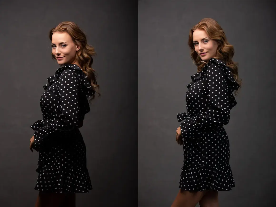
The fastest way to think about fill is as controlled shadow relief
- Fill light lifts shadow detail created by the key light without becoming the main subject of the scene.
- A reflector is the easiest starting point; a second light gives more control.
- For portraits, 2:1 is a safe natural-looking ratio, while 4:1 adds more drama.
- White bounce is soft and neutral, silver is stronger, gold is warmer, and black removes light instead of adding it.
- Too much fill flattens faces, lowers contrast, and makes product images look less dimensional.
What fill light actually changes in a photo
When I add fill, I am not trying to erase shadow; I am deciding how much of it should stay. Fill should protect detail, not erase dimension. It opens the darker side of a subject, softens the contrast between highlight and shadow, and makes skin, fabric, labels, or texture easier to read. That matters because camera sensors often lose shadow detail faster than our eyes do, especially in backlit or high-contrast scenes.
In practice, fill is a control knob for mood. A little of it keeps a portrait approachable and polished; too much of it turns the face into a flat mask. I treat it as a precision tool, not a default extra light.
Once that distinction is clear, the next question is simple: when should you use it at all?
When to use it and when shadows should stay
I reach for fill when the subject needs clarity more than drama. Backlit outdoor portraits, corporate headshots, beauty work, e-commerce products, and food images all benefit from a little shadow relief because the viewer needs to see the face, the label, the texture, or the color accurately.
- Backlit portraits when the background is brighter than the face.
- Midday outdoor shoots when eye sockets and under-chin shadows get too harsh.
- Product photography where legibility and clean surface detail matter.
- Social and marketing images that need to look polished across devices.
I leave shadows alone when they do the storytelling for me. Moody portraits, noir-inspired lighting, and some editorial fashion setups get stronger when the shadow side stays intact. In those cases, I would rather shape the existing light than dilute it.
The useful habit here is to decide on the mood first, then choose the fill amount second. That leads naturally to the tools you can use to create it.
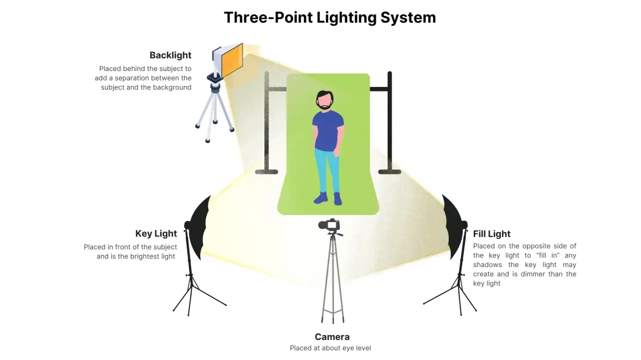
The main ways to create fill light
There are four practical ways I create fill on real shoots. Each one gives a different level of control, and the best choice depends on how fast I need to work, how much space I have, and how precise the result needs to be.
Reflectors and bounce cards
A reflector is the simplest fill tool, and it is often the one I recommend first. White gives the softest, most neutral bounce. Silver throws back more light and can be useful when the scene is dim or overcast. Gold adds warmth, which can be flattering on skin, but it can also drift into an unnatural tone if I push it too hard. Black does the opposite: it acts as negative fill by absorbing light and deepening shadows instead of lifting them.
Reflectors work best when they stay close enough to matter and broad enough to wrap the light gently around the subject. A larger surface usually feels softer; a smaller one is easier to handle when I am working alone.
Flash and strobes
A second speedlight or studio strobe gives the cleanest control. If I need repeatable results across a batch of portraits, this is usually my choice because I can set power, angle, and modifier separately from the key light. The tradeoff is setup time, and bare flash looks obvious quickly, so I usually soften it with a softbox, umbrella, or diffusion.
LED panels and practical lights
LEDs are useful for hybrid photo and video teams because I can see the effect before I shoot. They are especially handy for creators who need the same setup for stills, reels, and talking-head clips. The limitation is output: if I am fighting daylight, a small LED often needs to sit close or use a modifier to make a meaningful difference.
Window light and bounce from the scene
Sometimes the cleanest fill is already in the room. A white wall, ceiling, table, or nearby foam board can bounce enough light to lift shadows without adding another lamp. That approach is subtle and cheap, but it gives me less precision than a dedicated source.
If you think in terms of sources, the real challenge becomes balance, which is where ratios come in.
How I balance fill with the key light
My starting point is simple: make the key light do the creative work, then add just enough fill to keep important detail visible. The relationship between those two lights is the ratio, and it tells you how contrasty the frame will feel. If I can meter the lights, I do; if not, I use the histogram and the subject’s face as the final check.
| Ratio | What it looks like | Best for | My read on it |
|---|---|---|---|
| 1:1 | Very even, almost shadowless | Beauty, product, clean catalog work | Useful when accuracy matters more than mood |
| 2:1 | Soft contrast with visible shape | Headshots, lifestyle portraits | My default starting point |
| 4:1 | Noticeably deeper shadows | Editorial, fashion, moodier portraits | Good when the face needs more sculpting |
| 8:1 | High contrast and heavy drama | Noir-inspired or stylized work | Use only if the shadow is part of the story |
As a rule of thumb, one stop of difference between key and fill is about 2:1, two stops is about 4:1, and three stops is about 8:1. That simple ladder keeps me from guessing. A small shift in fill power can change the entire mood of the image.
1:1 feels high-key and airy, while 4:1 and above start to feel more sculpted and moody. That is why fill is never just about brightness; it is about how much shape I want to preserve.
Common mistakes that make the image look flat
Most bad fill comes from adding too much of the wrong kind of light. The goal is not to make every shadow disappear. It is to stop the shadows from becoming distracting.
- Placing fill too close to the camera axis and blasting the face evenly.
- Using silver or gold bounce when a softer white surface would look more natural.
- Ignoring color mismatch between the key and fill.
- Forgetting that fill should support shape, not replace it.
- Lighting the background so strongly that the subject loses separation.
- Letting fill remove the catchlights or make the eyes look lifeless.
The biggest trap is assuming brighter means better. In reality, a photograph usually looks more expensive when the fill is barely noticeable but exactly right. That is especially true in brand work, where the image has to feel clean without looking artificial.
To make that judgment faster, I lean on a few reliable real-world setups.
Where fill light earns its keep in real shoots
These are the situations where I find fill most useful because the subject has to read quickly and cleanly.
Portraits and headshots
For headshots, I usually want soft shadow cleanup rather than full flattening. A reflector just below face level can open the eyes, soften the nose shadow, and keep the jawline defined. If the subject wears dark clothing or stands against a dark backdrop, I may add a touch more fill or introduce a back light so the silhouette does not disappear.
Product and e-commerce images
For product photography, fill matters because buyers need to see texture, finish, and color accuracy. A white bounce card opposite the key often works better than a hot second light, especially on reflective surfaces. If the subject is glossy, I am careful not to create new reflections while trying to remove old ones.Read Also: Side Lighting - Master Depth & Texture in Your Photos
Food and lifestyle shots
Food looks better when the shadows still show shape but do not hide the main ingredients. A little bounce from a card or a nearby white surface can reveal detail in sauces, crusts, and garnish without making the scene look clinical. In lifestyle work, the same approach keeps skin tones pleasant and the environment believable.
Once you have seen fill in these real-world contexts, the final step is remembering the few decisions that make it look intentional instead of accidental.
What I would remember before every shoot
Start with the key light and decide how much shadow belongs in the frame. Add the smallest fill source that solves the problem. Match color first, then fine-tune brightness. Use a reflector when you want speed; use a second light when you need repeatability.
When fill works, nobody notices the tool; they only notice that the image feels polished, readable, and calm. That is usually the sign I was aiming for the right amount, not the maximum amount.