
I define texture by the way light and shadow turn a flat frame into something tactile. In practice, that means choosing surfaces with visible variation and using the angle of light to make those variations readable. In this article, I’ll focus on the decisions that matter most: how to see surface detail, how to light it, which subjects reward the effort, and how to edit without making the image feel artificial.
The essentials for making surface detail stand out
- Light is the first creative choice. Off-axis light usually reveals more surface structure than even front light.
- Subject selection matters. Rough, layered, or irregular materials are easier to shape into compelling images.
- Sharpness should be purposeful. Use an aperture and focus method that match the depth of the texture you want to show.
- Composition should simplify, not clutter. The frame works best when the surface has room to breathe.
- Editing should refine, not invent. Modest contrast, selective sharpening, and careful noise control usually do more than heavy effects.
What makes a surface read as texture
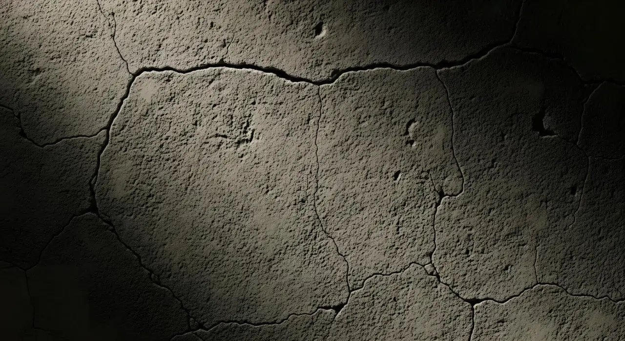
A surface reads as texture when the eye can infer roughness, softness, grain, or depth from tiny tonal changes. The trick is not the object itself but the way light catches its highs and lows. Microcontrast, which is the small tonal separation between neighboring details, does much of the work here. If the light is too even, the surface can still be sharp, but it will feel flat. I usually think of texture as a visual cue: the photo has to suggest how the surface would feel without relying on literal touch.That is why I start by looking at the light before I think about camera settings.
Light setups that reveal detail instead of flattening it
If I want detail to read clearly, I move the light off axis first. Raking light, which is light skimming almost parallel to the surface, is the fastest way to reveal bumps, grooves, and woven structure. A useful starting point is roughly 15 to 45 degrees off the surface, then adjusting until the shadows are present but not muddy.
| Lighting approach | What it does | Best use | Risk to watch |
|---|---|---|---|
| Side or raking light | Creates shadows that expose relief and depth | Stone, bark, brick, fabric, rust | Can exaggerate scratches or make fine detail too harsh |
| Soft side light | Keeps shape visible while reducing contrast | Skin, food, paper, product surfaces | May be too gentle if the surface is very subtle |
| Front light | Flattens depth and evens out tone | Documentation, clean catalog shots, smoother materials | Erases the very cues that make texture visible |
| Back or edge light | Separates translucent or thin material from background | Leaves, glass edges, fabric fibers, steam-like detail | Shows structure only at the edges, not across the whole surface |
Window light, a small LED panel, or a bounced flash can all work. The gear matters less than the angle and the falloff. If the surface is glossy, I rotate the subject first and the camera second, because changing perspective is often easier than fighting reflections in post. Once the light is in place, the next question is which surfaces are worth your time.
Subjects that reward a texture-first approach
The best subjects usually have variation at more than one scale. I look for broad structure, like cracks or weave direction, plus smaller interruptions that keep the surface from feeling mechanical. Natural materials are reliable: bark, stone, moss, sand, feathers, shells, and leaves all carry detail that reads well under oblique light. Manufactured surfaces can be just as strong when they show age or use, especially weathered paint, brushed metal, concrete, paper, leather, and old packaging.
Human and organic subjects need a lighter touch. Skin, hair, fur, and food crusts can be beautiful texture subjects, but the treatment should stay respectful and intentional. On skin especially, I avoid pushing contrast so hard that the image starts to feel clinical. The goal is to keep character, not to turn a person into a roughness map.
Patterns can also become textures when repetition has subtle variation. Brick, tiles, mesh, woven cloth, and corrugated metal all work because the eye gets rhythm, then notices the irregularities that make the frame interesting. The better the subject, the less you need to force the image in post, which leads naturally to the settings that keep all that detail intact.
Camera settings and framing that keep texture honest
I usually start with a simple rule: use the smallest aperture that gives me the depth I need, not the smallest aperture the lens can offer. For most surface work, f/5.6 to f/11 is a practical starting range. A tripod helps, but it is not mandatory if the light is strong enough to support a safe shutter speed and the surface is not moving.
| Situation | Starting point | Why it works |
|---|---|---|
| Flat surface, tripod, steady light | f/8, ISO 100-200 | Keeps detail sharp without pushing noise |
| Small subject with several depth layers | f/8-f/11, focus stacking if needed | Holds more of the surface sharp than a single focus plane |
| Handheld detail in changing light | f/5.6-f/8, shutter 1/250s or faster if movement matters | Balances depth and a safer handhold |
Focus stacking means combining several shots at different focus distances into one image, and it is useful when a close subject has too much depth for a single frame. A macro lens is ideal for that kind of work, but a close-focusing standard lens or a short telephoto can still produce excellent results. I also prefer a focal length that keeps perspective calm, because ultra-wide lenses can stretch lines and make repeating detail feel less believable.
- Focus carefully. Single-point autofocus or manual focus is usually safer when only one plane matters.
- Fill the frame on purpose. When the surface is the subject, empty space rarely helps.
- Watch the edges. A clean crack, fold, or transition gives the eye a place to stop.
- Check at 100 percent. Review the file before changing the light or moving on.
I frame with intention because a good crop can do as much for texture as a good lens. If the pattern feels busy, I tighten the frame; if it feels too orderly, I look for one interruption that adds life. Once the capture is solid, editing becomes a refinement step instead of damage control.
Editing choices that enhance texture without making it fake
The safest edit is usually the one that preserves the original surface character. I start with white balance, then a modest contrast curve, then selective sharpening only where the viewer needs it. A little texture or clarity adjustment can help, but too much makes highlights crunchy and shadows brittle. On matte surfaces like paper or fabric, heavy local contrast looks artificial fast. On stone, wood, rust, or concrete, a controlled boost can be effective because the material already carries strong structure.
- Sharpen selectively. Apply sharpening to the area that matters, not the whole file.
- Control noise gently. Over-smoothing removes the fine grain that helps a surface feel real.
- Protect highlights. Specular highlights, which are bright reflective spots, can disappear if you push contrast too far.
- Use masks when possible. Local adjustments keep the background calm while the surface stays detailed.
When I’m unsure, I toggle the edit on and off and ask a simple question: does the surface feel more believable, or just more processed? If the answer is the second one, I dial it back. That restraint matters most when the job needs a repeatable workflow rather than a one-off effect.
A simple field workflow that keeps the result consistent
My field process is straightforward because texture work rewards repetition. I choose one subject, study it from a few angles, and then make three passes: one with soft front light, one with side light, and one with the strongest angle the surface can handle. That comparison tells me very quickly whether the subject wants drama or restraint. If the image will live in a brand deck, product page, or editorial layout, I also keep one neutral version so the file can move between uses without feeling locked to a single mood.
- Pick a surface with visible variation and a clear edge or break in pattern.
- Move the light before you move the camera.
- Take one safer, evenly lit frame for reference, then one or two stronger side-lit frames.
- Review the image at full size to check focus, noise, and unwanted reflections.
- Keep the edit simple unless the image is meant to feel stylized.
For texture photography, the strongest frame usually comes from a calm capture and a disciplined edit. When I keep the process simple, the surface feels tactile instead of merely detailed, and that is the difference people notice even when they cannot name it.