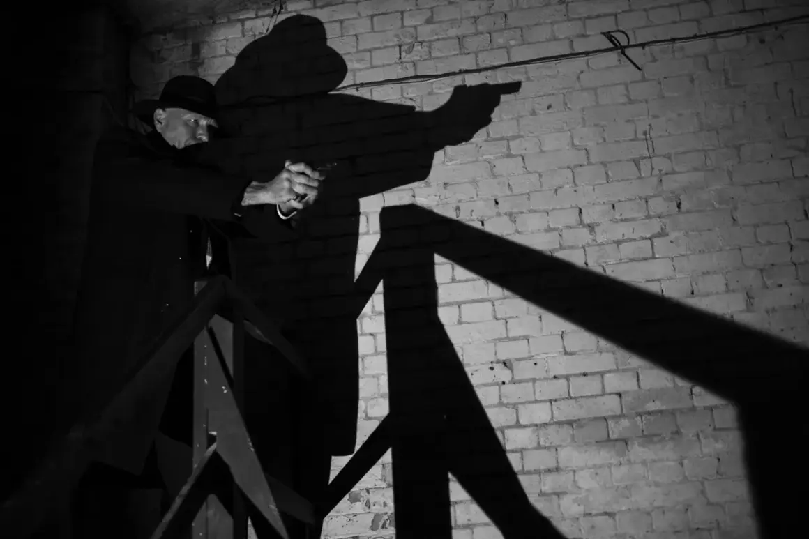
Film noir photography works because it turns light into tension. The style depends on hard shadows, strong contrast, and compositions that feel slightly dangerous even when the subject is standing still. In this article I break down what creates that look, how to light it, which subjects fit it best, and how to finish the image without making it look staged or overcooked.
The noir look depends more on control than on expensive gear
- One directional, hard light usually matters more than a complex setup.
- Deep shadows and negative space create most of the mood.
- Black-and-white is the most recognizable version, but restrained color can still work.
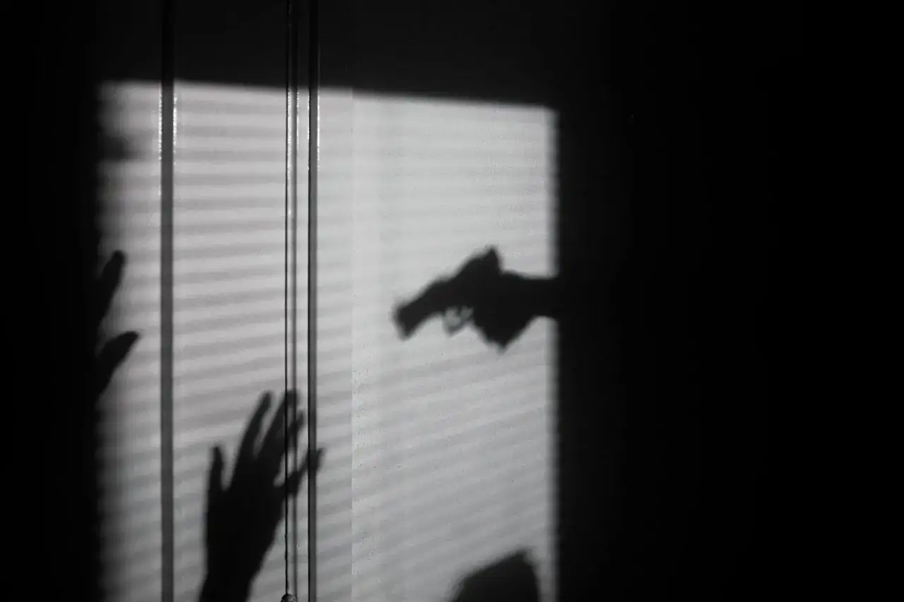
- Windows, blinds, door frames, stair rails, and reflections are reliable tools.
- The style falls apart fast when fill light removes all tension.
What gives noir photography its signature mood
In my experience, the style is not just about making an image dark. It is about selective visibility: letting the viewer see enough to understand the subject, but not enough to feel comfortable. That balance is why chiaroscuro, low-key lighting, and strong geometry matter so much. A cheekbone caught by one strip of light can do more than a whole room full of soft illumination.
| Visual ingredient | What it does | What I watch for |
|---|---|---|
| Low-key lighting | Pushes most of the frame into shadow | Avoiding flat detail everywhere |
| Hard contrast | Makes highlights and shadows feel sharper | Keeping the contrast dramatic, not clipped |
| Negative space | Isolates the subject and adds unease | Leaving parts of the frame intentionally empty |
| Strong lines | Gives the image structure and rhythm | Using doors, windows, rails, and blinds with purpose |
| Restrained tone | Keeps the frame from feeling busy | Choosing one dominant mood instead of several competing ones |
The best noir images feel like a scene paused at the exact moment before something changes. That is why faces half-hidden by shadow, bodies turned away from camera, and backgrounds stripped of clutter work so well. The style is visually simple, but emotionally it is loaded. From there, the next step is practical: building that tension with light you can actually control.
How to light a noir scene without overcomplicating it
I usually start with one hard source placed slightly above and about 45 degrees to the side of the subject. Then I remove fill until the shadow side still has shape, but not comfort. If I need more separation, I add a second, very quiet light for the background or use a practical lamp behind the subject. The rule I follow is simple: the shadows should feel designed, not accidental.
| Setup | Best use | Starting point | Why it works |
|---|---|---|---|
| One hard key light | Portraits and tight compositions | Place it high and off to one side | Creates the classic split of light and shadow |
| Window light | Interiors with a natural mood | Use a bare window or thin curtain | Feels believable and cinematic at the same time |
| Shadow patterning | Stylized portraits and scenes | Use blinds, rails, or frames to break the light | Adds visual texture without extra props |
| Silhouette backlight | More mysterious or graphic frames | Expose for the background and let the subject fall dark | Sharpens the outline and makes the subject feel remote |
If I am shooting flash, I often underexpose the ambient light by about 1 to 2 stops so the room does not dilute the mood. That gives me more control over where the eye goes. For portraits, I also prefer a modest aperture like f/4 to f/8, because I want enough depth to hold the facial structure and wardrobe details without making the image look clinical.
Small tools matter here. A grid, snoot, black flag, or even a simple piece of cardboard can be more useful than a larger modifier because they help me keep light where I want it. Once the lighting is under control, composition becomes much easier to handle.
Subjects and compositions that fit the aesthetic
Noir works best when the subject can carry a little uncertainty. Portraits are the obvious choice, but I also like stairwells, parked cars at night, rain-slick streets, doorways, mirrors, and hands framed against a coat or table edge. These elements all create the same underlying feeling: something is being revealed, but not fully.
- Portraits work because a partial face can suggest thought, conflict, or secrecy without needing a full narrative.
- Urban exteriors work because alleys, fire escapes, and streetlights naturally create strong lines and pockets of darkness.
- Reflections work because they split attention and make the viewer look twice.
- Staircases and railings work because they add diagonal movement and a sense of ascent or escape.
- Hands and props work because they give the frame a human detail without exposing everything else.
I also use camera angle very deliberately. A low angle can make a subject feel authoritative or trapped. A Dutch angle can add instability, but I use it sparingly because too many tilted frames quickly start to feel like imitation rather than intent. The same goes for smoke, hats, and trench coats: they are useful when the rest of the image already works, not as a substitute for structure.
One thing I try to avoid is over-isolation. If the subject is floating in darkness with no relationship to the environment, the image can lose its cinematic pull. I want at least one visible connection point, whether that is a window frame, a chair back, a street edge, or a streak of light crossing the floor. That gives the frame a place to breathe before the edit tightens everything further.
Editing choices that keep the image from looking overprocessed
The biggest mistake I see is trying to rescue weak lighting with heavy editing. Noir usually looks strongest when the file is already close to finished before post-processing begins. In editing, I focus on three things: tonal separation, controlled grain, and a conversion that protects texture instead of flattening it.
- Convert to black and white with intention. I do not want every color channel to disappear evenly; I want skin, clothing, and background elements to separate cleanly.
- Shape contrast with curves rather than one aggressive global slider. That keeps the frame dramatic without destroying detail in the midtones.
- Add grain lightly. Enough to soften digital perfection, not so much that the image starts looking muddy.
- Check the blacks and highlights at 100 percent zoom. If important detail is gone, the image may be too heavy-handed.
| Finish | When I use it | What to watch for |
|---|---|---|
| Black and white | When I want the classic noir read immediately | Protecting skin texture and avoiding blocked shadows |
| Muted color | When the scene relies on neon, street lamps, or editorial branding | Keeping the palette narrow so the mood does not collapse |
| High-contrast monochrome | When the geometry of the frame is the main subject | Making sure the image still has tonal depth |
I prefer muted color only when it adds something the monochrome version would lose, such as sodium-vapor amber, rainy blue reflections, or a small red accent that changes the story. Otherwise, black and white is usually the cleaner choice because it removes distraction and pushes the viewer straight into the light structure. That said, the edit should serve the mood already built in camera, not try to invent it afterward.
The check I use before calling a frame finished
A noir image feels believable when the style is doing narrative work instead of costume work. A hat, smoke, or a set of blinds can help, but they are not the point. Before I call a frame done, I ask three questions: does the light explain the mood, does the composition hold tension, and would the image still work if I removed the obvious noir props?
- Keep one visual idea dominant rather than stacking too many effects.
- Let some darkness stay unresolved instead of forcing detail into every corner.
- Use backgrounds with hard lines, because they support the graphic quality of the style.
- Reserve tilted angles, smoke, and heavy shadows for frames that truly need them.
- Make sure the subject still reads clearly at a glance, especially on small screens.
That discipline is why the style still works in 2026. It reads quickly, it travels well on screens, and it gives a simple portrait or street scene a stronger emotional charge without needing elaborate production. When the lighting is intentional and the composition is clean, the image feels less like a reference and more like a real scene from a larger story.