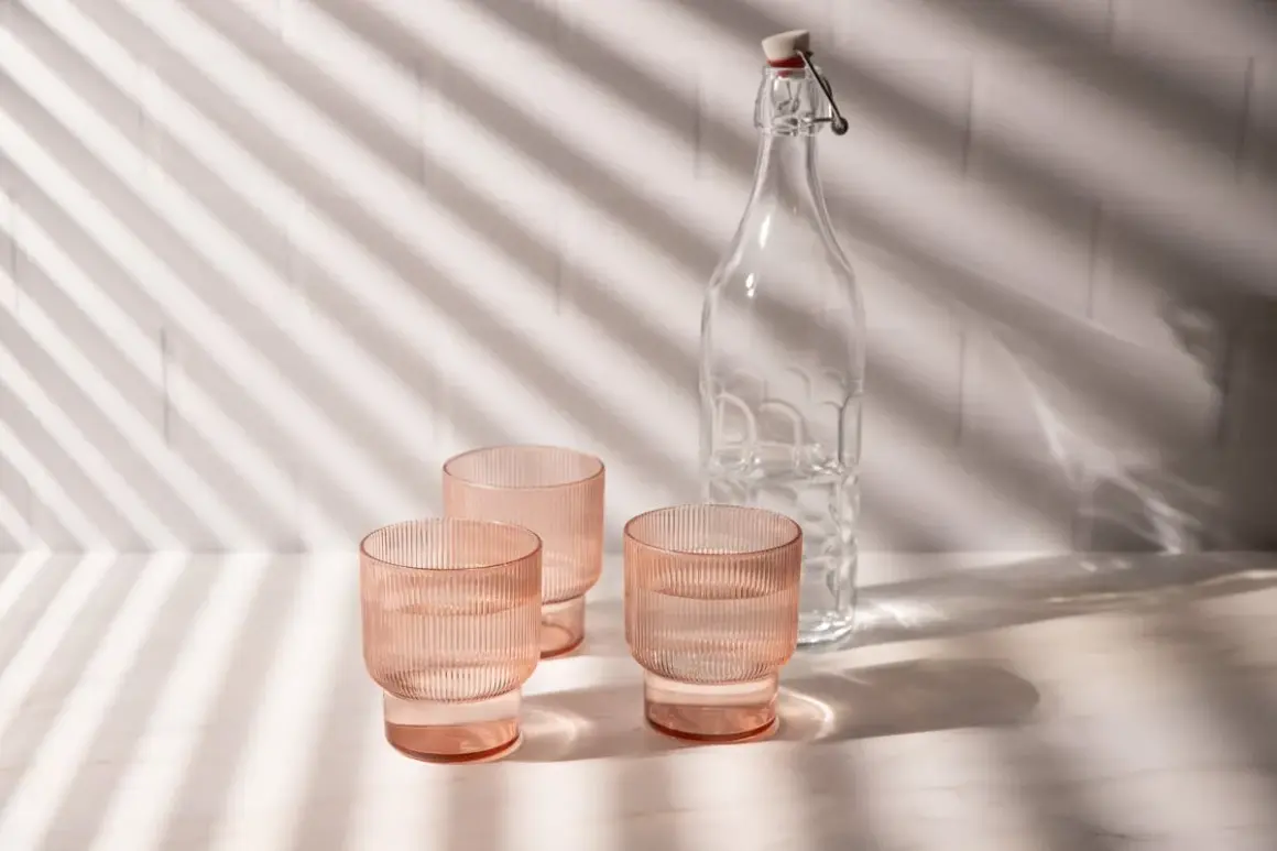
Good product photos rarely happen by accident. When daylight is handled well, it gives packaging a cleaner tone, preserves texture, and keeps small details from looking overprocessed. This article breaks down how I set up window light, how I shape it with simple tools, which camera settings stay reliable, and where the method works best across different product types. Natural product photography works best when the light is controlled rather than merely available.
The fastest way to get clean product photos with daylight
- Shoot beside a large window with indirect light, not in direct sun.
- Soften harsh daylight with a sheer curtain, tracing paper, or a diffuser.
- Use a white reflector to lift the shadow side and keep labels readable.
- Keep ISO low, shoot in RAW, and use a tripod when the light drops.
- Adjust the setup by product type because glass, matte packaging, and textiles do not behave the same way.
Why window light works so well for product images
Window light is useful because it keeps products looking believable. Soft daylight shows texture on paper labels, fabric weave, ceramic glaze, and even the faint curvature of a bottle without making the image feel stiff. I reach for it when a brand needs the photo to feel calm, premium, and close to how the product looks in real life.
The tradeoff is control. Daylight changes color and intensity through the day, and a small shift in angle can turn a clean surface into a glare problem. That is why I treat daylight as a material to shape, not a background condition to hope for. Once you understand that, the setup becomes far easier to repeat.
The next step is building a scene that lets the light stay soft without leaving everything to chance.
How to build a controllable window-light setup
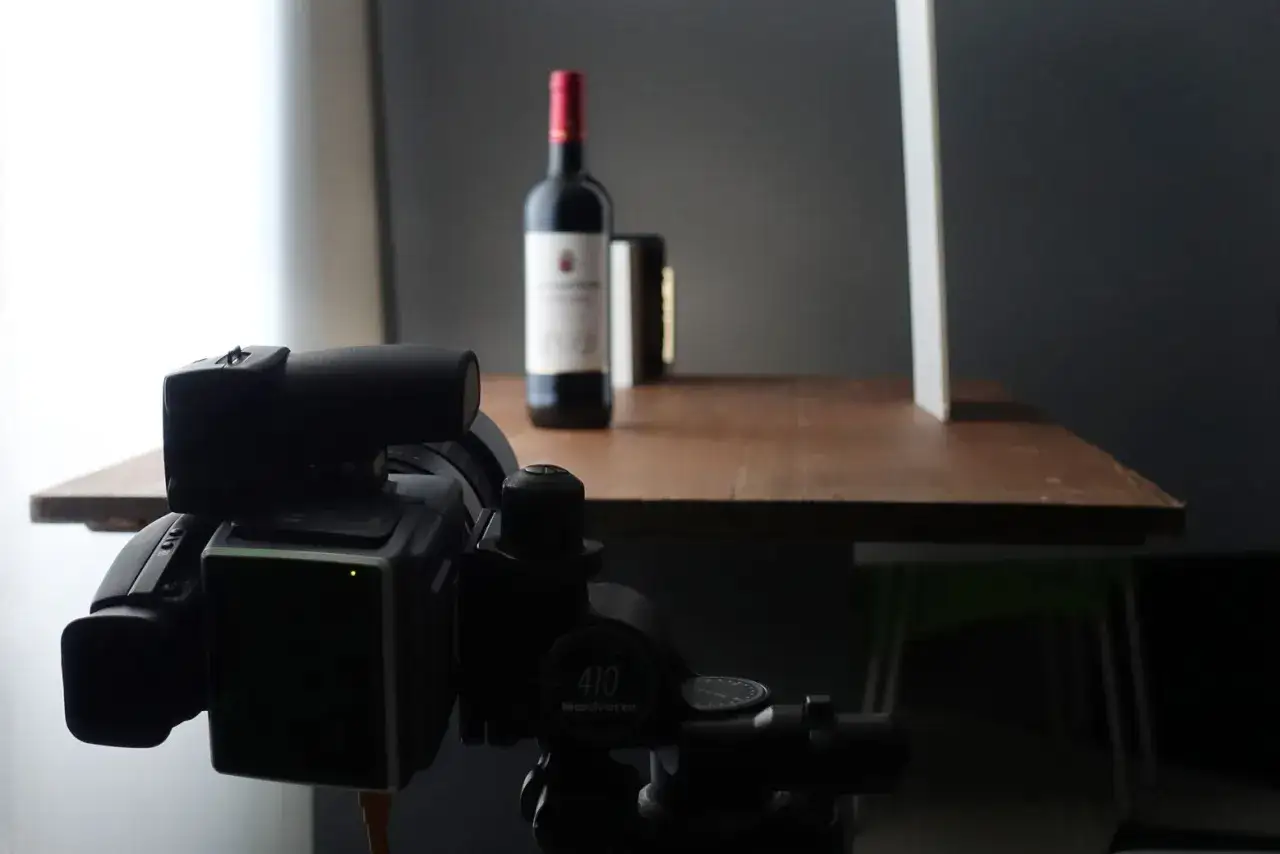
I start with a large window that gives me indirect light. In the U.S., a north-facing window is often the easiest place to work because the light stays softer across the day, but a shaded east- or west-facing window can work too if direct sun is blocked. If the light is too strong, I move the subject farther from the glass or hang a sheer curtain between the window and the set.
A usable daylight kit does not need to be expensive. If you already own a camera or a modern phone, the rest can stay surprisingly lean.
| Item | What it does | Typical cost |
|---|---|---|
| Sheer curtain or diffusion fabric | Softens direct light and spreads it across the subject | $10-$30 |
| White foam board | Bounces light back into the shadow side | $3-$10 |
| Black card | Adds contrast by blocking stray spill | $3-$10 |
| Tripod | Keeps framing and focus consistent when the shutter slows down | $30-$150 |
| Clamp or tape | Holds diffusion and reflectors in place | $5-$20 |
I usually place the product about 2 to 4 feet from the window and then move it closer only if I want stronger direction or deeper shadow. That distance gives me room to manage spill and keeps the light from looking too harsh. If I am photographing several products in the same session, I mark the tripod position and subject distance so the light stays consistent from shot to shot.
Once the setup is stable, the real work is shaping the light so the product looks intentional instead of merely lit.
How to shape the light instead of just accepting it
Soft daylight is a starting point, not a finished look. I use three tools over and over again: diffusion, reflection, and negative fill. Each one changes how the light behaves without forcing me into a full studio setup.
Diffuse the source
Diffusion turns a small, harsh beam into a larger, softer source. A sheer curtain, tracing paper, or a lightweight diffusion scrim can do this job. I rely on it whenever direct sun is creating hard edges on glossy packaging or making a white label look patchy. Diffusion is the fastest way to make daylight usable.
Use reflectors to fill the shadows
A white reflector does not create new light; it sends some of the existing light back into the darker side of the product. That matters when a bottle or box starts to look too dark on one edge. I often set a foam board opposite the window and move it a few inches at a time until the shadow side still has shape but no longer disappears.
Read Also: Texture Photography - Make Surfaces Tactile, Not Flat
Add negative fill when the image feels flat
Negative fill means using a black card or dark surface to absorb light instead of bouncing it. It sounds counterintuitive, but it is one of the quickest ways to add depth. If a matte product looks washed out, I place black card just outside the frame to pull back a little contrast. That small move can make the image feel much more dimensional.
If the product is highly reflective, I usually combine diffusion with a reflector and a black card rather than relying on one tool alone. The combination gives me enough control to place highlights where I want them and remove the ones I do not. After that, the camera settings need to hold the look together, especially when the daylight shifts.
Camera settings that keep color and detail honest
For daylight product work, I prefer simple settings that keep the file clean and predictable. The goal is not to chase a dramatic exposure. It is to preserve the product’s true color, keep edges sharp, and leave enough room to adjust the image later.
- ISO 100-200 for the cleanest files. I only push to ISO 400 when I have to, and even then I check noise carefully.
- Aperture f/5.6-f/8 for most single products. This range is usually sharp enough without making the background feel distracting.
- Aperture f/8-f/11 for flat lays, group shots, or packaging with a lot of depth. It helps keep labels, caps, and edges in focus.
- Shutter speed can be slow if the camera is on a tripod. I would rather use a slower shutter than raise ISO too quickly.
- White balance should stay consistent. A gray card or custom Kelvin setting saves time in post and keeps brand colors from drifting.
- RAW format is worth using whenever color accuracy matters. Daylight can shift from warm to cool faster than most people expect.
If I am shooting on a phone, I lock exposure and focus before I start moving props around. That avoids the tiny brightness jumps that make a sequence feel inconsistent. For products with multiple depth planes, I also use focus stacking, which is just a series of shots at slightly different focus distances merged later so the entire object stays sharp.
Those settings are a good baseline, but the best light strategy still depends on what is actually in front of the camera.
Match the lighting style to the product
Different products ask for different kinds of daylight. A matte skincare bottle can handle a softer, flatter setup than a chrome watch or a glass spritz bottle. I plan the light around the surface first, then the mood second.
| Product type | Best daylight approach | Main risk | Adjustment I usually make |
|---|---|---|---|
| Skincare and cosmetics | Soft side light with gentle fill | Glossy labels can wash out | Angle the product slightly away from the window and use a white card on the shadow side |
| Glass bottles and drinks | Back or three-quarter back light | Hot spots and unwanted reflections | Use diffusion plus black cards to shape the highlights |
| Jewelry and watches | Very soft, broad daylight | Tiny reflections can look messy fast | Keep the setup simple and control every reflective surface around the product |
| Apparel and textiles | Large window light with even fill | Wrinkles and color shifts become obvious | Flatten the fabric carefully and check color against a neutral reference |
| Packaged goods and boxes | Soft frontal or side-front light | Flat cardboard can lose depth | Add a black card for edge definition if the image feels too neutral |
That table matters because the same lighting recipe does not suit every subject. A glossy perfume bottle needs more control than a matte candle tin, and a folded shirt needs more even fill than a single luxury box. When I match the setup to the surface, the photo usually improves before I even touch editing.
The limit of daylight shows up most clearly when the shoot stops being a single image and becomes a system.
When daylight stops being enough
Natural light is excellent for editorial product shots, small brand launches, social content, and one-off hero images. It becomes less practical when I need many SKUs to match perfectly, when the shoot happens after sunset, or when the packaging is so reflective that every variation in cloud cover changes the result. In those cases, I either move to controlled artificial light or build a hybrid setup that lets me keep the daylight look while making the output repeatable.
If I had to keep the setup as lean as possible, I would start with one window, one sheer diffuser, one white foam board, one black card, and a tripod. That combination handles most beginner and intermediate product sessions without forcing the images into a generic studio look. For small brands, natural product photography is often the smartest place to start because the setup stays affordable and it teaches you how products actually respond to light.
Once you can see when to soften, when to bounce, and when to subtract light, you stop guessing and start making deliberate choices. That is the difference between a product photo that merely looks acceptable and one that feels ready for a brand.