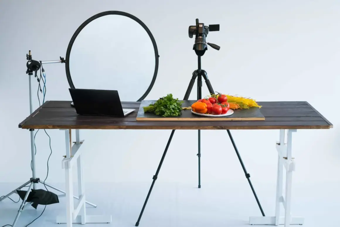
Small objects can look plain on a desk and surprisingly polished once they are arranged with intention, which is why tabletop photography works so well for products, food, crafts, and editorial still life. The real challenge is not finding something to shoot; it is controlling scale, light, reflections, and spacing so the frame feels deliberate instead of accidental. This guide focuses on the practical decisions that make a setup repeatable, efficient, and visually strong.
What matters most before you set up the shot
- Use a clean surface and keep the background secondary to the subject.
- Choose objects that benefit from detail, texture, labels, or shape.
- Soft, directional light usually looks better than bright, flat light.
- A tripod, manual white balance, and a fixed angle save time in editing.
- For glossy or reflective items, bigger light sources and black cards matter more than fancy gear.
What this style really solves
I treat this kind of work as controlled storytelling. A table gives me a compact stage where I can decide exactly how much context to include, how much texture to reveal, and how much room the object needs to breathe. That is why this format is so common in ecommerce, editorial content, recipe work, and brand visuals: it keeps the subject readable without forcing a full studio production.
The strongest use cases are the ones where viewers need to inspect something closely. Labels, finishes, packaging, ingredients, craftsmanship, and material quality all benefit from a scene that is stable and repeatable. If the object’s value depends on detail, this setup gives you that detail without visual noise. Once you know what the format is good for, the next question is which subjects actually reward it.
Subjects that look strongest on a table
Not every object benefits from being placed on a surface and photographed from close range. The format works best when shape, texture, or fine detail is part of the appeal. Here is how I usually think about the most reliable subject types:
| Subject | Why it works | Best angle | Lighting note |
|---|---|---|---|
| Jewelry and watches | Small scale rewards precision and close inspection. | Low three-quarter angle or slight top-down | Use soft light with black cards nearby to shape reflections. |
| Cosmetics and skincare | Packaging, typography, and product color matter immediately. | Straight-on or gently angled | Keep the background clean and the labels bright enough to read. |
| Food and drinks | Texture, freshness, and color carry the image. | Top-down for flat layouts, lower angle for drinks | Use directional light so the food does not look washed out. |
| Stationery and packaging | Flat items benefit from order, rhythm, and spacing. | Overhead | Even light and careful alignment are more important than drama. |
| Tools, gadgets, and handmade objects | Surface texture and construction details need a controlled frame. | Three-quarter angle | Use enough contrast to show edges, seams, and material changes. |
One mistake I see often is forcing every object into the same visual treatment. Glass, metal, paper, and matte ceramic all behave differently, so the subject should guide the setup rather than the other way around. Once that choice is clear, the next step is building a setup that does not fight you every time you move an item.

Build a setup that stays controllable
I want a setup that solves three problems at once: support, background, and light control. The more repeatable those pieces are, the faster I can move from one object to the next without rebuilding the entire scene. In practice, that usually means starting simple and only adding gear when the object demands it.
| Setup | Best for | Typical U.S. entry cost | Strength | Limit |
|---|---|---|---|---|
| Window light plus foam boards | Beginners, food, simple crafts, editorial still life | $0-$40 | Cheap, natural, and easy to understand | Changes with weather and time of day |
| One LED panel with diffusion | Small products, content batches, desk-sized scenes | $80-$300 | Portable and consistent | Can look harsh if the panel is too small or too close |
| Light tent | Glossy objects, catalog work, quick white-background shots | $30-$150 | Reduces reflections and simplifies the background | Can flatten the scene if you never add contrast back in |
| Strobe with softbox and trigger | Repeatable product work and more polished commercial images | $250-$900 | Excellent control and consistent output | More setup time and a steeper learning curve |
If the budget is tight, I would start with daylight, a white surface, and two black or white foam boards before buying anything else. That combination teaches you how the light behaves, which is the part that actually matters. If you need repeatability for ecommerce or a brand library, I would move toward artificial light sooner rather than later. Once the physical setup is stable, the next decision is how to shape the light itself.
Light the scene for shape, not just brightness
Good lighting for small objects is less about making everything bright and more about making the object feel dimensional. I usually begin with one broad, soft source and then decide where I want the shadows to stay, disappear, or become part of the design. That approach gives the scene structure instead of a washed-out look.
Use one broad source first
A window with diffusion, a softbox, or a bounced LED source usually gives the most reliable starting point. The key is size: the larger the light source is relative to the object, the softer the edges become. That softness is helpful, but it should not erase form entirely. I often feather the light slightly past the subject so the brightest part of the beam does not hit the center of the frame head-on.
Add negative fill when the scene goes flat
Negative fill is just a black surface placed near the subject to absorb light and deepen the shadows. It sounds simple because it is, but it makes a huge difference with shiny packaging, bottles, jewelry, and pale surfaces. If a scene feels clean but lifeless, I usually do not add more light; I remove some light from the edges so the object regains contrast.
Read Also: Conference Photography - Master Event Coverage That Works
Match the approach to the material
Matte objects can handle broad, even illumination. Glossy products need larger apparent light sources and more careful placement so reflections land where they help the design instead of destroying it. Transparent or translucent items often look best with backlight or side-backlight because the light reveals depth inside the material. Glass and metal are never just lit; they are shaped by what they reflect. Once the light behaves, composition becomes much easier to judge.
Compose so the object feels intentional
Composition is where a basic setup turns into a finished image. I think of props as punctuation, not decoration: they should explain scale, use, or mood, and then get out of the way. A single spoon, a folded napkin, a brush, or a piece of fabric can help the frame feel lived-in, but too many supporting elements start competing with the subject.
- Use a top-down angle for flat lays, labels, stationery, and ingredient spreads.
- Use a three-quarter angle for boxes, bottles, mugs, candles, and anything with visible depth.
- Leave negative space when the image needs to feel premium or editorial.
- Keep horizons, edges, and label lines straight unless the tilt is clearly intentional.
- Rotate the object a few degrees at a time to test how reflections and shadows change.
For ecommerce, I usually keep the layout simpler than I would for editorial work, because the image has to inform first and persuade second. For a brand story or campaign image, I can introduce more texture and layering, but the subject still needs to read instantly. Once the frame is composed, the camera settings should support that clarity instead of working against it.
Camera settings and capture workflow that stay efficient
The most practical shooting setup is usually a tripod, manual exposure, and enough depth of field to keep the subject readable from front to back. I start at f/8 more often than any other aperture because it balances sharpness and depth without becoming needlessly slow. From there, I adjust based on the subject, the lens, and how much of the scene needs to stay in focus.
- Aperture: f/5.6 to f/11 for most small-object scenes; wider if you want softer background separation.
- ISO: keep it at base ISO when possible, or roughly ISO 100 to 400 for a clean file.
- Shutter speed: let the tripod do the work; a slower shutter is fine if nothing moves.
- White balance: set a custom value or use a gray card so color stays consistent across a series.
- Focus stacking: use it when a single frame cannot keep the front and back of the object sharp at once.
- Bracketing: take a few exposure variations when reflections or bright packaging are hard to balance.
I also like tethered shooting when the work needs approval or precision, because small adjustments are much easier to judge on a larger screen. That extra feedback loop saves time later, especially when a label is off-center or a reflection is sitting in the wrong place. After capture, the editing pass should protect that precision rather than repaint it.
Edit for accuracy first, mood second
In this genre, I think restraint pays off. The goal is usually not to create a dramatic cinematic grade; it is to present the object cleanly and truthfully while still making it look appealing. That means correcting color, cleaning dust, balancing contrast, and controlling distractions without flattening the real material of the subject.
The edits that usually matter most are white balance, crop consistency, perspective correction, dust removal, and selective sharpening. If the product is being sold online, believable color is more valuable than an aggressive look. If the image is editorial, I can be a little looser with tone and atmosphere, but I still avoid the kind of over-processing that makes surfaces look plastic.
- Neutralize unwanted color casts before increasing contrast.
- Remove lint, dust, fingerprints, and stray marks on the surface.
- Check blacks and highlights carefully so texture does not disappear.
- Keep a consistent crop ratio across a series for a cleaner presentation.
- Use sharpening sparingly on labels, edges, and texture, not everywhere at once.
Once the edit is under control, the last question is whether this is actually the right format for the job or whether another approach would serve the subject better.
Where the format starts to break down
This method is excellent for control, but control has limits. Tall objects can outgrow the surface area very quickly, reflective objects can become frustrating if the setup is too small, and anything that depends on movement or human interaction may need a different visual language. A table is a stage, not a cure-all.
I move away from this approach when the scene needs environment more than isolation. A handmade mug may look great on a tabletop, but a lifestyle frame with hands, steam, and a kitchen context can communicate more clearly if the story is about use rather than form. The same is true for larger goods: if the object needs breathing room that the setup cannot provide, forcing it onto a small surface only makes the image feel cramped.
The cleanest decision is often the simplest one: use a table when you need precision, and use a broader environment when context carries more of the message. That distinction keeps the work honest and saves a lot of unnecessary tinkering.
The habits that make repeatable results easier
When I want this kind of work to stay efficient, I build habits instead of improvising every shoot from scratch. I keep notes on light direction, mark object positions with tape, and save a few reference frames that I know work. Those small routines make the next session faster and reduce the chance that I will rebuild a setup I already solved.
- Keep a small kit ready: foam boards, clamps, microfiber cloths, and a neutral backdrop.
- Photograph your lighting setup once it works, so you can recreate it later.
- Record the aperture, distance, and light placement for each setup that succeeds.
- Leave room to refine reflections by moving lights a few inches, not by restarting the whole scene.
That is the real payoff here: once you have one reliable tabletop system, you stop reinventing the process and start making better decisions inside it. The images improve, the workflow gets faster, and the subject stays in focus for the right reasons.