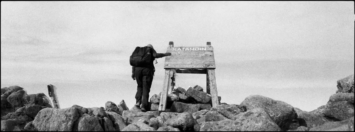
Fine art photography is less about recording what stands in front of the lens and more about shaping a visual idea that feels deliberate, personal, and complete. In this guide, I break down what sets the style apart, which subjects work best, how to build a cohesive series, and how to make the final image feel finished on screen and in print. That matters because the same camera can produce a snapshot, a portfolio piece, or a gallery-ready print depending on the choices behind it.
The strongest work starts with intention, then uses subject, light, and presentation to make that intention visible.
- The genre is defined by intent, not by a fixed subject list.
- Landscapes, portraits, still life, architecture, and abstraction all work when they serve one idea.
- A strong series usually starts with 20-40 candidate frames and is edited down to 6-12 final images.
- Light, color, framing, and post-processing should feel consistent across the body of work.
- Printing and presentation matter because the same image can feel unfinished if it is displayed without care.
What makes this style different from commercial and documentary work
What I look for first is purpose. Commercial photography is built to sell, documentary work is built to inform, and this style is built to express an idea, mood, or point of view. That sounds subtle, but the difference changes everything: subject choice, composition, lighting, and even the way you edit the final file.
In practice, that means a portrait does not need to identify the sitter, a landscape does not need to be literal, and a still life does not need to feel casual. The image can be staged, edited, or simplified as long as the choices support the concept instead of distracting from it. I often tell people that the real question is not "What did you photograph?" but "What did you want the viewer to feel, notice, or question?"
That distinction is useful because it stops you from chasing technically polished but emotionally empty frames. Once that is clear, the next step is choosing subjects that can actually carry the idea.
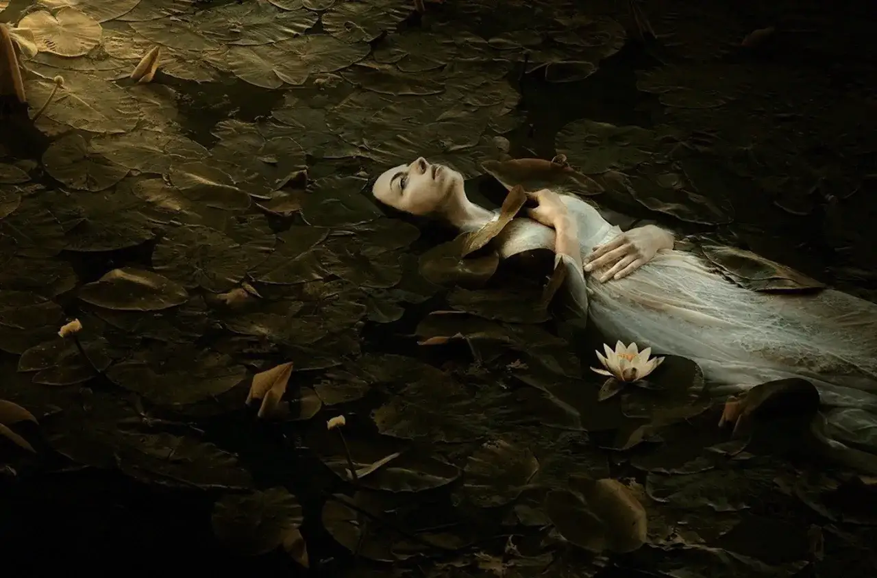
Subjects that carry meaning instead of decoration
The best subjects are the ones that can do more than look attractive for a second. I usually think in terms of symbolic weight, shape, texture, gesture, and how much room a subject gives me to build an interpretation around it. A plain object can become powerful if it is photographed with enough intention.
| Subject | Why it works | Common risk | What I watch for |
|---|---|---|---|
| Portraits | They carry emotion, identity, and narrative immediately. | They can drift into generic headshot language. | Light, pose, wardrobe, and expression need to feel purposeful. |
| Landscapes | They work well when the mood or structure matters more than literal description. | They can look like postcard images. | I look for unusual weather, scale, or a strong visual tension. |
| Still life | Objects can become symbols, especially in controlled light. | The setup can feel overly posed or obviously artificial. | I simplify the scene until every object has a reason to be there. |
| Architecture | Lines, geometry, and repetition give the frame a strong visual rhythm. | It can slide into standard real-estate style coverage. | I focus on shadow, perspective, and abstraction. |
| Abstract details | They leave room for interpretation and push the image away from literal description. | They can become vague if there is no structure. | I still need a clear composition and a strong tonal relationship. |
| Narrative scenes | They suggest a story without explaining every detail. | They can look staged in a weak way. | I use gesture, placement, and props sparingly. |
If I had to reduce the whole category to one sentence, it would be this: choose subjects that can mean something beyond themselves. After that, the real work is turning a promising subject into a repeatable visual language.
How I plan a fine art photography series
Most weak bodies of work fail because they start with a subject instead of a concept. I get better results when I begin with one sentence that explains the emotional or thematic center of the series, then I ask what visual decisions can support that sentence. For example, if the idea is isolation, I might emphasize negative space, small figures, and a restrained palette. If the idea is memory, I might allow blur, repetition, or softer tonal transitions.
- Start with a question. I write the series as a question I want the images to explore, not as a topic label.
- Limit the visual vocabulary. I choose a narrow set of colors, lenses, or compositional rules so the work feels related.
- Shoot more than you need. An early edit of 20-40 frames is normal for a small project; the final selection usually lands around 6-12 images.
- Edit for rhythm. I look at how one frame speaks to the next, because a sequence creates meaning that one image alone might not carry.
- Write a short statement. For web use or submissions, I keep it tight, usually 75-150 words, so the work gets context without becoming an essay.
The most useful discipline here is restraint. A series becomes stronger when every image adds a slightly different note instead of repeating the same visual sentence. Once the sequence is set, the next question is whether the lighting and editing choices are reinforcing that idea or quietly working against it.
Lighting, composition, and editing that support the idea
I do not think of lighting as decoration. I think of it as structure. Soft light can make a subject feel reflective or fragile, hard light can add tension, and directional light can create depth and separation. The same subject can tell a completely different story depending on where the shadows fall.
Composition works the same way. Negative space, which is the open area around the subject, can make a frame feel lonely, calm, or unresolved. Tight framing can increase pressure and intimacy. Symmetry can feel formal or ceremonial, while an off-center placement often feels more human and unsettled. I use these tools to push the image toward the emotion I want, not just to make it look balanced.
Editing should finish the idea, not rewrite it. I keep color grading consistent across a series, and I avoid mixing heavy contrast, pastel washes, and ultra-clean neutrality in the same body of work unless that shift is part of the concept. If the image is in black and white, I want the tonal range to feel intentional: highlights, midtones, and shadows should all have a job to do. That is what separates a polished frame from one that feels merely processed.
By the time the file is ready, the technical decisions should be invisible enough that the viewer notices mood before method. From there, print and presentation decide whether the work still holds together outside the screen.
Printing and presentation that make the work feel complete
Presentation is where a lot of personal work either sharpens or falls apart. On a monitor, an image can survive with a little ambiguity; in print, it has to hold its own. That is why I always test how the image behaves at a practical size before I treat it as finished. A frame that feels strong at 8x10 inches should usually scale well to 11x14 or 16x20, which are friendly sizes for portfolio reviews, small exhibitions, and home display in the U.S. market.
I also pay attention to paper choice. Matte paper tends to soften contrast and feel more contemplative, while glossy or baryta-style papers can increase punch and detail. Neither is automatically better. The right surface depends on whether I want the work to feel quiet, dramatic, archival, or highly precise. Framing matters for the same reason: a simple black frame can make the image feel disciplined, while a heavier frame can push it toward a more formal gallery presence.
For online portfolios, I prefer a clean presentation with enough white space for the image to breathe. For submissions, I keep captions minimal unless the context requires more explanation. A short statement, a clear sequence, and a consistent file export are often enough. The image should feel finished even if the viewer sees it for only a few seconds, because that is usually all you get before they decide whether to keep looking.
Once the work is presented well, the remaining problem is usually not presentation but editing judgment. That is where the most common mistakes show up.
What usually weakens the work before anyone sees the point
The most common problem I see is over-literal thinking. A photographer finds an interesting subject and assumes the subject alone is enough. It rarely is. Without a clear point of view, the image becomes attractive but forgettable. The second problem is overprocessing: too much clarity, too much texture, too much color correction, or too many effects fighting for attention.
- Relying on cliché - flowers, lonely chairs, and fog can work, but only if they are carrying a real idea rather than pretending to be one.
- Mixing too many visual languages - if one frame is airy, the next is harsh, and the next is heavily stylized, the series stops feeling authored.
- Ignoring sequence - a strong standalone image can weaken a series if it repeats the same note too many times.
- Using props as a shortcut - props should deepen meaning, not replace it.
- Skipping editing discipline - a tight edit often improves the work more than a new location or lens.
I also watch for images that need too much explanation. If the caption is doing all the emotional work, the frame itself is not doing enough. That is why I prefer to cut aggressively and keep only the images that still communicate after the obvious ones are removed. Before I call the work finished, I run one last check on whether it can stand alone and inside a sequence.
Small checks that tell me the final image is actually working
When I am close to the end, I ask a few simple questions. Does the image say something I could not get from a quick phone snapshot? Does the crop feel chosen rather than convenient? If I remove one frame from the set, does the series become weaker? Those questions sound basic, but they reveal whether the work has real structure.
- Can I describe the idea in one sentence without sounding vague?
- Does every element in the frame support that sentence?
- Would the image still feel intentional if the viewer knew nothing about the backstory?
- Does the file look as strong in print as it does on screen?
If the answer is yes, the work is probably ready to show. If the answer depends on a long explanation, I keep editing. That is the standard I trust: the subject matters, but the idea, the sequence, and the final presentation matter more. When those parts line up, the image stops feeling like an exercise and starts feeling like a piece of authored visual work.