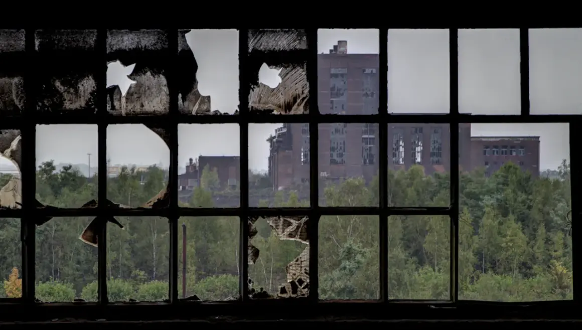
Abandoned factories, shuttered hospitals, and empty houses can produce some of the most layered images in photography. Urbex photography works because it combines architecture, history, decay, and atmosphere, but the genre only pays off when you know how to choose a location, stay safe, and frame the scene with intention.
What matters most before you enter an abandoned site
- The strongest images usually come from places with structure, light, and visible traces of use.
- Permission matters more than aesthetics; many empty-looking buildings are still private property.
- A small kit is enough, but light, protection, and a stable exposure plan matter.
- Wide shots show scale, while details such as signage, textures, and objects create emotional weight.
- Editing should preserve texture and mood, not flatten the scene into fake drama.
What urbex photography actually captures
I think of this style as a study in time. The building is the subject, but the real story is the relationship between structure and neglect: rust on steel, vines through broken windows, dust on a desk, or a staircase that still suggests movement long after people left. When that balance is right, the image feels less like a record of decay and more like a scene with a memory in it.
That is why the genre can be powerful in editorial work, personal projects, and visual storytelling. You are not just showing a ruined place; you are showing a location where function, abandonment, and atmosphere collide.
Once that idea is clear, the real work is choosing subjects that hold attention instead of just looking abandoned.
The subjects that give the strongest images
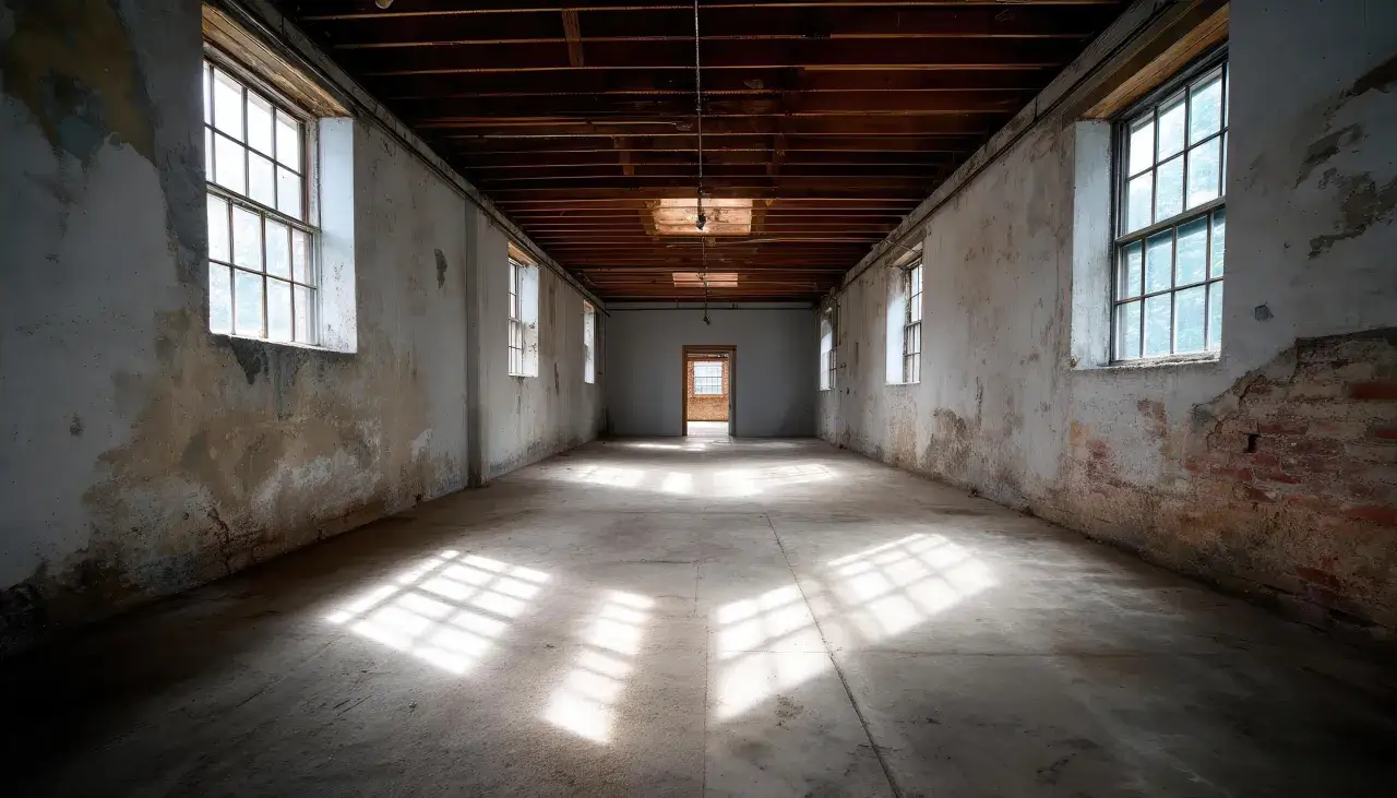
The best abandoned sites usually offer one of three things: geometry, evidence of people, or a dramatic fight between light and decay. If a location has all three, I know I can build a strong set from it.
| Subject | Why it works | What to watch |
|---|---|---|
| Factories and mills | Big frames, repeating windows, exposed beams, and strong texture give you instant structure. | Large spaces can look empty fast, so look for machinery, signage, or shafts of light to anchor the shot. |
| Schools and hospitals | They carry human presence naturally, even when the rooms are bare. | These sites can be fragile, monitored, or unsafe, so I treat access and floor stability as major concerns. |
| Houses and apartments | They feel intimate. A chair, a curtain, or a photo frame can change the emotional tone immediately. | They can become cluttered visually, so I isolate details instead of trying to show everything at once. |
| Rail yards and transit spaces | Strong lines, symmetry, and industrial repetition make composition easier. | Access is often restricted, and the best frames may require longer lenses or careful positioning. |
| Churches, theaters, and civic buildings | They often have dramatic architecture and directional light that naturally supports a strong image. | Fragile interiors, dust, and partial collapse can limit where you can stand and shoot. |
My rule is simple: if a site has visual structure but no readable story, it becomes a texture sample rather than a memorable photograph. Once you know what to look for, the next question is whether the location is safe and legal enough to enter.
How I approach access and safety in the U.S.
In the United States, I never assume an empty property is fair game. Ownership can be active even when a building is boarded up, and trespass rules vary by state, county, and city. If I cannot confirm permission, I do not treat the location as usable.
- Check ownership or permission before the shoot.
- Prefer daylight visits and avoid rushing in at dusk.
- Bring a second person when possible; abandoned floors and stairwells are the real risk.
- Wear boots, gloves, and a mask if dust, mold, or broken glass is visible.
- Watch for chemical odors, sagging ceilings, wet floors, exposed nails, and unstable stairs.
- Leave immediately if the site looks actively monitored or recently used.
I also keep my gear simple when a site is uncertain, because the less time I spend fumbling with equipment, the more attention I can give to where I’m stepping. With access and risk sorted, gear stops being a shopping list and becomes a way to work efficiently.
The kit and settings I trust in low light
You do not need a huge system for this genre, but you do need one that behaves predictably in dark, uneven spaces. I want enough quality for print or editorial use, enough responsiveness to move quickly, and enough control to handle mixed light.
A practical baseline kit
- Camera body that stays usable at ISO 1600 to 3200 without falling apart.
- Wide zoom or prime in the 16-35mm range for interiors, plus a 35mm or 50mm for details.
- Tripod if the floor is stable and you expect shutter speeds slower than 1/60s.
- Flashlight or small LED panel for navigation and gentle light shaping.
- Boots, gloves, and a mask when dust, debris, or mold are part of the site.
Settings I start with
- Aperture at f/5.6 to f/8 for most rooms, because I want depth without losing too much light.
- Shutter speed at 1/125s handheld, then slower only when I can brace myself or use a tripod.
- ISO at 800 as a starting point, rising to 1600 or 3200 when the scene demands it.
- Focus in single-point mode for details, or manual focus when contrast is too weak.
- Exposure bracketing in 3 frames when windows are bright and the interior is dark.
That combination gives me enough flexibility to work quickly without turning every room into a technical puzzle. Once the exposure is under control, composition becomes the part that separates a competent frame from a memorable one.
How I compose abandoned spaces so they feel deliberate
I look for order inside disorder. The best frames usually have a dominant line, a strong anchor, and one area of negative space that lets the viewer breathe. Without that structure, even a dramatic location can collapse into visual noise.
Use lines that already exist
Corridors, rails, beams, broken windows, and staircases can guide the eye toward the center of the frame. In large interiors, I often wait a few seconds longer just to see where the natural lines actually lead. That patience usually matters more than the lens choice.
Keep one human trace in view
A lone chair, a peeling nameplate, a child’s drawing, or a forgotten machine gives the viewer something to read. Those details are important because they make the place feel inhabited in memory, not just empty in fact.
Balance scale with detail
I rarely leave a location with only wide shots. A good sequence usually includes one establishing image, one mid-range composition, and at least one tight detail of texture or object. That mix is what turns a set of images into a story.
Good composition gives the file its shape; editing decides how much mood survives the process. The trick is to enhance the atmosphere without sanding off the texture that made the place interesting in the first place.
How to edit decay without turning it into a special effect
My editing goal is restraint. I want the image to feel intentional, not theatrical. If the highlights are too bright, the shadows too crushed, or the color too aggressive, the scene stops feeling like a real place and starts looking like a preset demonstration.
- Recover highlights first, especially around broken windows and reflective metal.
- Lift shadows only enough to keep structure visible; complete shadow recovery often kills mood.
- Keep texture intact on rust, paint, concrete, and wood grain.
- Use black and white when color distracts from shape, symmetry, or detail.
- Avoid heavy clarity and oversharpening, which make dust and noise look artificial.
I also watch for one common trap: over-saturating rust, moss, and peeling paint because they look dramatic on a monitor. In practice, that pushes the image toward cliché. A cleaner edit usually lasts longer and feels more believable. After editing, the last filter is simpler than most people think: avoid the mistakes that waste a good location.
The mistakes that make abandoned-site photos feel generic
Most weak urbex sets fail for the same reasons. The photographer arrives without a plan, shoots only the obvious wide angle, edits everything into the same orange-green mood, and leaves out the small details that give the place personality.
- Shooting the room, not the story - if every frame looks like an inventory photo, the set has no rhythm.
- Ignoring safety for the sake of the shot - no image is worth a broken stair, a fall, or a trespass problem.
- Flattening the light - over-lighting interiors destroys the sense of age and silence.
- Using every image as a wide shot - details are what make the place feel specific.
- Editing for drama instead of honesty - if the scene looks artificial, the emotional effect weakens fast.
When I review my own files, I usually find that the strongest image is the one where I stayed patient and let the site tell me what it wanted to be. That leads to the most useful question of all: how do you know a place is actually worth the time?
The check I run before I commit to a location
I use a short mental filter before I go deeper into a site. If the location has safe access, at least one strong line, one clear sign of human presence, and enough light to separate subject from background, it is probably worth working. If it lacks all four, I usually move on.
- Can I enter legally and leave without drama?
- Does the building offer a readable shape from the first frame?
- Is there at least one detail that tells me who used the place?
- Can I work without forcing the scene or over-lighting it?
That filter keeps the work focused. The best abandoned spaces are not always the biggest, the most famous, or the most ruined; they are the ones that still carry structure, atmosphere, and a trace of life. When those elements line up, the photograph feels complete before you even touch the editing slider.