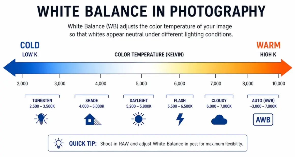
Color feels trustworthy only when the lighting and the camera agree on what neutral should look like. Good white balance keeps skin tones believable and prevents the scene from drifting toward orange, blue, or green in ways the viewer notices immediately. In this article I break down how the adjustment works, how different light sources push images off center, and how I choose a practical setting on set and in post without flattening the mood.
What matters most when color needs to look natural
- Light sources do not all share the same color, so the camera needs a reference point.
- Temperature is only half the story; tint can matter just as much, especially with LED and fluorescent fixtures.
- A neutral gray target usually gives a cleaner baseline than guessing from memory or using a random white object.
- Automatic mode is fast, but a fixed setting is usually safer when shots must match.
- RAW and flat video profiles give more recovery room, but they cannot rescue clipped highlights or bad mixed light.
- The best workflow is simple: set a base, shoot a reference frame, and recheck whenever the light changes.
Why different lights make the same subject look different
Every lamp has a color signature. The camera sees that signature even when your eye adapts to it, which is why a room can feel normal to you and still record with an obvious cast. I usually start by asking whether the scene is lit by one source or by several, because a single daylight source is easy to correct and a mixed room is where problems start.
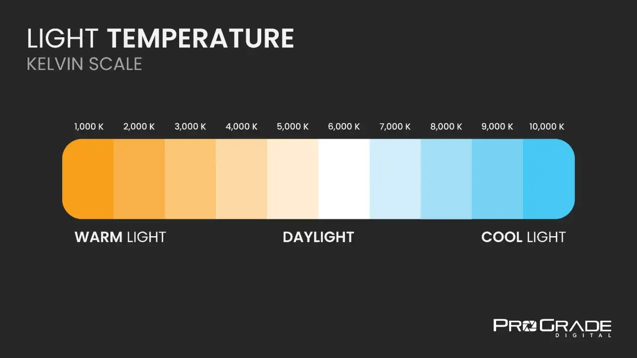
| Light source | Approximate color temperature | Typical look | What it means on set |
|---|---|---|---|
| Candle and warm practical lamps | 1800K-2200K | Very warm, amber-heavy | Often a creative choice; hard to make fully neutral |
| Household tungsten bulbs | 2700K-3200K | Warm and soft | Common indoors, but can make skin read too orange if unchecked |
| Studio tungsten fixtures | 3200K | Controlled warm light | Predictable if every source matches |
| Daylight and flash | 5200K-5600K | Neutral daylight | Useful baseline for many photo and video setups |
| Overcast sky or open shade | 6500K-8000K | Cooler and bluer | Often needs warming if you want a natural skin tone |
| Fluorescent or budget LED | Varies a lot | Can lean green or magenta | Temperature alone is not enough; tint matters here |
LED fixtures add one more wrinkle: the number on the box is only part of the story. A light can read as 5600K and still look slightly green or magenta if its spectrum is uneven. That is why CRI, which describes how faithfully a light renders color, and TLCI, which is aimed more at camera use, matter in practice and not just on a spec sheet. Once you understand the source of the shift, the choice of method becomes much simpler.
How I set the camera before the shot starts
I start with the look I want, not with a menu setting. If the scene needs to feel clean and believable for interviews, product shots, or branded content, I give the camera a neutral reference first and only then decide whether to warm or cool the scene creatively. That extra minute saves far more time later than trying to repair a bad base in the edit.
| Method | Best for | Main strength | Main limitation |
|---|---|---|---|
| Automatic setting | Run-and-gun shooting, events, quick B-roll | Fast and convenient | Can drift from shot to shot |
| Fixed Kelvin value | Controlled lighting, repeatable setups | Easy to match across takes | Needs judgment if the room changes |
| Neutral target or custom preset | Interviews, product work, studio scenes | Most consistent baseline | Adds a small setup step |
| Post-only correction | RAW-heavy workflows, rescue work | Flexible after capture | Less reliable if the original light was messy |
I prefer a neutral gray target over a bright white sheet because it gives the camera a safer reference and avoids clipped highlights. If I need a custom read, I place the target where the subject sits, not under the lens, because the light has to match the actual scene. That small discipline is what turns a guess into a repeatable workflow. With that base in place, the real question is when to let the camera keep adapting on its own.
When auto helps and when it gets in the way
Automatic mode is useful when the light keeps changing faster than I can react. At events, on documentary jobs, or while grabbing quick B-roll, it gives me something usable immediately. Where it falls apart is consistency: if the frame contains a red wall, a green stage wash, or a sunset window, the camera may chase the wrong neutral point and make adjacent shots feel mismatched.
- Use auto when speed matters more than perfect continuity.
- Use a fixed Kelvin value when the lighting is stable and you want matching shots.
- Use a custom reference when the subject color must stay faithful across angles.
- Avoid auto on interviews if you are cutting between camera angles or changing exposure mid-scene.
I treat auto as a convenience feature, not a default creative decision. Once continuity matters, I want the decision locked before the scene starts. That is where post-production enters, but it works best as backup rather than rescue.
Why post-production is the safety net, not the plan
RAW files give me more room because the camera stores more of the sensor data before aggressive processing is baked in. Flat video profiles help too; they preserve more room for grading later. That flexibility is useful, but it is not magic. If a channel is clipped, if a subject is contaminated by green spill from a wall, or if a mixed source changes from shot to shot, no slider can restore information that was never recorded cleanly.
| Problem | Usually fixable later? | What I look for |
|---|---|---|
| Overall warm or cool cast | Yes | Easiest to correct in RAW or flat footage |
| Slight green or magenta tint | Often | The tint slider usually helps more than temperature alone |
| Two shots taken under different lamps | Sometimes | Match them manually, then check skin and neutrals together |
| Clipped highlights | No | Lost detail cannot be rebuilt cleanly |
| Color spill from nearby surfaces | Partly | Fix the source if you can, then refine in the edit |
In editors like Lightroom or Premiere, temperature and tint are still the first controls I reach for because they solve the broad problem quickly. The eyedropper works well when the frame contains a genuinely neutral area, but it only helps if that area is actually neutral and not just close enough. When I have to choose, I would rather fix the light on set than chase perfection on a timeline. Even then, the most common mistakes happen before the edit starts.
The mistakes that make corrected color look fake
The most common mistake is correcting for neutrality when the scene is supposed to feel warm, cool, or moody. A restaurant interior does not need to look like a lab, and a sunset scene does not need to be stripped of its color because the numbers say it is wrong. I care about believable color, not sterile color.
- Relying on a shirt, wall, or ceiling as the reference instead of a neutral target.
- Ignoring tint and fixing only the blue-yellow axis.
- Mixing daylight, practical bulbs, and LEDs without deciding which source should dominate.
- Judging the image on an uncalibrated monitor, then wondering why the edit looks different elsewhere.
- Letting skin tones drift while the neutrals look technically perfect.
That last point matters more than beginners expect. If skin looks healthy and the scene reads naturally, the image is usually close enough even when a measurement tool says otherwise. The next step is to make that judgment repeatable from scene to scene.
The workflow I trust for consistent results
My working sequence is simple. First, I decide the emotional direction of the shot. Then I pick one dominant source as the reference, set the camera from that light, and shoot a quick reference frame before I move on. If the scene changes, I repeat the check instead of hoping the previous setting still fits.
- Decide whether the scene should read neutral, warm, or cool.
- Choose the main light source and reduce unnecessary mixed light if you can.
- Set the camera with a fixed value or a custom reference.
- Capture a neutral target in the same light as the subject.
- Save a reference frame for every new setup.
- Recheck whenever clouds, LEDs, gels, or practical lamps change the scene.
That sequence works in small productions as well as on larger sets because it is built around consistency, not gear. I can run it with a mirrorless camera and a gray card or with a multi-camera interview setup and still get the same benefit: less drift, fewer surprises, and faster matching in post. The last check is the one that keeps the whole process honest.
The final check that keeps a scene believable
Before I call the color finished, I look at three things: skin, neutrals, and continuity between shots. If those three line up, I know the viewer will read the image as natural even if the lighting is stylized. If one of them feels off, I fix it before export, because small color errors are much harder to forgive once the scene is in motion.
- Check the same subject under key light and fill, not just in one flattering frame.
- Compare adjacent clips side by side instead of judging each clip alone.
- Watch for green contamination from cheap LEDs and bounce surfaces.
- Keep a note of the reference setting if you plan to return to the same look later.
That is the habit that saves me the most time: I treat neutral color as part of lighting design, not as a cleanup chore. When the light is controlled first, the final image looks intentional without feeling processed.