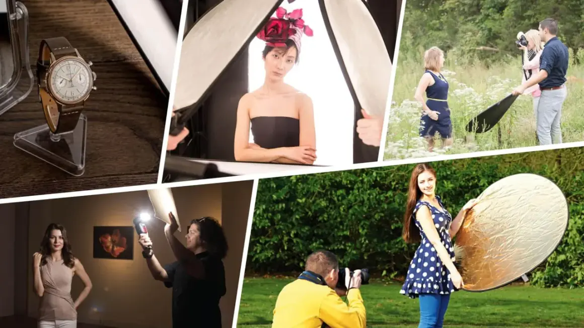
Bounce lighting is one of the fastest ways to make a scene feel softer and more deliberate without adding complicated gear. If you want to know how to use bounce lighting well, the answer starts with a simple idea: direct the source into a reflective surface so the subject receives a larger, gentler wash of light instead of a hard beam. In this article, I’ll cover surface choice, angle, color contamination, exposure adjustments, and the mistakes that usually separate a clean bounce from a messy one.
The fastest way to make bounced light work well
- Start with a clean, light-colored surface. White walls, ceilings, and reflectors are the safest default.
- Think in size and distance. A larger, closer bounce source usually gives softer light.
- Watch the color of the surface. Silver adds punch, gold warms skin, and colored walls can contaminate the scene.
- Use bounce lighting to control shadow shape, not erase shadows entirely. Flat light is usually the wrong goal.
- Re-meter or re-check exposure after bouncing. The reflected light is often weaker than the original source.
What bounce lighting actually changes in the image
When I bounce light, I am not just redirecting brightness. I am changing the effective size of the source, and that is what makes the light look softer. A small lamp or flash pointed at a wall becomes a much larger luminous area once the wall sends the light back toward the subject, so shadows spread out, skin looks less shiny, and the transition from highlight to shadow feels smoother.
That is why bounce lighting works so well for portraits, talking-head video, and product shots that need polish without looking overly staged. It also gives me more control over where the light lands, because I can aim the beam at a ceiling, a wall, or a reflector and let the reflected surface do the shaping. If the direct light feels too harsh, bounced light usually fixes the problem faster than adding more power or a bigger fixture. With that in mind, the first practical decision is the surface itself.
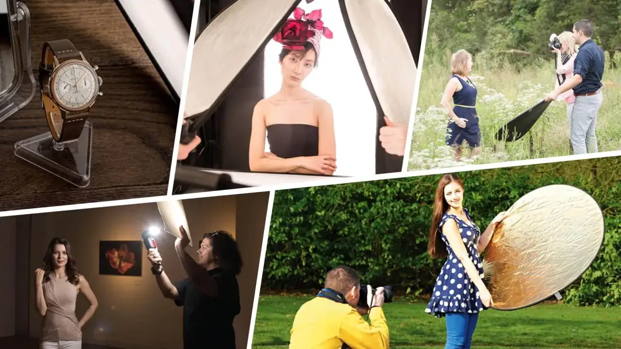
Choose the surface that shapes the result
I usually start by asking one question: what surface will give me the cleanest return without changing the color too much? White and neutral surfaces are the easiest to trust, because they keep the light soft and predictable. Silver gives me more punch when I need it, and gold is useful only when I actually want warmth baked into the image.
| Surface | Look | Best use | Watch out for |
|---|---|---|---|
| White wall or ceiling | Soft, neutral, broad | Portraits, interviews, natural-looking fill | Can pick up room color if the space is tinted |
| White reflector or foam board | Clean and controlled | Tabletop work, small sets, quick fill | Smaller coverage than a wall or ceiling |
| Silver reflector | Brighter and more contrasty | Outdoor daylight, when you need more output | Can create shiny highlights and specular sparkle |
| Gold reflector | Warm and flattering | Sunset portraits, skin that needs warmth | Easy to overdo and make the light look orange |
| Light-colored board or wall paint | Flexible and inexpensive | On-location setups, scrappy productions | Glossy paint or texture can create uneven reflections |
If I have only one tool in the bag, I prefer a white or silver 5-in-1 reflector, because it gives me enough control for most interview and portrait situations. The surface is only half the equation, though; the angle and placement decide whether the bounce looks intentional or accidental. Once the surface is right, the next step is the actual setup.
Set up a bounce-light shot step by step
I keep the setup simple so I can troubleshoot it fast. Here is the sequence I use most often when I am working with a flash, LED panel, or even window light.
- Point the source at the reflective surface, not at the subject.
- Place the subject close enough to receive the returned light, then move them or the bounce surface until the shadow shape looks right.
- Adjust the angle so the light returns from the direction you want, usually slightly above eye level for faces.
- Take a test frame and check exposure, catchlights, and shadow density.
- Open the aperture, raise ISO, or increase power if the bounced light is too weak.
- Fine-tune white balance if the wall, ceiling, or reflector adds a color cast.
A practical starting point is to move a reflector or bounce board within about 2 to 4 feet of the subject, then adjust from there. Closer usually means softer and stronger; farther usually means less influence and a more obvious falloff. The inverse square law still applies, meaning small distance changes can make bigger light changes than people expect. Catchlights are the small reflections in the eyes that keep a portrait from feeling dead, so I always check them before I call a setup done. After the setup works, the quality of the returned light matters more than the gear list.
Control softness, color, and contrast on purpose
Softness comes from apparent size. A large surface close to the subject behaves like a broad source, and that is what gives bounced light its flattering edge. If I want a face to keep some dimension, I do not chase the softest result possible; I aim for enough softness to smooth the shadows while leaving structure in the cheekbones, jaw, or product edges.
Color is the part that gets people into trouble. White gives the cleanest base, silver adds contrast and a slightly more specular, mirror-like look, and gold warms the scene. Silver can be useful on cloudy days or in dull interiors, but it is also the fastest way to make skin and shiny objects look too bright if I push it too hard. Gold can work beautifully in late-afternoon daylight, but indoors it can look artificial fast.
I also use negative fill when the bounce spreads too much light. A black flag, black fabric, or the dark side of a reflector does the opposite of bounce: it absorbs spill and restores shape. That sounds like a small move, but it often makes the difference between “lit” and “washed out.” Once you understand those controls, the next question is where bounce lighting actually earns its keep.
Use it where it helps most and avoid the setups that fight you
I reach for bounce lighting most often in three situations: small rooms, simple interviews, and portraits near a neutral surface. It is also useful for product demos, editorial food work, and event coverage when I need flattering light quickly and do not want the setup to distract from the scene. In branded content, that matters because the lighting should support the message, not steal attention from it.
| Situation | Why bounce helps | What to watch |
|---|---|---|
| Interview in a small office | Softens a single key light and keeps the shot natural | Low ceilings can flatten the face if the bounce is too high |
| Portrait beside a white wall | Turns the wall into a large fill source | Wall color can tint skin, especially near painted interiors |
| Product shot on a tabletop | Reduces hard shadows and glare on packaging | Glossy labels can still throw hot spots if the angle is wrong |
| Event or wedding reception | Quick, discreet, and forgiving in mixed light | Dark venues absorb light and can make bounce flash inefficient |
| Outdoor shade | Reflects daylight back into faces and eyes | Wind and movement can make handheld reflectors unstable |
There are also situations where I stop forcing the technique. If the room is dark, the wall is a saturated color, or the ceiling is too low and shiny, bounced light can become weak, muddy, or oddly directional. In those cases, a reflector may still work, but sometimes a different modifier is the more honest answer. The last thing I watch is the failure mode, because bounce light only looks effortless when the bad cases are handled early.
Avoid the mistakes that make bounced light look amateur
The biggest mistake is aiming the source at the subject and hoping the bounce will somehow improve it. That usually creates a harsh center, weak spill, and a light pattern that feels accidental. I also see people use a surface that is too small for the frame, which makes the light patchy and difficult to repeat from shot to shot.
- Do not ignore the color of the bounce surface. A beige wall may look harmless until skin takes on that tone.
- Do not bounce from too far away. The farther the light travels, the more output you lose.
- Do not flatten the face completely. Some shadow is useful because it gives the subject shape.
- Do not forget the background. Spill can brighten parts of the set that were supposed to stay quiet.
- Do not assume silver is always better. It is brighter, yes, but brightness is not the same thing as quality.
My quick fix is simple: if the image looks muddy, I switch to white first, move the bounce closer, and remove extra spill with a black flag if needed. If the image looks flat, I reduce the bounce size or shift the angle until the shadows come back. Those three moves solve most problems without turning the shoot into a technical detour. With the traps out of the way, the workflow becomes repeatable.
The workflow I keep on my own checklist when time is tight
When I am moving fast, I follow the same order every time: pick the cleanest surface, aim the source at that surface, check the return light on the subject, then shape the spill with distance or negative fill. That sequence keeps me from guessing, and it works whether I am lighting a face for a video interview or trying to clean up a product frame in a cramped room.
The simplest rule is also the one I trust most: bounce off the largest, most neutral, most useful surface you can find, then fine-tune with angle and distance until the light feels intentional. Once you know how to use bounce lighting, you can get a polished result with very little gear, as long as you respect the surface, the room color, and the fact that soft light still needs direction.