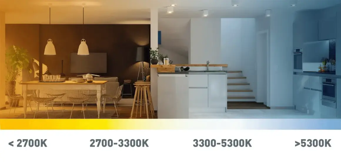
Kelvin is the fastest way to predict how a light source will feel in a room: warm and cozy, clean and neutral, or crisp and daylight-like. In practical terms, what does k mean in lighting? It points to color temperature, a standard way of describing whether a bulb leans amber or blue. That matters when you are choosing light for a living room, an office, or a camera setup, because the same brightness can still create a very different atmosphere.
Key takeaways on Kelvin and light color
- K stands for Kelvin, the unit used to describe correlated color temperature, or CCT.
- Lower numbers look warmer in the 2700K to 3000K range; higher numbers look cooler and more blue-white.
- Kelvin is not brightness. Lumens tell you how much light a bulb gives off.
- Kelvin is not color accuracy. CRI tells you how faithfully the light shows colors.
- Room function matters: relaxed spaces usually benefit from warmer light, while task-heavy or daylight-matched spaces often need cooler light.
- Consistency matters more than chasing extremes, especially in connected rooms and on camera.
What Kelvin actually measures in lighting
In lighting, the K stands for Kelvin, the unit used for correlated color temperature, or CCT. I think of it as a shorthand for the visual tone of white light, not the heat of the bulb itself. A lower number, such as 2700K, looks warmer and more yellow; a higher number, such as 5000K, looks cooler and more blue-white.
The scale exists because white light can be described against the appearance of a heated blackbody radiator. You do not need the physics to use it well, but the idea matters: the Kelvin rating tells you how the light will look, not how powerful it is. If you want to compare actual output, you still need lumens; if you want to know color accuracy, you need CRI.
The cleanest way to read Kelvin is as mood control for white light. It does not replace brightness, and it does not guarantee good color rendering. Once that distinction is clear, the rest of the buying decision gets much easier, and the next step is translating the number into a real room choice.
Common Kelvin ranges and what they feel like
The useful part of the scale is not the number alone, but the way it changes the atmosphere of a space. The U.S. Department of Energy groups warm light around 2700K to 3000K and cooler light around 3600K to 5500K, and that practical split is what most buyers actually feel when they compare bulbs side by side. Here is the range I reach for most often:
| Kelvin range | What it looks like | Typical use | What to watch for |
|---|---|---|---|
| 2200K to 2700K | Very warm, amber, candle-like | Bedrooms, decorative lamps, evening relaxation | Can feel too orange for task work or product photography |
| 2700K to 3000K | Warm white, familiar, soft | Living rooms, dining areas, hospitality spaces | Usually the safest choice for cozy interiors |
| 3500K to 4100K | Neutral white, balanced, clean | Kitchens, bathrooms, offices, multi-use rooms | Can look flat if the room already has cool finishes |
| 5000K to 6500K | Cool white, daylight-like, crisp | Task lighting, garages, studios, inspection work | Can feel harsh in relaxed spaces if overused |
These ranges are a starting point, not a law. Two bulbs labeled 3000K can still look slightly different because of the LED spectrum, the fixture, and the room around them. That is why I usually recommend judging Kelvin in context instead of treating the packaging as the final word. Those ranges are the anchor, but the room itself decides whether they feel right.
How Kelvin changes the look and feel of a room
Kelvin is doing more work than most people realize. Warm light tends to flatter skin tones, soften wood finishes, and make a room feel more intimate. Cool light increases contrast, makes whites look cleaner, and can help a room feel more alert and open.
That is why the same space can feel either relaxed or clinical depending on the bulb choice. A 2700K lamp in a bedroom usually reads as calm. A 5000K lamp in the same room can make everything feel sharper than necessary. In a kitchen or office, though, a cooler source can improve visibility where you are chopping, reading, or editing.
I also pay attention to layered lighting. If the ceiling lights are 3000K, the table lamps and under-cabinet lighting should usually stay close to that family unless there is a deliberate reason to separate them. Mixing 2700K and 5000K in the same sightline often creates the visual mismatch people describe as “off,” even when each fixture is technically fine. That is why Kelvin should be chosen alongside brightness, not in isolation, because the room is experienced as a whole.
Kelvin versus lumens and CRI
This is where a lot of buyers get stuck. Kelvin, lumens, and CRI solve three different problems, and none of them can replace the others.
- Kelvin tells you the color appearance of the white light.
- Lumens tell you how much light you are getting.
- CRI tells you how accurately that light renders colors.
A bulb can be 5000K and still disappoint if it has poor CRI. In that case, skin can look dull, fabrics can look muddy, and product colors can shift in ways you notice immediately on camera or in retail display work. On the other hand, a 2700K bulb with strong CRI can make a home feel rich and natural even if it is not especially bright.
This distinction matters a lot in the United States because many shoppers still buy by wattage out of habit. I would rather see someone buy by lumens first, then choose Kelvin for the atmosphere, then check CRI if the room depends on accurate color. That sequence avoids the most common disappointment: a bulb that is technically efficient but feels wrong the moment it is switched on. With that in place, the remaining step is matching the number to the way you actually use the space.
How I choose Kelvin for homes, offices, and camera work
When I am choosing bulbs for a room or a set, I start with the job of the space, not the packaging. A lighting choice should support behavior first and style second. The good news is that a simple rule works in most American homes and production environments.
For living spaces
Living rooms, bedrooms, and dining areas usually look best in the 2700K to 3000K range. That band feels welcoming and is easier on the eye in the evening. If a space is meant for winding down, I lean warmer rather than cooler.
For workspaces
Desks, kitchens, bathrooms, and reading corners often benefit from 3000K to 4000K. That range keeps contrast strong enough for task work without jumping all the way into the blue-white territory that can feel sterile. If the room is shared by multiple people with different preferences, neutral white is usually the safest compromise.
Read Also: Fashion Lighting Photography - Master Stunning Images
For video and content production
For camera setups, product photography, and small studios, I usually start near 5000K to 5600K when I want to mimic daylight or match a daylight-balanced source. That makes white balance more predictable and helps keep multiple fixtures consistent. If the room mixes natural daylight with artificial light, consistency becomes more important than the exact number on the box.If I had to reduce the whole decision to one sentence, I would say this: choose warm for atmosphere, neutral for balance, and cool for visual precision. That sounds simple, but a few mistakes can still ruin the result even when the Kelvin number looks right.
Mistakes that make good lighting look wrong
The biggest mistake is treating Kelvin like a quality score. Higher is not automatically better, and lower is not automatically more flattering. The right value depends on the room, the surfaces in it, and the job the light is supposed to do.
- Buying by Kelvin alone and ignoring lumens and CRI.
- Mixing very different Kelvin values in one visible area without a design reason.
- Using cool light in relaxing spaces where warmth would feel more natural.
- Using warm light for color-critical work where accurate viewing matters more than mood.
- Forgetting that fixtures change the result, because shades, lenses, and wall color all alter perception.
There is one more limitation worth naming: Kelvin describes white light, not every kind of decorative or RGB effect. If you are using colored accent lights, strip lights, or theatrical sources, the Kelvin rating may be only part of the story. Dimming also changes perception, and some products are designed to shift warmer as they dim. That is useful in homes, but it can be a headache if you expect every LED to behave like a fixed incandescent lamp. A simple rule-of-thumb keeps the whole process from becoming overcomplicated.
The simplest rule for choosing a Kelvin range
If you want the short version I use in practice, start here: 2700K to 3000K for relaxed rooms, 3000K to 4000K for mixed-use spaces, and 5000K or above for task-focused or daylight-matched work. Then check whether the fixture’s CRI is strong enough for the room’s purpose and whether the lumen output is high enough for the size of the space.
For most homes, I would rather choose a slightly neutral bulb with good color quality than chase an extreme warm or cool look. For content creation, I would rather keep every source consistent than use a range that looks interesting on paper but creates white-balance headaches on camera. The Kelvin number is small, but it shapes how a room feels, how colors appear, and how well the light supports the job you need it to do.
That is the real answer behind Kelvin in lighting: it is not just a technical label, it is one of the quickest ways to control mood, clarity, and visual consistency without changing the room itself.