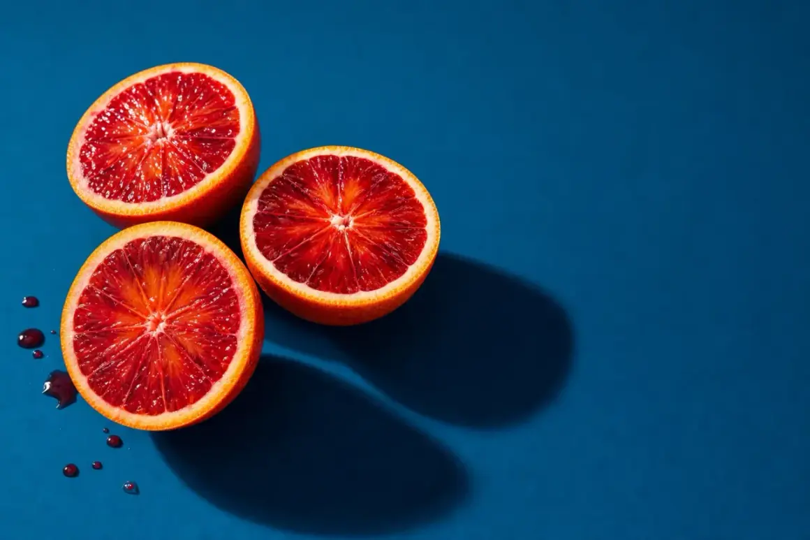
Fruit is one of the easiest subjects to place in front of a lens and one of the easiest to make look ordinary. The strongest images keep the color believable, the texture readable, and the shape intentional, whether the goal is a clean ecommerce frame, a moody still life, or a bright editorial spread. In this guide, I break down the looks that work, how I choose and prepare the produce, which light and settings I start with, and how I edit without making the fruit look artificial.
The fastest way to make fruit look purposeful
- Decide first whether the image should feel commercial, editorial, moody, or casual, because the styling changes with the use case.
- Use soft, directional light whenever you want texture and color to stay believable.
- Pick fruit that is fresh enough to survive close inspection, then shoot cut pieces before they dry out or brown.
- Keep the composition simple: one hero fruit, one or two supporting pieces, and enough negative space to let the shape breathe.
- Edit for cleanliness and freshness, not for plastic shine or oversaturation.
Choose the look before you build the set
I rarely start by thinking about the camera. I start by deciding what the viewer should feel: premium, rustic, fresh, playful, or clinical. That decision matters because the same apple can read like a luxury product, a recipe ingredient, or a social media post depending on the lighting, background, and crop.
For brand work, I usually separate fruit imagery into a few practical styles. Each one solves a different visual problem, and mixing them without intent is where many shoots start to look confused.
| Style | Best use | Lighting approach | Composition cue | Main risk |
|---|---|---|---|---|
| Clean commercial | Ecommerce, packaging, hero banners | Soft window light or a large diffused source | Simple spacing, clean edges, minimal props | Looks flat if the light is too even |
| Moody still life | Editorial spreads, premium branding, seasonal campaigns | Directional light with controlled shadows | Asymmetry, dark background, strong contrast | Can lose freshness if the shadows get too heavy |
| Macro detail | Texture studies, close-up product storytelling | Diffused light with careful focus control | Slice, peel, dew, seeds, surface detail | Depth of field becomes too thin too quickly |
| Overhead flat lay | Recipe content, social graphics, listicles | Even light from above or slightly off-axis | Patterns, circles, repeating shapes | Looks generic if every prop is purely decorative |
| Lifestyle frame | Kitchen scenes, market stories, human-centered content | Natural window light with relaxed contrast | Hands, cutting boards, linens, utensils in use | Clutter can overwhelm the fruit |
That table is how I narrow the brief before I touch the fruit. Once the style is clear, the next job is to choose produce that can actually carry the image, because even the best light cannot rescue tired fruit.
Start with fruit that can hold up on camera
Fruit selection is not just about color. It is about skin quality, firmness, moisture, and how long the subject will stay attractive under lights. Apples, pears, citrus, grapes, cherries, berries, figs, and kiwi all behave differently, and the wrong choice can turn a polished setup into a race against bruising or oxidation.
I usually choose fruit in this order: first by purpose, then by shape, then by color. If the frame needs structure, I reach for apples, pears, citrus, or grapes. If it needs softness and delicacy, I lean toward berries, cherries, or sliced stone fruit. If I want drama, I use a mix of whole and cut fruit so the viewer sees both the exterior and the interior texture.
What I inspect before the shoot
- Skin and surface: I look for bruises, soft spots, and wrinkles, especially on peaches, plums, and berries.
- Color consistency: I avoid fruit with uneven ripening unless that variation is part of the story.
- Shape: Slightly irregular fruit can be beautiful, but only when the composition is balanced enough to support it.
- Fresh cut potential: Apples, pears, avocados, and bananas need a plan if they will be sliced on camera.
- Moisture control: Too much condensation looks messy, while too little can make fruit seem dry and old.
For cut fruit, timing matters. I shoot whole pieces first and sliced pieces last, because exposed surfaces change quickly. Apples and pears begin to brown almost immediately, bananas darken fast, and berries lose firmness if they sit too long in warm air. A quick splash of citrus water can slow oxidation on some fruit, but I use it carefully; too much liquid can soften the color and create a washed-out look. Once the fruit is ready, the quality of the light becomes the deciding factor.
Use light to show texture, not just brightness
Light is doing more work than the camera. Soft directional light gives fruit its shape, reveals pores on citrus skin, and keeps translucent pieces like grapes or orange slices from looking dead. Flat light may be safe, but it often strips out the very texture that makes fruit appealing.
The easiest place to start is a large window with indirect daylight. I place the set close to the window, then use a reflector or white card on the opposite side to lift the shadows just enough. If the scene still feels dull, I move the light slightly behind the fruit so the edges glow. Backlight can be especially effective for slices, berries in a glass bowl, or any fruit with moisture or translucency.
| Situation | Starting settings | Why it works | Notes |
|---|---|---|---|
| Window light on a tripod | f/4 to f/5.6, 1/125s or faster, ISO 100 to 400 | Easy balance between sharpness and soft background separation | Great for natural-looking still life frames |
| Directional backlight | f/5.6 to f/8, 1/160s or faster, ISO 100 to 200 | Shows translucency and gives slices a clean glow | Use a diffuser so highlights do not blow out |
| Controlled softbox setup | f/8 to f/11, 1/125s, ISO 100 | Reliable for consistent series and commercial work | Ideal when the shoot must match across multiple frames |
| Macro detail or stacked focus | f/8 to f/16, 1/160s or faster, ISO 100 to 400 | Helps keep a larger part of the fruit sharp | Focus stacking means blending several focused frames into one image |
A tripod makes this much easier, especially if you need consistency across a series. I also like a diffuser, a small reflector, and a black card for negative fill, which is simply a way of removing light to deepen shape. That control is what separates a clean fruit image from a random snapshot, and it leads directly into composition.
Compose for shape, color, and a clean edge
Fruit is visually powerful because it already has strong geometry: circles, curves, wedges, seeds, stems, and repeating patterns. The composition should amplify that structure instead of fighting it. I usually build the frame around one clear idea, then strip away anything that competes with it.
One hero fruit and one or two supporting pieces are often enough. A pile of seven different fruits sounds lively in theory, but in practice it can flatten the story unless the shoot is about abundance. The more commercial the use case, the more I simplify. The more editorial or artistic the brief, the more I can afford to experiment with asymmetry, fragments, and negative space.
Practical composition rules that actually help
- Use one dominant color family: Reds with warm neutrals, greens with pale stone, or citrus with dark wood usually read cleanly.
- Give the fruit room: Negative space helps the eye settle, especially when text will sit on top of the image later.
- Think in angles: Straight-on shows height, 45 degrees shows volume, and overhead shows pattern and arrangement.
- Respect the crop: Crop intentionally so stems, cut edges, and slices do not feel accidentally clipped.
- Use props only when they explain the scene: Linen, ceramic, glass, knives, and boards should support the story, not decorate it for its own sake.
If I am photographing fruit for a brand, I also think about where the image will live. A square or vertical crop often performs better on mobile feeds, while wide compositions are better for banners and editorial layouts. The frame should feel complete even before copy or design is added, because that is what makes the image flexible later. After the composition is set, the final job is to edit with restraint.
Edit for freshness, not gloss
Post-production should make the fruit look clean, not fake. I usually work from a RAW file, correct white balance first, then adjust exposure and contrast before touching color. That order matters because fruit skin is unforgiving; if the color balance is wrong, saturation sliders only make the problem louder.
The most useful edits are often small. A gentle tone curve can add depth without crushing shadows. A subtle HSL correction can tame an orange that went too neon or a strawberry that turned too magenta. Local cleanup can remove a distracting bruise or a stray crumb, but I keep surface texture intact because fruit should still feel real.
Read Also: Insect Photography - Beyond Gear: Master Macro Shots
What I fix, and what I leave alone
- Correct: white balance, uneven exposure, distracting dust, and minor blemishes that do not define the fruit.
- Reduce: oversaturated reds, clipped highlights on shiny skins, and harsh clarity that makes the surface look crunchy.
- Keep: natural pores, tiny irregularities, seeds, and moisture where it adds to freshness.
- Export thoughtfully: use sRGB for web delivery, and keep enough resolution for zoom or crop flexibility if the image will support ecommerce or campaign use.
For web work, I usually prepare at least two versions: one optimized for fast loading and one larger master file for future crops or print adaptation. That habit saves time later, especially when a client suddenly wants the same image in a vertical layout for social. Good editing makes the asset more usable, but bad shooting choices still show up quickly, which is why the next section matters.
Watch for the mistakes that make fruit shots look amateur
The most common problems are not technical. They are judgment errors. People often overcomplicate the scene, use fruit that is already past its peak, or light the setup so evenly that every surface becomes lifeless. Once you know what to look for, the fixes are straightforward.
- Too many fruit types: Mixing apples, berries, citrus, and tropical fruit in one frame can feel unfocused unless the concept is abundance or market variety.
- Hard overhead light: Strong top light flattens round fruit and makes skin texture harder to read.
- Wet surfaces everywhere: Too much spray or condensation can look theatrical in the wrong way.
- Overediting saturation: If the color is pushed too far, the fruit starts to look synthetic instead of fresh.
- Ignoring the background: A beautiful peach can still look cheap against a noisy or clashing surface.
- Shooting too slowly: Cut fruit changes quickly, and hesitation often shows up as browning, drying edges, or collapsing garnish.
I also see a lot of images that try to be both a product shot and an artistic still life, and the result is usually neither. If the image needs to sell, it should feel clear. If it needs to inspire, it can be more atmospheric. That distinction saves time, and it leads naturally to a workflow that keeps the process repeatable.
A workflow I trust when the image has to do real work
When I need a fruit image to be reliable for a brand, I follow the same basic sequence every time. First I define the use case and crop. Then I choose one color direction and one visual style. After that I prepare the fruit, set the light, and shoot a tight set of variations instead of trying to invent the whole composition on the fly.
- Choose the delivery format first, such as square, vertical, or wide.
- Pick one hero fruit and no more than two supporting pieces unless the concept clearly calls for more.
- Clean, dry, and cut only what can be photographed before it starts to look tired.
- Set the light before arranging props so the scene responds to the illumination, not the other way around.
- Capture at least three framings: a wider scene, a tighter crop, and one detail frame.
- Review highlights, shadows, and edges at full size before moving on.
- Edit lightly, export in the right aspect ratio, and keep a master file for later reuse.
That approach is simple, but it scales well. It works for a lone pear on a linen cloth, a row of citrus slices for a recipe blog, or a polished campaign image for a food or wellness brand. The point is not to make the setup elaborate; it is to make every decision support the fruit itself. When that happens, the image feels fresh, clear, and easy to trust.