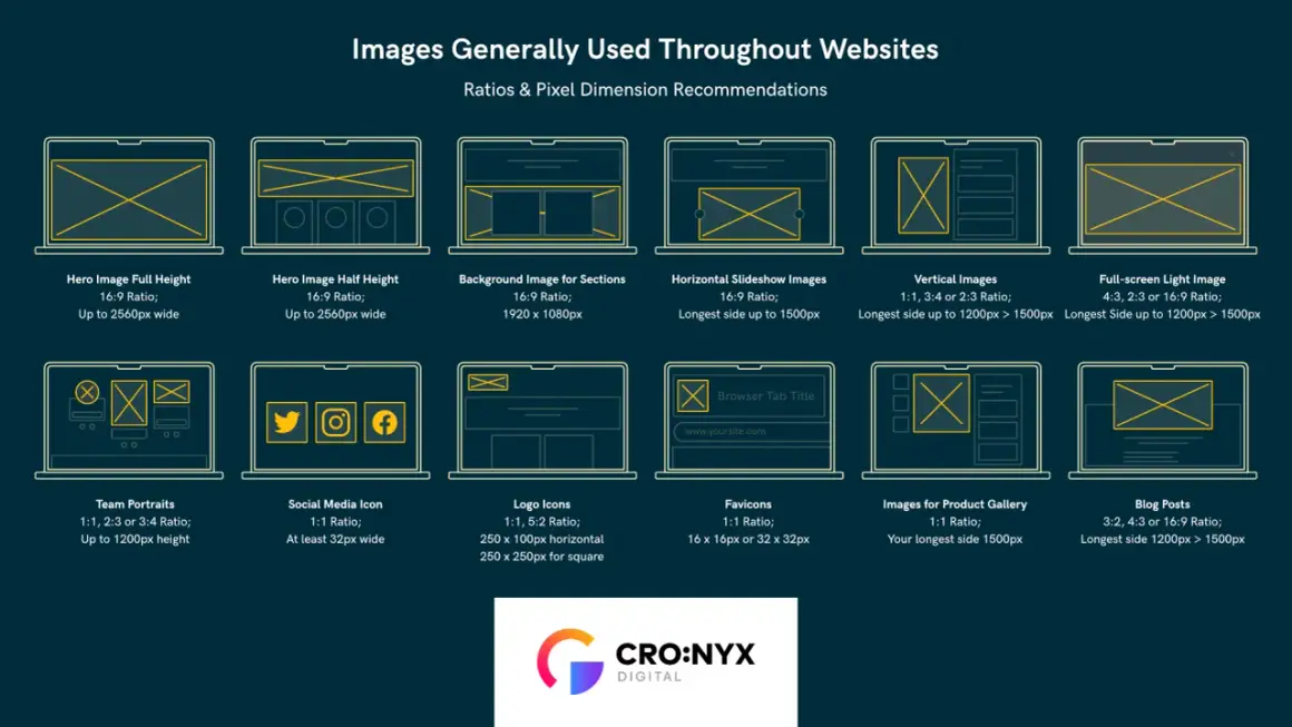
Choosing the right landscape image size is mostly a decision about destination, not aesthetics. The same frame that looks perfect on a website hero banner can fail badly in an 8x10 print, which is why landscape photo dimensions have to be tied to aspect ratio, pixel count, and intended viewing distance. In this guide, I break down the common sizes I use, the print conversions that actually matter, and the export choices that keep files sharp without bloating them.
The fastest way to choose the right size is to start with the output
- Pick the aspect ratio first: 3:2 for most cameras and prints, 16:9 for wide screens, 4:3 for a slightly taller frame.
- For web use, width matters more than PPI; 1600 to 1920 px wide covers most full-width landscape placements.
- For print, multiply the intended inches by the target PPI. For close viewing, 300 PPI is the safest baseline.
- Standard U.S. print sizes such as 4x6, 8x10, 11x14, and 16x20 are easiest to frame, but some crops need trimming.
- Upload a source file larger than the display size, then serve smaller versions with responsive image settings.
The fast answer is that ratio matters before pixels do
I always start with the shape of the image, because that decision determines everything that follows. Aspect ratio is the width-to-height relationship, while pixel dimensions are the actual file size in pixels; a 3:2 file can be tiny or enormous, but it still keeps the same shape. That distinction is the part many people miss, and it is the reason one image can feel natural in a print frame while another needs a heavy crop.
| Ratio | How it feels | Best use cases |
|---|---|---|
| 3:2 | Balanced and familiar | Most cameras, general-purpose prints, editorial photography |
| 4:3 | Slightly taller and calmer | Balanced compositions, content blocks, some tablets and screens |
| 16:9 | Wide and cinematic | Hero banners, headers, video thumbnails, modern displays |
| 2:1 | Panoramic | Seascapes, mountain ridges, skyline strips, dramatic vistas |
For landscape work, I usually think in terms of shape first and resolution second. Once the crop is right, the next question is how many pixels you actually need for the screen or print that will carry the image.
Pixel counts that work for web pages and social placements
For online use, I care less about the old PPI label and more about the actual rendered width. Browsers display by pixels, not by the print metadata hidden in the file, so a landscape image that is too small will look soft no matter what number sits in the metadata field. If the image may appear on large monitors or Retina screens, I prefer to upload a source that is larger than the displayed size and let the site serve the right version.
| Use case | Recommended pixels | Why I use it |
|---|---|---|
| Full-width blog hero | 1920 x 1080 px | Clean 16:9 shape for large screens and banner-style placements |
| Standard content image | 1600 x 900 px | Enough detail for responsive layouts without wasting too many bytes |
| Editorial landscape image | 1800 x 1200 px | Natural 3:2 framing that still holds up in print previews |
| Link preview card | 1200 x 630 px | Common landscape format for social and messaging previews |
| Wide panoramic strip | 2400 x 1200 px | Useful when the scene needs extra width but not a full panorama |
If a layout only shows the image at 900 px wide, I usually keep a 1800 px source and let the browser scale it down. That gives me room for responsive delivery, which matters in marketing sites where the same image may appear in a desktop hero, a tablet column, and a mobile stack.
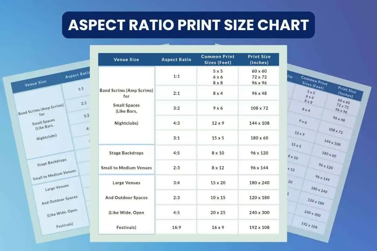
Print sizes that frame cleanly in the United States
Print is where the numbers become less forgiving. For close viewing, 300 PPI is still the safest baseline, though larger wall prints can often live with less because people stand farther away from them. The key is to match the pixel count to the final paper size instead of hoping the printer will rescue a file that was never large enough in the first place.
| Print size | Native ratio | Pixels at 300 PPI | What it suits |
|---|---|---|---|
| 4 x 6 in | 3:2 | 1800 x 1200 px | Albums, casual prints, postcards |
| 5 x 7 in | 7:5 | 2100 x 1500 px | Gift prints and small frames |
| 8 x 10 in | 5:4 | 3000 x 2400 px | Common framed print, but it needs a crop from most camera files |
| 11 x 14 in | About 1.27:1 | 4200 x 3300 px | Office walls, hallways, compact statement pieces |
| 12 x 18 in | 3:2 | 5400 x 3600 px | One of the cleanest landscape print sizes for most DSLR and mirrorless files |
| 16 x 20 in | 4:5 | 6000 x 4800 px | Larger wall art, with a crop that is not native to most cameras |
| 16 x 24 in | 3:2 | 7200 x 4800 px | Gallery-style landscape prints with very little compromise |
| 20 x 30 in | 3:2 | 9000 x 6000 px | Large wall display for landscapes with enough source detail |
I like the 3:2 family because it lines up with so many camera sensors and U.S. print sizes. When the print gets bigger, I care even more about whether the image holds detail in the shadows, the sky, and any fine texture in trees, water, or stone, because those areas show softness first.
Different subjects need different crops
The subject itself changes the best dimensions more than people expect. A misty mountain range, a downtown skyline, and a real estate exterior may all be horizontal photographs, but they do not want the same crop because they are asking the viewer to pay attention to different parts of the frame. I usually choose the ratio that protects the story of the scene, not the one that simply looks trendy.
| Subject or style | Best-fit ratio | Why it works |
|---|---|---|
| Wide seascapes and open fields | 16:9 or 2:1 | These scenes need breathing room, especially when the horizon is the main visual anchor |
| Mountains and travel scenes | 3:2 | It keeps foreground, midground, and sky in balance without making the file feel too skinny |
| Architecture and city skylines | 3:2 or 16:9 | Taller structures can feel cramped in extra-wide crops unless the framing is very deliberate |
| Real estate exteriors | 3:2 | It is flexible across MLS, brochures, and website listings |
| Outdoor portraits with a scenic background | 4:3 or 3:2 | These ratios give the subject enough room without turning the landscape into a thin strip behind them |
| Editorial headers and ads | 16:9 or 1.91:1 | Text overlays, crops, and responsive layouts are easier to manage in wider frames |
The tradeoff is simple: the wider you go, the more foreground and sky you can lose; the taller you go, the less panoramic the scene feels. I would rather preserve the emotional read of the photo than force it into a shape that fights the subject.
Export choices that keep detail without bloating the file
Good dimensions still fall apart if the export process is sloppy. I avoid stretching an image to fit a container, and I never assume one large file will behave well everywhere. Instead, I prepare a master crop, resize for the destination, and export separate versions for print, web, and social so each one does its job cleanly.
- Crop first, resize second. Lock the composition before you downsize the file.
- Use sRGB for web delivery so colors stay consistent across most browsers and devices.
- Export at about 75 to 85 quality for JPEGs when speed matters, or use WebP when the site supports it.
- Keep the source file larger than the display size, especially for responsive layouts and high-density screens.
- Sharpen after resizing, not before, because output sharpening behaves differently at final dimensions.
- Set width and height attributes, or an aspect ratio, so the layout reserves space before the image loads.
In practice, I like to think in tiers: one master file, one web-optimized version, and one print-ready version. That structure is boring in the best way, because it saves time and avoids the weird softness that shows up when a CMS starts resizing files behind your back.
The mistakes that make a good landscape look unfinished
Most bad results come from a handful of avoidable errors rather than from the photo itself. I see the same ones repeatedly: people confuse pixels with inches, they stretch instead of crop, or they export a file that is technically “high resolution” but still too small for the job. The picture may still look acceptable on a phone, but the flaws show up fast on a monitor or in print.
- Using one exact size for every platform.
- Assuming a 72 PPI tag makes a file web-ready.
- Upscaling a low-resolution photo and expecting true detail to appear.
- Cropping too aggressively and removing the visual anchor of the scene.
- Ignoring safe space for captions, logos, or UI overlays.
- Overcompressing the file until skies, water, or foliage start to break apart.
My rule is to protect the image first and optimize it second. If I have to choose between a slightly larger file and a visibly damaged one, I take the larger file every time, because compression is easy to tune later and lost detail is not.
The simplest rule I use before I publish or print
If I had to reduce the whole process to one workflow, it would be this: choose the ratio for the destination, then choose the pixels for that destination, then export a second version if the image needs to live somewhere else too. That sequence keeps the composition honest and prevents the endless cycle of resizing a file after the fact.
For most landscape work, I get the best results by keeping a clean 3:2 master, creating a 16:9 crop for banners or headers when needed, and preparing a print version only after I know the final paper size. That approach covers most practical uses without forcing every scene into the same mold, and it is the simplest way I know to make landscape images look intentional on screen and on paper.