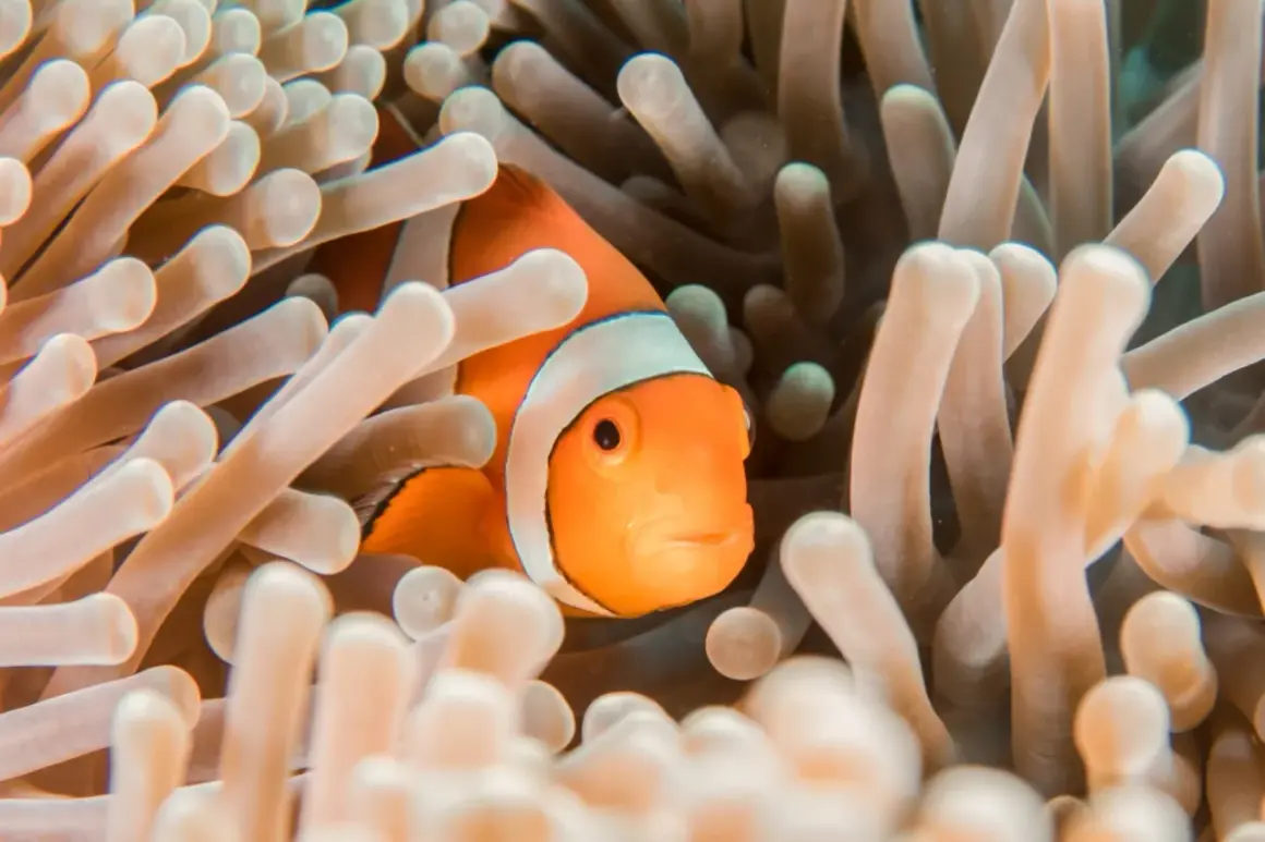
Strong aquarium photos are rarely about the fish alone. The best ones balance subject, glass, light, and timing so the frame feels clean rather than busy. In this article, I focus on the styles that work, the subjects worth chasing, and the shooting choices that make the difference between a flat snapshot and an image with real intent.
The practical takeaways that matter most
- Reflections are the main enemy, so glass position and room light matter as much as camera settings.
- The most useful subjects are single fish portraits, schooling behavior, coral or plant textures, and full-tank environmental shots.
- The strongest styles usually fall into four buckets: documentary, portrait-like, wide environmental, and abstract detail-led frames.
- Good starting settings are often around 1/125 to 1/500 s, f/2.8 to f/5.6, and ISO 800 to 3200, adjusted to the tank.
- For web and social use, choose images with clear composition and enough negative space to survive cropping.
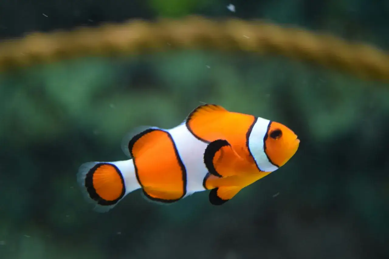
Why aquarium scenes are harder than they look
I usually read an aquarium frame as a three-way negotiation between the animal, the glass, and the room around it. That is why a scene can look vivid to the eye and still fall apart in camera: reflections creep in, autofocus hunts, and the light inside the tank may be too dim for the motion you want to freeze. The intent behind this topic is mostly visual and practical, not abstract; people want to know what to photograph, how to photograph it, and how to make the result feel polished enough to use.The search pattern is consistent with that. Image-heavy results tend to reward clean full-tank views, isolated animal portraits, and scenes where the background does not fight the subject. In other words, the reader is usually looking for inspiration, but they also need enough technique to turn that inspiration into a usable image. Once that goal is clear, the subject choice becomes much easier to make.
Subjects that carry the frame
Not every aquarium scene needs a heroic wide shot. In fact, some of the most useful frames are the small ones, because they isolate texture, motion, or behavior in a way that reads immediately. I think about aquarium subject matter in layers: what gives the image a clear focal point, what adds context, and what distracts from both.
- Single fish portraits work best when the species has strong shape, color, or eye detail. They are simple, but not boring when the lighting is controlled and the background stays soft.
- Schooling behavior adds motion and rhythm. This subject is less about one perfect animal and more about spacing, repetition, and direction inside the frame.
- Coral, plants, and texture details are ideal for close work. They turn the tank into a pattern study and are especially useful for editorial or educational use.
- Tank architecture matters more than many beginners expect. Rocks, driftwood, sand lines, bubbles, and filtration elements can create structure and give the image a sense of place.
- Human context can be powerful when the goal is storytelling. A keeper adjusting the tank, a visitor pointing through the glass, or a silhouette against the blue glow changes the image from a record shot into a scene.
- Reflection-based frames are a special case. Used deliberately, they can add atmosphere. Used carelessly, they just look messy.
My rule is simple: if the subject does not read in one or two seconds, I either tighten the composition or change the subject. After subject choice comes style, and style determines how that subject will feel on the page or screen.
Styles that fit aquarium scenes
I do not treat aquarium photography as one style. I treat it as a set of visual approaches, each with a different job. A clean, documentary image is useful for educational content. A portrait-like frame is better when color and personality matter. A wide environmental shot helps if the tank design itself is part of the story. The choice should follow the purpose, not just the moment.
| Style | Best subjects | What it does well | Main trade-off |
|---|---|---|---|
| Documentary | Natural behavior, full tanks, keeper activity | Feels honest and informative | Can look plain if the light is weak |
| Portrait-like | Single fish, invertebrates, standout species | Highlights detail and personality | Requires patient focus and clean glass |
| Environmental wide shot | Aquascapes, reef displays, habitat-style tanks | Shows scale, design, and mood | Background clutter becomes more obvious |
| Abstract detail-led | Bubbles, coral texture, light ripples, reflections | Creates atmosphere and pattern | Can lose clarity if the composition is too loose |
If I am making images for a brand or publication, I usually avoid mixing all four styles in one set unless I have a clear editorial reason. Consistency matters because viewers need to understand the visual language quickly. Once the style is fixed, the technical side becomes a lot more manageable.
How to get cleaner exposure and focus
This is where most aquarium images improve or fail. I rarely start with a flash, because flash at the glass usually creates glare and makes the water feel flat. Instead, I work with the tank’s own light, control the room, and push the camera settings only as far as the situation allows.
| Starting setting | Useful range | Why I start there |
|---|---|---|
| Shutter speed | 1/125 to 1/500 s | Fast enough to tame moving fish without making the frame unusably dark |
| Aperture | f/2.8 to f/5.6 | Gives enough light while keeping a usable depth of field |
| ISO | 800 to 3200 | Usually the practical range when tank light is limited |
| Focus mode | Single point or continuous AF | Depends on whether the subject is still or moving erratically |
- Get close to the glass so the camera sees through it instead of at it. That alone often cuts reflections.
- Turn off competing light sources in the room if you can. Side light from windows, lamps, and bright walls often shows up in the glass.
- Shoot in bursts of 3 to 8 frames when the fish is active. One-frame timing is usually a bad bet.
- Expose for highlights if the subject has bright scales, coral tips, or white markings. Recovering shadows is usually easier than recovering blown detail.
- Use a polarizer only when the light budget allows it. It can help, but it also steals light, so it is not a free fix.
I also prefer RAW capture here. Aquarium light can swing from cool blue to oddly green in the same frame, and RAW gives you a better chance of correcting color without making the image look brittle. Once the exposure is under control, the usual mistakes become much easier to spot.
The mistakes that make tank images look flat
Most weak aquarium shots do not fail because the camera was bad. They fail because the photographer ignored one of the three hard parts: reflection, motion, or clutter. The fixes are not glamorous, but they work.
- Shooting through dirty or scratched glass softens the entire frame. Clean the viewing surface first, not after you are already annoyed by the results.
- Using flash straight into the tank flattens depth and creates hard glare. It also makes the whole scene look less natural.
- Standing too far back and cropping aggressively throws away detail. If you know you will need a close-up, move closer and frame it properly.
- Ignoring the room behind you is a common beginner mistake. The camera does not care that the scene looked good to your eye; it records every reflection and bright object.
- Trying to force every subject into one style usually dulls the series. A moving fish needs a different approach from a planted scape or a reef texture.
- Chasing motion instead of waiting for behavior wastes good light. In many cases, patience produces a far stronger frame than rapid-fire button pressing.
If I had to reduce this to one point, it would be this: most aquarium scenes improve when you simplify, not when you add more gear or more effects. That matters even more when the image has to live on a site, in a campaign, or inside a social feed, because usage changes what counts as a strong frame.
Choosing frames for web, social, and editorial use
The right aquarium image depends on where it will appear. A homepage banner, a social post, and an editorial feature all ask different things of the picture. I treat that as a composition problem first and a style problem second.
- For web headers, I want a wide frame with obvious negative space. The image has to leave room for text without losing the subject.
- For social media, I usually prefer a single bold subject or a tight cluster of motion. Vertical crops tend to perform better when the subject has a strong shape.
- For editorial use, context matters more. A keeper, a visitor, a sign, or a visible environment detail helps the story feel grounded.
- For portfolio work, I usually include one frame that is clean and commercial and one that feels more personal or experimental. That mix shows range without looking scattered.
- For marketing teams, readability wins. The image should be easy to crop, easy to understand, and not so specific that it becomes unusable across placements.
Adobe Stock and similar libraries reflect the same reality: the images that stay useful are usually the ones with clean composition, strong subject separation, and minimal visual noise. That is not an accident; it is the result of images being designed for reuse, not just admiration. When I build a set, I think about that from the first frame, not as an afterthought.
The shot list I would build before leaving the aquarium
When I need a complete set, I do not rely on luck. I build the series in a deliberate order so I leave with a mix of utility and character. If you are working fast, this is the sequence I would use: one wide establishing frame, one close portrait, one behavior shot, one detail crop, and one image that includes the environment or the people around it.
If you are building aquarium photos for a site, portfolio, or campaign, that sequence gives you coverage without wasting time. It also makes the edit easier because the set will naturally include both safe frames and more expressive ones, which is usually the right balance for visual media work.