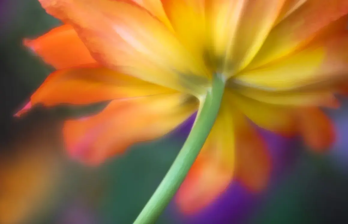
Flower photography works best when I treat it as a study in light, shape, and restraint. A strong bloom image is usually simple on purpose: one subject, a supportive background, and focus placed on the petals that carry the story. In this guide, I cover the practical choices that matter most when learning how to photograph flowers, from style and lighting to framing, settings, editing, and the mistakes that quietly weaken the shot.
The fastest way to make flower photos look intentional
- Shoot in soft light, ideally early morning, late afternoon, open shade, or light filtered through clouds.
- Choose one clear subject and let the background stay quieter than the flower itself.
- Use a wide aperture for isolation and a smaller aperture when you need more petal detail.
- Watch the edges of the frame, not just the center, because clutter usually hides there.
- Use a tripod, brace your camera, or raise shutter speed when wind makes sharpness fragile.
- Edit for natural color and texture, not for glossy, overprocessed perfection.
Choose the flower portrait you actually want
Before I touch the camera settings, I decide what kind of flower image I want to make. A single bloom with a soft background, a close macro detail, and a wider garden scene all ask for different choices. If I do not make that decision early, the final frame often feels undecided, as if it could not settle on a subject.
| Style | Best use | Typical look | Good starting approach |
|---|---|---|---|
| Close-up portrait | A hero flower with strong shape or color | Soft background, clear subject separation | Use a longer focal length, open aperture, and step back enough to simplify the background |
| Macro detail | Petal veins, pollen, dew, texture, and tiny structures | Very shallow depth of field, highly detailed subject area | Use a macro lens or close-focus lens, manual focus, and a tripod if possible |
| Environmental scene | Flowers in a garden, meadow, or natural setting | More context, more sense of place | Keep the frame balanced and leave enough depth of field for the subject and story |
| Minimal still life | Controlled indoor setups or editorial work | Clean shapes, deliberate negative space | Use a simple surface, controlled light, and remove every distraction you do not need |
I like to choose the style first because it tells me what to leave out. A macro frame rewards texture, while a garden portrait rewards atmosphere. Once that is clear, light and composition become easier to judge, which is the next piece I pay attention to.
Light does most of the work
Light is the difference between a flower that looks flat and a flower that feels alive. I almost always start by looking for softness rather than brightness. Early morning, late afternoon, open shade, and lightly overcast skies give petals a gentler transition from highlight to shadow, which keeps color and texture intact.
Harsh midday sun is the one condition I avoid whenever I can. It creates hard edges, shiny highlights, and dark shadows that make petals look clipped or tired. If that is all I have, I move the flower into shade, use a diffuser, or change my angle until the light becomes more usable. A simple reflector can also help by bouncing light back into the darker side of the bloom.
Backlight can be beautiful for translucent petals, especially on pale roses, tulips, and blossoms with visible veins. It gives the flower a soft glow, but it can also wash out highlights quickly, so I keep a close eye on exposure. In practice, I would rather protect detail in the petals and lift the exposure slightly later than lose the bright areas entirely.
- Soft side light reveals texture without making the petals look harsh.
- Backlight can make the flower glow, but it needs careful exposure control.
- Cloud cover often acts like a giant diffuser, which is ideal for beginners.
- Window light works well indoors if it is filtered and not blasting directly onto the subject.
Once the light is under control, the next challenge is shaping a frame that feels intentional rather than crowded.
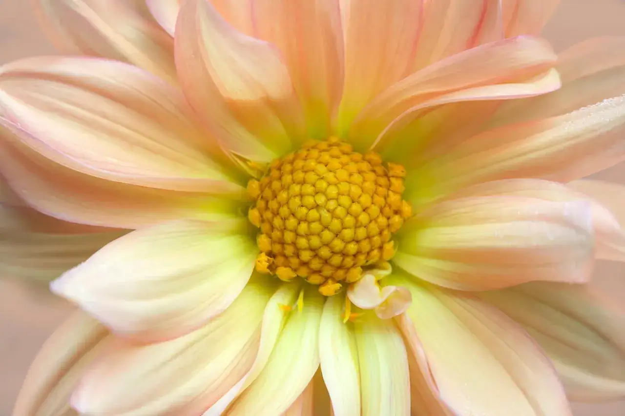
Build a clean frame, not a crowded one
The frame matters as much as the flower. A beautiful bloom can still fail if a stray stem cuts through it, a bright leaf pulls the eye away, or the background competes for attention. I think of composition as the part of the process that decides where the viewer looks first, second, and last.
The rule of thirds is useful here, but I do not treat it like a law. Sometimes I place a flower off-center to create movement or to leave room for the stem. Other times I center a bloom because its symmetry is the point. What matters is that the placement feels chosen, not accidental.
Leading lines, which are lines that guide the eye through the picture, can help in garden scenes. A curved stem, a row of petals, or a path of blurred blossoms can all point attention toward the subject. Negative space helps too, especially when the flower has a strong silhouette or a delicate shape that needs room to breathe.
- Shoot from flower height when you want the subject to feel connected to the viewer.
- Move a few inches left or right to clean up the background before you think about cropping.
- Check the edges of the frame for bright distractions, clipped petals, and broken lines.
- Use tighter framing when texture is the story, and wider framing when context matters.
- Do not be afraid to rotate the camera vertically if the stem or bloom shape fits the space better.
That framing choice only works if the camera settings preserve the subject cleanly, so I move next to exposure and focus.
Use camera settings that keep the flower sharp where it matters
For flower work, I care less about absolute rules and more about starting points that make sense. Aperture controls how much light enters the lens and how much of the scene appears sharp. A wide aperture gives a shallow depth of field, which is the narrow zone of focus that isolates a bloom from the background. A smaller aperture gives more depth of field, which helps when I need more of the flower to stay sharp.
| Scenario | Starting settings | Why I use them |
|---|---|---|
| Single bloom with a soft background | f/2.8 to f/4, 1/250 sec or faster, ISO 100 to 400 | Creates separation and keeps the flower readable without clutter |
| Whole flower with more petal detail | f/5.6 to f/8, 1/125 sec or faster, ISO 100 to 400 | Balances subject isolation with more complete sharpness |
| Macro detail on a tripod | f/8 to f/16, shutter adjusted for the light, ISO 100 to 200 | Gives more depth of field for tiny structures, especially when the subject is still |
I usually work in aperture priority when the light is changing and I want the camera to manage shutter speed for me. In steadier conditions, manual mode gives me more consistent files from frame to frame. If the flower is swaying, I raise shutter speed first, because a technically perfect exposure is not useful if the subject is blurred by wind.
A macro lens is built for close focusing and usually lets me record fine detail at very short distances. That matters because depth of field gets extremely narrow as I move closer. If the whole bloom is too deep for one frame, focus stacking can help, which means combining multiple shots focused at different points so the final image looks sharp through more of the subject. It works best when the flower is still and the wind is calm.
Focus peaking, if your camera offers it, is another useful tool. It highlights the edges that are currently sharp in live view, which makes manual focus much easier for tiny subjects. With close-up flowers, that small advantage can save a frame that would otherwise miss the eye or the front petal.
With the settings in place, I turn to the part that silently makes or breaks most flower images: the background.
Let the background support the bloom
A flower does not need an empty background, but it does need an obedient one. The background should make the bloom easier to read, not harder. I often fix this by changing my position before I change anything else. A small shift to the left, a lower angle, or a slightly longer focal length can turn a messy garden patch into a smooth wash of color.
When the flower is pale, a darker background can help it stand out. When the flower is deep red, purple, or orange, a lighter neutral background may be more useful because it prevents the scene from feeling too heavy. Indoors, I like matte surfaces, neutral paper, fabric, or a black backdrop when I want strong separation. Outside, I often rely on distance, because moving the flower farther from busy foliage softens the background naturally.
- Use darker backgrounds for light petals when you want stronger contrast.
- Use lighter or neutral backgrounds for dark flowers when you want color to stay rich.
- Keep reflective objects out of the frame unless reflections are part of the idea.
- Increase the distance between the subject and the clutter whenever the location allows it.
- Use a longer lens when you want the background to blur more smoothly.
From there, editing becomes a way to refine what was already there, not to rescue a weak capture.
Edit for texture, not plastic perfection
I edit flower images the same way I would approach a portrait: carefully, and with respect for texture. Petals should look alive, not polished into something artificial. The first pass is usually technical, not creative. I straighten the frame, crop for stronger placement, and correct white balance so whites stay white and reds do not drift into neon territory.
- Crop and straighten before anything else, because composition sets the base for every other adjustment.
- Recover highlights in pale petals so fine detail does not disappear.
- Lift shadows only enough to keep the flower readable.
- Add modest contrast or texture where it improves the petals, not across the entire frame.
- Remove stray stems, spots, dust, or tiny distractions that pull the eye away from the subject.
- Apply sharpening carefully, because oversharpening makes petals look crunchy very quickly.
I stay conservative with saturation. Flower color can be rich, but if I push it too far, the image starts to look commercial in the wrong way, as if the bloom lost its natural surface. The same caution applies to clarity and dehaze. Those tools can add definition, but too much of either can make the petals feel brittle. When the subject is delicate, restraint usually looks more believable.
Once the edit is clean, I look back at the shooting process itself, because the same mistakes show up again and again.
Five mistakes that flatten flower photos
I see the same problems repeatedly in flower images, and almost all of them are fixable in the field. The issue is rarely the flower. It is usually the way the photographer handled light, distance, or attention.
- Shooting in harsh noon sun, which creates hard highlights and muddy shadows.
- Placing every flower in the exact center, which makes the frame feel static.
- Letting the background compete with the bloom, especially with bright leaves or tangled stems.
- Using so much blur that the subject loses context and starts to feel disconnected.
- Ignoring the outer edges of the frame, where small distractions are often easiest to miss.
- Overediting petals until the texture looks fake or the color becomes too loud.
- Stopping down too far on close-up work without checking for softness caused by diffraction, which is the softening that can appear at very small apertures.
The good news is that these mistakes usually disappear once the process becomes more deliberate. I do not need to do more; I need to decide more carefully.
A simple field routine I trust on real shoots
When I am on location and do not want to overthink the process, I keep the workflow simple. That makes it easier to react to changing light, moving petals, and the small differences that separate one decent frame from a genuinely strong one.
- Look at the flower and decide whether it wants to be a portrait, a detail, or an environmental shot.
- Circle the subject until the background becomes calm enough to support it.
- Choose the softest available light, or wait a few minutes for it to improve.
- Set aperture based on the story, not on habit.
- Take a short burst if the flower is moving in the wind.
- Review the image at full size and check focus before you leave the scene.
That is really the heart of how to photograph flowers: choose one visual idea, simplify everything around it, and let light do the rest. If I keep that logic in mind, even an ordinary garden bloom can turn into a photograph that feels deliberate, clean, and worth slowing down for.