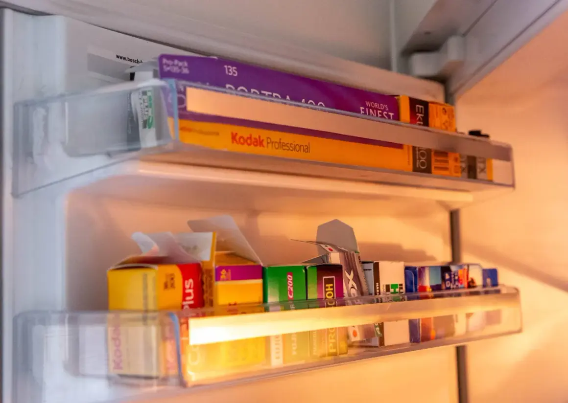
Finding a convincing vintage feel on 35mm is less about nostalgia in the abstract and more about choosing the right color response, grain structure, and contrast curve. For warm daylight nostalgia, I usually start with Kodak Gold 200; for a rougher family-snapshot feel, ColorPlus 200 or Kodacolor 200 is the cheaper, looser choice; and for night scenes, CineStill 800T creates a completely different kind of retro mood. The trick is matching the stock to the kind of memory you want the frame to feel like.
The fastest route to a believable retro frame
- Kodak Gold 200 is my default pick for warm, nostalgic daylight images.
- Kodak ColorPlus 200 or Kodacolor 200 gives a cheaper, slightly rougher consumer-film feel.
- Kodak Ultramax 400 is the practical choice when you need vintage color and more speed for mixed light.
- CineStill 800T is the cinematic option for neon, tungsten, and night street scenes.
- Kodak TRI-X 400 and Ilford HP5 Plus are the safest black-and-white stocks for a classic documentary look.
What makes a frame feel vintage instead of just old
I think a lot of people chase the wrong thing here. A frame does not feel vintage because it is soft or grainy by default, it feels vintage when the color, contrast, and imperfections work together in a way that resembles an actual print from an earlier era. Four things do most of the work: warmth, contrast, grain, and light handling.
Warmth is the easiest to spot. Consumer color stocks often lean slightly yellow, orange, or peach, which immediately reads as memory instead of clinical accuracy. Contrast matters just as much, because a softer highlight roll-off keeps bright areas from looking too digital. Grain gives the image texture, but it should feel alive, not messy. And exposure latitude, which is simply how forgiving a film is when you miss exposure a little, matters because a generous negative usually scans into a softer, more print-like image.
The part people miss is that the final scan can either preserve that character or wipe it out. Heavy sharpening, aggressive contrast, and over-clean color correction can make a nostalgic negative look like a modern file with a filter on top. That is why the film choice and the lab treatment have to work together, not fight each other. Once that is clear, picking the right stock becomes much easier.The films I would start with first
If I were loading a camera today for a vintage-leaning roll, I would narrow the list quickly. These are the stocks I reach for because they create a distinct mood without forcing me to fight the result in scanning or editing.
| Film | Look | Best for | What it does well | Trade-off |
|---|---|---|---|---|
| Kodak Gold 200 | Warm, soft, slightly nostalgic | Daylight portraits, travel, everyday scenes | Classic consumer color, gentle grain, easy retro warmth | Not ideal when the light gets dim |
| Kodak ColorPlus 200 / Kodacolor 200 | Casual, a little rougher, slightly more lo-fi | Budget film, street shots, overcast days | Cheap entry into the nostalgic consumer-film look | Can feel less polished than Gold if the scan is heavy-handed |
| Kodak Ultramax 400 | Punchier, more saturated, more grain | Flash photography, mixed light, indoor-outdoor use | More speed and flexibility without losing the retro family-photo vibe | Less subtle, so the look can get loud fast |
| CineStill 800T | Cinematic, moody, glowing highlights | Neon, tungsten interiors, night streets | Halation, the warm bloom around bright lights, gives an unmistakable movie frame effect | Can look odd in daylight if you want warm nostalgia instead of cool drama |
| Kodak TRI-X 400 | Classic black-and-white with real texture | Street, documentary, portraits | Bold grain and contrast with a timeless editorial feel | More assertive than smoother B&W stocks |
| Ilford HP5 Plus | Classic B&W, slightly smoother than TRI-X | General-purpose monochrome, push processing | Versatile, forgiving, and easy to live with in mixed light | Less dramatic than TRI-X if you want a gritty edge |
If I had to name one overall winner for a warm vintage look, it would be Kodak Gold 200. If I wanted something cheaper and a little more casual, I would take ColorPlus 200 or Kodacolor 200. If I knew I would be using flash or shooting indoors, Ultramax 400 becomes the safer answer because it gives me more room to work. That is the point where the right film starts to depend less on “best overall” and more on the scene you actually photograph.
Choose the stock around the decade you want to evoke
The phrase “vintage look” is broad, and that is where a lot of people get stuck. A frame that feels like a 1970s family print is not the same thing as a frame that feels like a 1990s point-and-shoot snapshot, and neither of those should look like a noir street photograph. I usually separate the mood into a few practical buckets.
- Warm family album nostalgia usually points to Kodak Gold 200. It gives you the kind of soft, friendly color people associate with old prints and birthday photos.
- Lo-fi casual snapshot energy is where ColorPlus 200 or Kodacolor 200 fits best. The look is a little rougher, and that works when you want less polish and more character.
- Disposable-camera flash energy belongs to Ultramax 400. It handles mixed light better and keeps the image lively when you are shooting indoors or at dusk.
- Neon and city-night mood is CineStill 800T territory. It is the most cinematic option here, and the tungsten balance is built for artificial light. Tungsten-balanced means the film is tuned for warm indoor light, not daylight.
- Documentary heritage belongs to TRI-X 400 or HP5 Plus. If you want old-newsprint energy, street grit, or classic monochrome portraits, black and white often gets you there faster than color.
That is why I always ask the same question before loading a roll: do I want the image to feel warm, rough, cinematic, or documentary? Once I know that, the film choice stops being a guessing game and starts becoming a design choice. From there, the way I shoot it matters just as much.
How to shoot it so the vintage look survives scanning
A good stock can still look wrong if the exposure and scanning are working against it. I have seen plenty of negatives with real character get flattened into a sterile file because the scan was pushed too hard. My rule is simple: give the film a chance to breathe, then keep the scan honest.
- Give consumer color negative film a little extra exposure. For Gold 200, ColorPlus 200, and Kodacolor 200, I usually prefer a slight overexposure, roughly one-third to one stop, because it keeps shadows gentler and helps the image feel more print-like.
- Use simple, directional light. Golden hour, window light, backlight, and overcast skies all flatter retro color better than flat midday sun. Hard light can work, but it usually pushes the image toward harshness instead of nostalgia.
- Use flash on purpose. Direct flash is one of the quickest ways to get that honest point-and-shoot look from the 90s. It works especially well with Ultramax 400 and can also make Gold feel more immediate.
- Ask for restrained scans. If a lab over-corrects the negative, the film’s own palette disappears. I usually want neutral scans first, then I decide how much extra warmth or contrast I want later.
- Do not over-sharpen the final image. A little softness is part of the charm. If the file looks too crisp, too clean, and too corrected, the vintage feeling evaporates.
When all of that is working together, the stock has room to do what it does best. That also explains why the wrong choices can make even a good roll look strangely modern, which is where the common mistakes come in.
The mistakes that make retro film look fake
There are a few habits that keep showing up whenever someone tries to force a vintage result. None of them is fatal on its own, but together they make the image feel confused instead of intentional.
- Choosing the wrong film for the light. Gold 200 in dim tungsten can get too warm, and CineStill 800T in daylight can lose the mood people expect from it.
- Chasing grain as if grain alone creates character. Grain without good color or light just looks muddy. Texture is only one part of the look.
- Overdoing the edit. If the scan gets crushed with contrast or oversaturated in post, the image stops feeling like film and starts feeling like a preset.
- Ignoring the subject. Wardrobe, location, and props do a lot of the visual work. A perfect stock cannot save a scene that feels too modern in every other way.
- Relying on expired film as a shortcut. Expired rolls can be fun, but they are unpredictable. I would never call them the best starting point if the goal is a reliable vintage look.
Once those mistakes are out of the way, the decision becomes much simpler. The best roll is the one that matches the mood you want before any editing happens, not the one that promises magic after the fact.
The rolls I would load first for each retro mood
If I were narrowing this down to the shortest practical list, I would use it like this. It is not glamorous, but it works, and that is what matters when the goal is a believable vintage frame rather than a novelty effect.
- Warm daylight nostalgia - Kodak Gold 200.
- Budget retro snapshots - Kodak ColorPlus 200 or Kodacolor 200.
- Everyday flexibility with more speed - Kodak Ultramax 400.
- Cinematic night scenes - CineStill 800T.
- Classic black-and-white documentary energy - Kodak TRI-X 400.
- Softer, more forgiving black-and-white - Ilford HP5 Plus.
If you want one roll to start with, I would pick Kodak Gold 200. It gives the most immediately recognisable vintage warmth without turning every frame into a gimmick, and it stays easy to shoot in real life. After that, the biggest improvement usually comes from better light, cleaner exposure, and a lab scan that respects the negative instead of trying to modernize it.