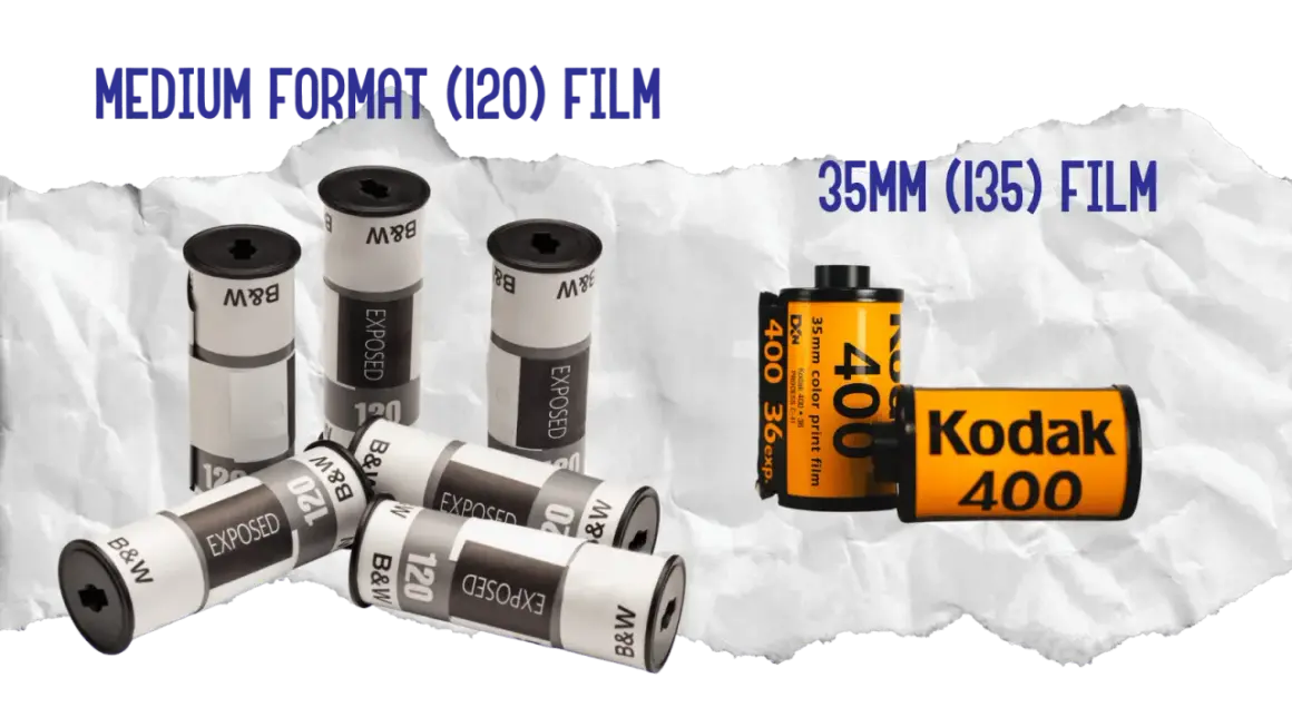
35mm film has a very specific visual identity: compact frames, visible grain, and a tonal response that feels more tactile than a clean digital file. If you want a practical answer to what does 35mm film look like, the honest version is that it can look soft, crisp, moody, or punchy depending on the stock, exposure, and scan. I’m going to break down the developed negative, the finished image, and the workflow choices that make the biggest difference.
The short version is that 35mm film looks textured, flexible, and highly dependent on the stock and workflow
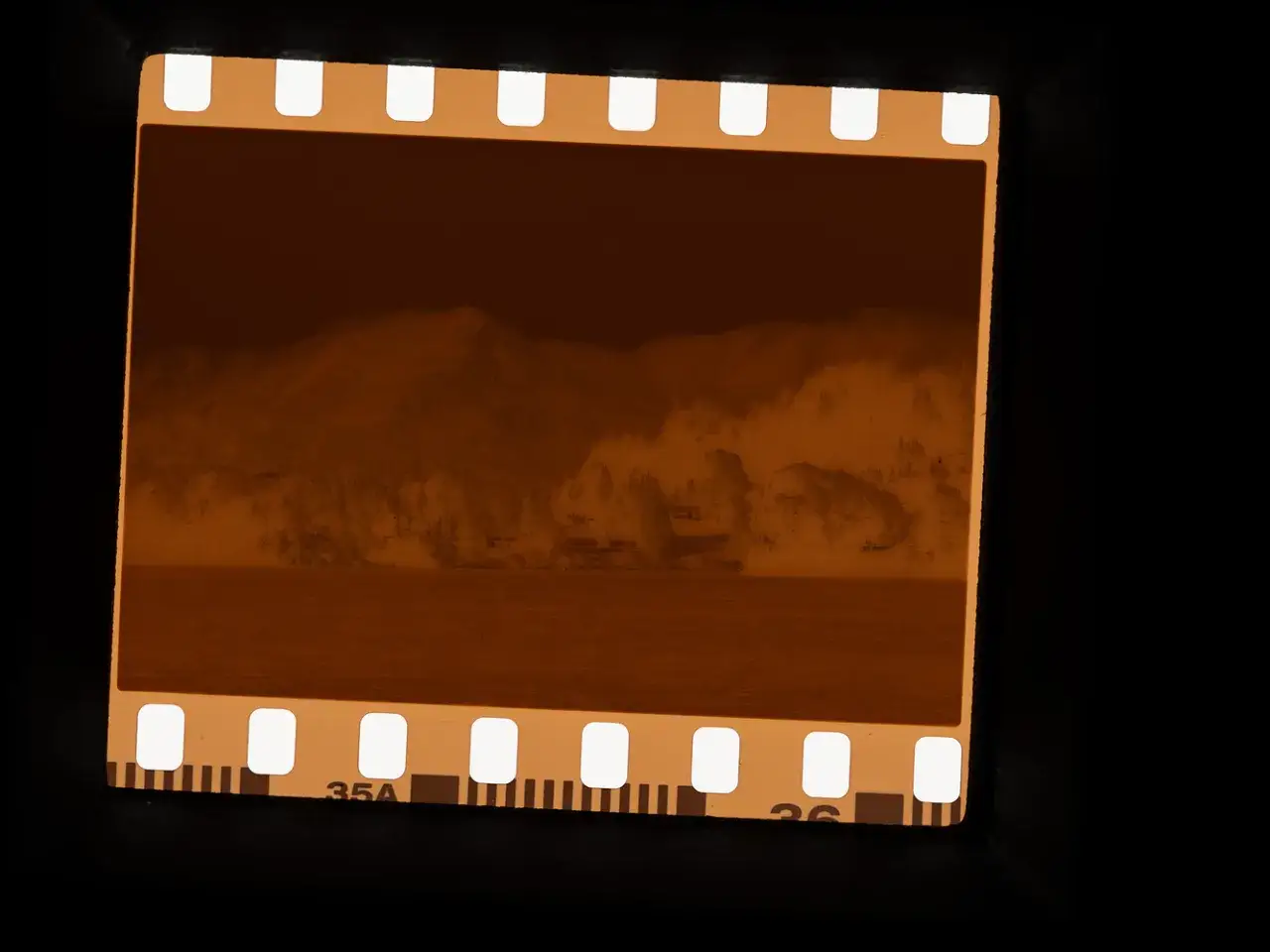
- Most color negatives arrive as a warm orange-brown strip before they are inverted.
- The finished image usually shows visible grain, gentle highlight roll-off, and a 3:2 frame.
- Black-and-white and slide film can look dramatically different from color negative.
- The lab, scan, and print often change the result as much as the camera itself.
- A low-ISO stock can look surprisingly clean; a faster stock usually looks rougher and more energetic.
What a developed roll looks like in your hand
Before you ever see a scan, 35mm usually appears as a long, narrow strip of frames with perforations along both edges. In the U.S., labs often label it as 135 format, and the frame size is roughly 24 x 36 mm, which gives it the familiar 3:2 shape used in many prints like 8x12 or 16x24.
That physical strip matters because it tells you a lot about the image before the image is even inverted. The film is small, so each frame holds less surface area than medium format, and that is one reason the final look tends to feel a little more textured and a little less clinical.
Color negative
A color negative usually has that orange mask people notice first. The frames look backward until they are inverted, and the image can seem flat or muddy in raw form even when the final scan will look perfectly normal. That is why the strip itself often looks nothing like the final photo.
Black-and-white negative
Black-and-white film looks simpler: a gray or silvery image on a clear base, with density changes instead of color layers. It is easier to read by eye, and the grain pattern is usually more obvious, especially with faster stocks.
Read Also: Best Film for Canon AE-1 - Pick Your Perfect Roll
Slide film
Slide film, or transparency film, is the opposite of a negative. It produces a positive image directly, so the colors and contrast look much closer to the final result right off the film strip. It also leaves less room for exposure mistakes, which is part of why it can look so precise.
Once that strip is scanned or printed, the character changes again, and that is where most people recognize the classic film look.
What the finished image looks like on screen or paper
The finished image is where 35mm earns its reputation. I usually see three things first: grain, color response, and the way highlights behave. Grain is not a filter on top of the photo; it is part of the emulsion structure, so it feels embedded rather than pasted on.
- Grain: more noticeable than on larger formats, especially in shadows or higher ISO film.
- Tone: highlights often ease off instead of hitting a hard digital wall.
- Color: can be warm, muted, saturated, or cool depending on stock and scanning.
- Sharpness: can be very good, but it rarely looks overly clinical.
- Halation: some rolls show a soft glow around bright points, which happens when light bounces inside the film layers.
The 3:2 aspect ratio also matters more than people expect. It feels balanced for portraits, street scenes, and horizontal compositions, and it maps cleanly to common U.S. print sizes without awkward cropping. Those traits are real, but the stock underneath them changes the feel a lot.
Why different film stocks change the look so much
Two rolls shot on the same camera can look worlds apart. ISO, emulsion design, and intended use all shape the result, which is why a fine-grain color stock, a fast black-and-white stock, and a slide film never feel interchangeable.
| Film type | Typical visual look | Where it works best |
|---|---|---|
| Color negative | Smooth skin tones, moderate contrast, forgiving highlights | Portraits, travel, everyday color |
| Fine-grain color negative | Cleaner detail, brighter color, less obvious grain | Daylight, landscapes, editorial work |
| Black-and-white negative | Strong tonal separation, classic texture, more visible grain on faster stocks | Street, documentary, moody work |
| Slide or transparency film | Punchy contrast, saturated color, very little latitude | Landscapes, controlled light, precise exposure |
| Expired or specialty stocks | Color shifts, fog, unpredictable grain | Experimental projects |
The practical takeaway is simple: low ISO usually means finer grain and cleaner detail, while faster film gives you more texture and less polish. If you want a gentle, editorial color response, color negative is the easiest place to start. If you want high contrast and drama, slide or pushed black-and-white will get there faster. Even then, the stock is only one part of the equation.
What changes the look more than the format itself
If you want to understand the image honestly, you have to look beyond the frame size. In my experience, most of the difference people notice comes from a handful of workflow decisions:
- Exposure: slight overexposure on color negative often smooths grain and protects highlights; underexposure often makes shadows rougher and colors less forgiving.
- Development: push processing means developing as if the film were rated slower than it was shot, which usually increases contrast and grain; pull processing does the opposite and can tame highlights.
- Lens choice: a sharp modern lens can make 35mm look cleaner, while older glass can add flare, softness, or lower micro-contrast.
- Scanning or printing: sharpening, denoise, inversion settings, and paper choice can make one negative look like three different images.
- Lighting: soft overcast light feels calm; hard sidelight and backlight make the same format look much more dramatic.
- Enlargement: a tiny web image hides grain; a large print reveals it. A 35mm frame scaled to 16x24 in the U.S. will show more texture than the same file seen on a phone.
When people say a roll “looks filmic,” they are often reacting to the whole chain rather than the camera alone. That is why it helps to compare the format with digital and larger negatives before making a judgment.
How 35mm compares with digital and medium format
| Format | What you usually notice | Best for | Trade-off |
|---|---|---|---|
| 35mm film | Visible grain, portable handling, classic 3:2 frame, immediate character | Street, travel, documentary, everyday work | Less detail than larger film, more dependent on scan and process |
| Full-frame digital | Cleaner files, sharper edges, consistent color, easier correction | Controlled work, speed, commercial turnaround | Can feel more clinical unless shaped carefully |
| Medium format film | Smoother tonality, finer grain, stronger subject separation | Portraits, landscape, fine-art prints | Bulkier, slower, more expensive |
Full-frame digital may share a similar aspect ratio, but it does not reproduce the same grain structure or tonal behavior by default. Medium format usually looks smoother because the negative is larger, which spreads detail over more surface area. So the right question is not just whether the image is sharp, but whether the texture suits the subject.
What I’d check before calling a frame truly film-made
If I’m judging a 35mm frame, I ignore the phone-friendly version first and look at the underlying negative or a properly made scan. That is usually where the truth lives.
- Is the grain structure believable, or does it look like a digital overlay?
- Do the highlights breathe, or do they clip abruptly?
- Is the color response tied to the stock, or has aggressive editing flattened it?
- Does the crop preserve the 3:2 frame, or has the image been pushed into a shape that works against it?
- Does the picture feel better in a print than it does on a tiny screen? That is often a sign the format is doing its job.
35mm film looks tactile rather than sterile. It gives you grain, small-frame energy, and a slightly imperfect realism that can feel either nostalgic or contemporary, depending on how you shoot and process it. If I had to reduce it to one idea, it would be this: the stock sets the starting point, but the final look is built by exposure, development, scanning, and print.