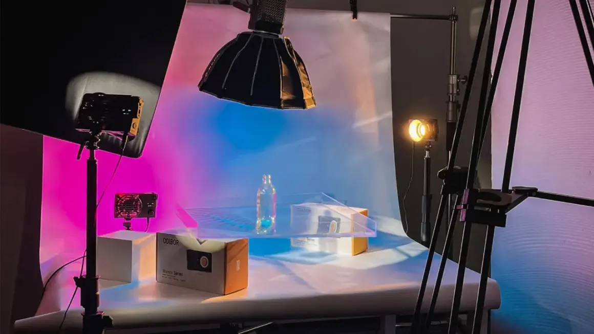
In a clean interview, product demo, or branded reel, the background is doing more work than it looks like. The way you light it changes depth, mood, and how polished the frame feels before color grading ever begins. I treat a background light as the part of the setup that quietly tells the eye where to rest, and this article shows when to use it, how to place and shape it, which fixtures make sense, and how to avoid the common mistakes that make a scene feel flat.
What matters most before you add another fixture
- Background illumination is about separation and depth, not just making a wall brighter.
- Keep the subject far enough from the backdrop to control spill, ideally about 5 to 8 feet in small rooms.
- Use grids, barn doors, flags, or diffusion to shape the beam before you chase more output.
- A soft wash, a textured gradient, and a colored accent are three very different looks with different jobs.
- Not every scene needs extra background illumination; sometimes a darker, cleaner backdrop supports the subject better.
What background lighting changes in a shot
The job is not just to make a wall brighter. Well-managed background lighting creates separation, keeps a subject from merging into the set, and gives the frame a sense of depth that the camera would otherwise flatten. In practical terms, it is the difference between a talking head that feels pasted onto the scene and one that feels placed inside it.
I also think of it as visual hierarchy. If the background is too bright, it steals attention; if it is too dark and dead, the subject can look isolated in an accidental way. The sweet spot depends on the story, but the principle stays the same: the backdrop should support the shot, not compete with it. That is why background illumination and key/fill lighting need to be designed together, not adjusted in isolation.
Once that role is clear, the next question is whether the scene actually needs that extra layer at all.
When a background light earns its place in the setup
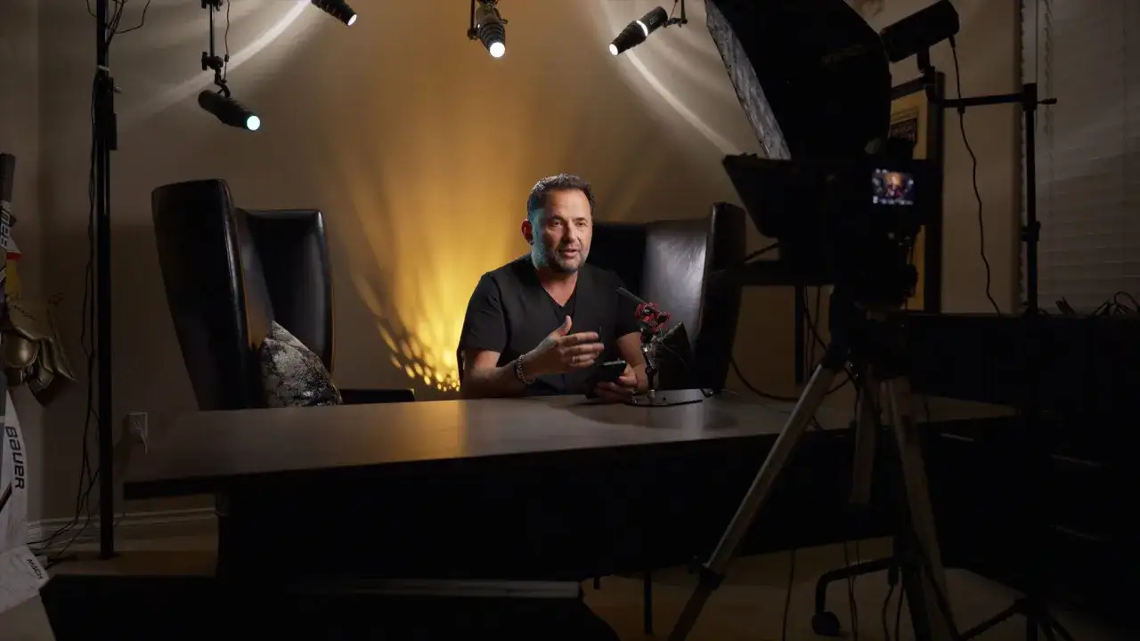
I only call for a background light when the backdrop needs its own visual job. In a small office studio, that might mean separating a subject from a beige wall; in a brand spot, it might mean giving the set a stronger color identity; in a moody scene, it may mean keeping the background present without flattening the darkness.
| Scene type | Use extra background illumination | Why it helps |
|---|---|---|
| Talking-head interviews | Usually yes | It creates depth and keeps the subject from blending into a plain wall. |
| Product demos | Often yes | A controlled wash or accent adds polish without distracting from the product. |
| Low-key drama | Sometimes no | Leaving the background darker can make the scene feel intentional and cinematic. |
| Green screen or virtual set work | Yes, with care | Even coverage and clean separation reduce spill and make compositing easier. |
| Already-designed locations | Only if needed | Practical lamps, windows, or textured walls may already give the shot enough life. |
My rule is simple: if the wall is already attractive, textured, or motivated by practical sources, I do less. If the set looks empty, merges into shadow, or needs a cleaner brand color, I add more. A good lighting decision is not about always adding a fixture. It is about knowing when the background should be active and when it should stay quiet.
Once the decision is made, placement becomes the part that actually determines whether the shot feels controlled or messy.
How I place and shape the light
Placement matters more than output. I usually start by keeping the subject 5 to 8 feet in front of the backdrop when the room allows it. That gap gives me room to control spill and lets the background fall off more cleanly. If the room is tight, I use grids, flags, or a narrower beam rather than pretending brute force will fix it.
| Look | Starting move | What to watch for |
|---|---|---|
| Even wash | Place the fixture 3 to 6 feet from the background and aim it slightly off center. | Avoid hotspots in the middle and keep the beam wide enough to cover the frame. |
| Soft gradient | Shift the source to one side and feather the edge across the backdrop. | Let the falloff work for you so the wall does not look uniformly lit. |
| Texture accent | Use a tighter beam from 6 to 10 feet away and let the surface shape show. | Texture disappears if the light is too broad or too soft. |
| Color accent | Add an RGB source or gel and keep the beam isolated from the subject. | Watch wardrobe and skin tones so the color reads as design, not a mistake. |
One technical idea helps here: falloff, the way light loses intensity as it travels. If I can let the beam soften naturally instead of flooding the whole wall, the shot usually feels more intentional. On a textured wall, that controlled falloff can make the surface look rich; on seamless paper, it helps hide hotspots and keeps the center from looking burned out.
For interviews, I often start with the background 1 to 2 stops darker than the key and then open it up only if the scene feels too heavy. For a high-key look, I may push the background close to white, but I still want the subject to stay legible. That balance is what keeps a bright frame from turning into glare.
Once the beam is shaped correctly, the next decision is which fixture can deliver that shape without fighting the room.
Which fixtures make sense for different backgrounds
I do not choose by brand first. I choose by control. A modest fixture with a grid and clean spill control beats a brighter lamp that floods the room. In a small U.S. home studio, that difference shows up fast because the wall, ceiling, and lens all sit too close together.
| Fixture type | Strength | Limitation | Best use |
|---|---|---|---|
| LED panel | Soft, even output that is easy to tame in tight spaces | Limited punch and less precise shaping than a tighter source | Simple washes, interview backdrops, and small sets |
| COB light with softbox or grid | Strong output with good directional control | Can feel bulky in cramped rooms if you do not manage spill | Medium rooms, controlled gradients, and shots that need more reach |
| Tube light | Easy to hide, easy to angle, useful for accents | Not ideal when you need a broad and perfectly even wash | Edges, practical-looking glows, and colored accents |
| Fresnel | Tight beam and strong texture control | Less forgiving if you want a large soft background wash | Hotspots, narrow accents, and stylized patterns |
| Practical lamp with a dimmer | Feels motivated and naturally part of the set | Usually not enough on its own for the whole backdrop | Cozy interiors and layered background details |
I reach for RGB only when color is doing real work. A clean daylight fixture plus a gel can be more predictable than a saturated color source, especially if the shot needs to hold up across multiple edits or social crops. The point is not to collect more tools. The point is to choose the one that gives me the cleanest control over shape, spill, and mood.
That is also where most amateur mistakes happen, because the wrong look is usually the result of poor control rather than poor taste.
Common mistakes that make the backdrop look amateur
- Lighting the backdrop brighter than the subject without a reason. That reverses the visual hierarchy and makes the frame feel confused.
- Putting the beam dead center every time. A centered hot spot usually looks accidental unless you are building a very specific high-key look.
- Ignoring spill on hair, shoulders, table edges, and nearby walls. Spill is what turns a controlled setup into a washed-out one.
- Using saturated color everywhere. One strong hue can feel designed; too many strong hues start to look like you ran out of restraint.
- Forgetting white balance. A warm practical and a cool background source can work together, but only if the color contrast is deliberate.
- Choosing style before story. A dramatic backdrop is useless if it distracts from the product, the speaker, or the message.
The fastest fix is usually not a bigger light. It is a better beam. A grid, a flag, a different angle, or a little more distance often solves the problem before you need to buy or rent anything else. Once those mistakes are under control, the actual setup process becomes much more straightforward.
A setup I use for clean interviews and branded content
- Place the subject 5 to 8 feet from the background so the wall can separate from the subject without looking artificially lit.
- Set the key light first and expose it for the face, not for the wall.
- Add the background source next and keep it about 1 to 2 stops below the key if you want subtle separation.
- Use a grid, barn doors, or a flag to keep the background light from spilling onto the subject.
- Bring in fill only after the backdrop looks right, because fill can change how the wall reads more than people expect.
- If the scene needs brand color, keep the saturation moderate and make sure wardrobe does not fight it.
For product demos, I often go one step further and give the backdrop a slight gradient or a narrow color accent. That keeps the product readable while still making the frame feel designed. For talking-head content, restraint usually works better: a cleaner wall, a soft wash, and enough separation to keep the subject from sinking into the set.
What I care about at this point is not perfection but repeatability. If I can build the look again in 10 minutes on a different set, the setup is doing its job.
The quickest way to make the frame feel intentional
If I had to reduce the whole topic to one rule, it would be this: light the background only as much as the story needs, then stop. A controlled wash, a gentle gradient, or a small practical can do more for production value than a wall of extra brightness. When the background has shape but does not shout, the subject feels stronger and the shot looks finished without feeling overworked.
That is the standard I use on most sets, from quick social videos to polished client pieces: keep the subject readable, keep the backdrop intentional, and spend your energy on control before you spend it on more output.