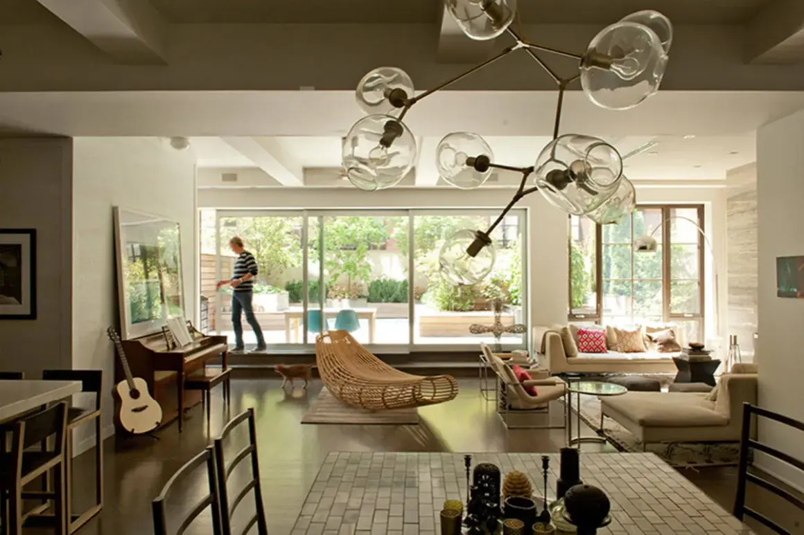
Interior architecture photography is about translating built space into a clear visual story. I care less about making a room look generic and more about showing how light, proportion, materials, and circulation work together. The best images answer a practical question fast: what does this space feel like, how is it used, and why does it matter?
That is why this genre sits between documentation and interpretation. In the rest of this article, I break down the gear, framing decisions, lighting choices, subject types, and editing habits that make interior work feel polished without looking fake.
The goal is to make the room read clearly, not just look bright
- A tripod, a level camera, and a controlled focal length do more for the result than an expensive body alone.
- f/8 to f/11 and low ISO are reliable starting points for crisp interior frames.
- Straight verticals, camera height, and room flow are the fastest ways to improve composition.
- Natural light works well for soft editorial spaces; flash blending and exposure bracketing help when contrast gets difficult.
- Different subjects need different priorities: a kitchen is not a lobby, and a boutique office is not a historic chapel.
What this kind of photography is really trying to say
I treat interior work as visual translation. A good frame does not just document furniture and walls; it explains how the space behaves in light, how the eye moves through it, and what the design choices are trying to achieve. That is why the same room can look flat in one set of images and compelling in another.
The main distinction is intent. Real estate images often need to sell access, size, and cleanliness quickly. Architectural and editorial interior images usually need more nuance: craftsmanship, material contrast, spatial rhythm, brand identity, or the atmosphere of a place. A hotel lobby, for example, is not just a lobby. It is a first impression, a circulation hub, and often a branding tool.
Once I know the purpose of the image set, everything else becomes easier to decide. That includes the lens I choose, the angle I stand in, and how much perfection I want to preserve in post. That intent also determines the kit I reach for next.
The gear that earns its place in the bag
I have little patience for gear that makes interior work slower without improving control. The essentials are simple, but they need to be reliable.
| Tool | Why it matters | What I watch for |
|---|---|---|
| Tripod | Keeps framing stable and lets me work at lower ISO | It should be rigid enough to hold level without drifting |
| Wide-angle zoom or prime | Helps me capture full rooms without backing into a wall | Too wide can distort furniture and make the room feel false |
| Level or geared head | Makes it easier to keep verticals straight | This matters more in interiors than in most other genres |
| Remote release or timer | Reduces vibration during long exposures | Small shake is enough to soften clean lines |
| Light source or flash | Helps when ambient light is uneven or mixed | I use it to solve problems, not to overpower the room |
My default exposure starting point is usually ISO 100-400, f/8-f/11, and a shutter speed that follows the available light. If the camera is on a tripod, I am happy to let shutter speed slow down. The result is cleaner detail and more depth across the room. On full frame, a 16-35mm lens is often enough; on crop sensors, a lens in roughly the 10-24mm range can serve the same purpose.
I do not reach for the widest focal length by default. I prefer to ask whether the room needs breadth, or whether a slightly tighter frame would tell the story with more accuracy. That decision becomes much clearer once composition is under control.
Composition that keeps rooms believable
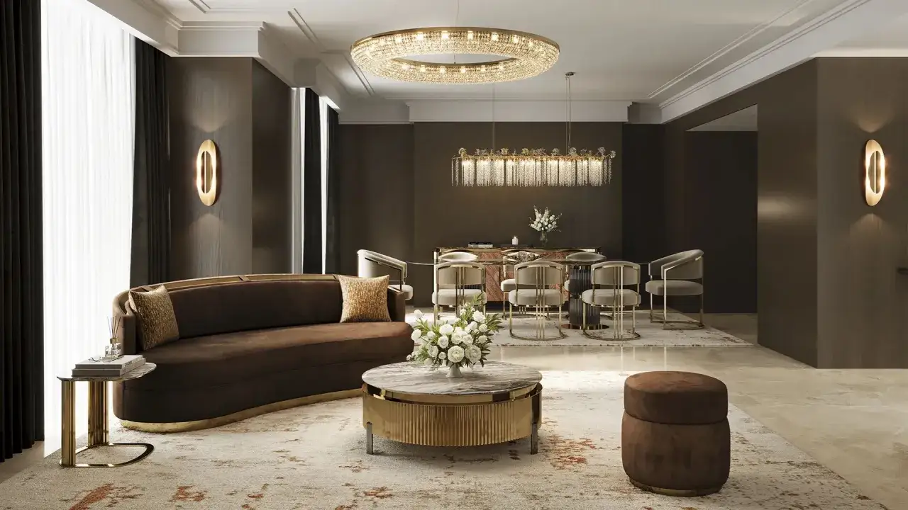
Strong composition is what stops an interior from looking like a stretched snapshot. The viewer should sense the room immediately, without getting distracted by leaning walls, cut-off furniture, or angles that make the space feel smaller than it is.
Keep vertical lines honest
I level the camera first and correct perspective later only as much as needed. When verticals tilt, cabinets, door frames, and wall edges start to feel unstable. In interiors, that instability reads as carelessness even when the lighting is good. If I need extra precision, I will use a shift lens or crop after correction rather than letting the geometry drift.
Choose a viewpoint that explains circulation
I usually look for an angle that shows how someone would move through the room. That might mean including a doorway, a hallway opening, or the line from a seating area toward a window. A frame that explains flow often feels more useful than a frame that simply shows the biggest wall.
Use symmetry with restraint
Symmetry is powerful in staircases, hotel lobbies, beds, bathrooms, and other spaces with a strong central structure. But in smaller residential rooms, perfect symmetry can flatten the image and make the room feel staged in a stiff way. I use it when the architecture supports it, not because it looks tidy on a contact sheet.
Camera height matters too. I often start around chest height, then move slightly higher or lower depending on ceiling height, furniture scale, and the mood the room needs. A few inches can change how grounded or spacious the image feels. From here, the biggest variable is usually light.
How I handle light, exposure, and color without flattening the room
Lighting is where interior work either feels believable or starts to look synthetic. I want the image to hold contrast, depth, and a sense of time of day, while still showing detail in the shadows and through the windows.
| Lighting approach | Best for | Main tradeoff |
|---|---|---|
| Natural light only | Soft editorial interiors, calm residential spaces, hospitality rooms with good daylight | It depends heavily on weather, window direction, and time of day |
| Ambient light plus practical lamps | Bedrooms, lounges, and lifestyle-driven interiors | Mixed color temperatures can get messy fast |
| Flash or strobe blend | Commercial work that needs consistent control and cleaner shadows | Can look clinical if the light is too even |
| HDR or exposure blending | Rooms with strong window contrast or bright reflective surfaces | Overdone blending makes the scene feel artificial |
Work with the windows, not against them
Window light is usually the anchor. If the room has a strong view, I try to preserve it instead of blowing it out for the sake of bright walls. On the other hand, if the outside exposure is not part of the story, I am comfortable letting it go a little and protecting the interior tones. That choice should be intentional.
Keep color temperature under control
Mixed lighting is one of the fastest ways to weaken a room. Daylight, warm bulbs, reflective surfaces, and colored materials all compete for attention. I either control the sources at capture or commit to a cleanup strategy in post. Auto white balance is rarely my first choice when the room contains several different light sources.
Read Also: Texture Photography - Make Surfaces Tactile, Not Flat
Blend exposures with restraint
When contrast is too high for a single frame, I bracket exposures rather than forcing one file to do everything. Three to five frames, spaced one to two stops apart, is usually enough for a clean blend in many interiors. I use the blend to restore detail, not to erase the natural falloff that gives the room depth. Once the light is under control, the next question is what kind of space I am actually photographing.
Different interior subjects need different priorities
One of the biggest mistakes I see is treating every interior as if the same rules apply. A kitchen, a boutique hotel suite, and a corporate reception area may all be inside buildings, but the story each one needs to tell is different.
| Subject | What matters most | Typical mistake |
|---|---|---|
| Residential living room | Comfort, scale, and how the furniture supports conversation | Over-wide framing that makes the room feel stretched |
| Kitchen | Clean geometry, surface detail, and reflective control | Hotspots on counters, appliances, and cabinet fronts |
| Bathroom | Precision, cleanliness, and mirror management | Visible camera clutter or distorted fixtures |
| Hospitality lobby or suite | Brand mood, circulation, and layered lighting | Focusing only on decor and losing the sense of scale |
| Office or workplace | Function, wayfinding, and daylight balance | Making it look like a home instead of a workplace |
| Historic or cultural interior | Authenticity, material integrity, and restrained editing | Over-processing the image until the space loses its character |
In practice, that means I do not build a shot list from angles alone. I build it from use cases: a hero frame for the website, a wider contextual view, a detail shot that shows material quality, and a transition image that helps the viewer understand how the rooms connect. That logic matters even more in post-production.
Editing that keeps the space honest
Editing is not where I rescue a weak interior. It is where I make a good capture feel coherent. The first pass is always technical: straighten the geometry, correct perspective, clean dust, and balance exposure so the room feels unified.
After that, I make judgment calls. I reduce color casts that compete with the actual materials, but I avoid stripping away all warmth from wood, brass, or painted surfaces. I lift shadows enough to reveal structure, but I do not chase a perfectly flat histogram. Rooms need depth. If every shadow disappears, the image starts to look like a render instead of a photograph.
For sets with several images, consistency matters as much as any single frame. I want the series to feel like it was shot in the same light, on the same day, with the same visual discipline. That consistency is what makes a client trust the work at a glance. It also makes the mistakes easier to spot before they leave the studio.
The mistakes that quietly ruin good interior work
Most weak interior sets are not broken by one catastrophic problem. They are damaged by a handful of small ones that add up.
- Crooked geometry makes a room feel unstable, even when everything else is polished.
- Over-wide lenses can exaggerate depth and make furniture look unnaturally small.
- Competing light sources create color pollution that is hard to clean later.
- Clutter at the frame edges pulls attention away from the design of the space.
- Ignored reflections expose the camera, the photographer, or objects the client never wanted visible.
- Over-processing removes texture and makes the room feel less believable.
I also think many photographers misread the subject itself. They photograph the room as an object, when they should be photographing what the room is for. A kitchen should feel usable. A lobby should feel like arrival. A reading room should feel quiet. When the function comes through clearly, the image becomes much more memorable.
That leads to the last thing I check before I press the shutter, because the strongest sets are usually built before the camera ever fires.
The final walk-through that makes the set feel finished
Before I start shooting in earnest, I do a slow walk-through and ask three questions: what is the main story, what is distracting from it, and what image will matter most to the client after the shoot is over? That small pause saves time later because it forces me to decide what belongs in the frame and what needs to be moved, turned off, or ignored.
- I remove one visible distraction from every frame, even if it is tiny.
- I check windows, mirrors, screens, and glossy surfaces for accidental reflections.
- I capture a wide frame, a medium frame, and at least one detail that shows material quality.
- I make sure the first image in the set is strong enough to establish the visual tone.
- I leave with a sequence that explains the space, not just a folder of isolated pretty shots.
That is the standard I use for interior architecture work: clear geometry, controlled light, and a subject-specific story that respects how the space is meant to be experienced. When those pieces line up, the photographs feel calm, usable, and convincing without looking staged.