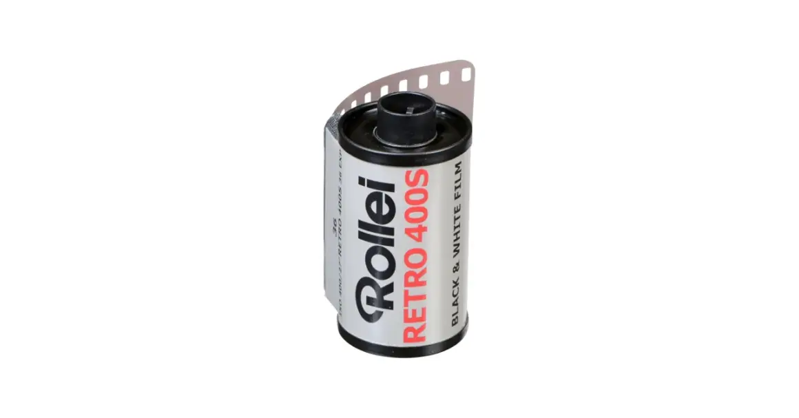
Retro 400S sits in the useful middle ground between a practical 400-speed black-and-white film and something more deliberate and graphic. In this article I’ll break down how it behaves in real shooting, what kind of scenes it loves, how I would meter and develop it, and where it fits against the usual black-and-white staples.
The main things to know before you load a roll
- It is a panchromatic ISO 400 black-and-white film with strong sharpness, high contrast, and fine grain.
- It responds well to yellow, orange, and red filters, especially if you want stronger skies or more separation in distant scenes.
- Box speed is a safe starting point, but EI 200 or EI 800 can make sense depending on light and how much shadow detail you want.
- The clear PET base helps scanning and reversal processing, which is unusual enough to matter if you work digitally after the scan.
- It is strongest in street, landscape, architecture, and textured daylight scenes, less flattering if you want soft, forgiving portraits.
What makes this film different from a standard 400-speed stock
What gives Rollei Retro 400S its character is not just the speed, but the way it balances sensitivity with a very crisp rendering. Rollei’s data sheet describes it as panchromatically sensitized from 380 to 730 nm, with a nominal ISO 400 speed, very high sharpness, and a measured resolving power of 160 lp/mm under test conditions. In plain language, that means the film is built to record detail aggressively and cleanly, not to flatter scenes with a soft, velvety look.
The other feature that matters is the crystal-clear PET base. That helps in two ways: negatives scan more easily, and the film can also be processed as a black-and-white reversal film if you want positive transparencies. I would not call this a novelty stock, though. It behaves like a serious working film that happens to have a few unusual strengths, and that makes it more interesting than many people expect.
One detail I keep coming back to is the exposure latitude. The manufacturer lists it at ± 2 apertures, which is decent but not limitless. That tells you how to think about it: it can tolerate some error, yet it still rewards disciplined exposure. That becomes important once you start choosing scenes and filters, which is where the look really starts to show.
How it looks when the scene already has structure
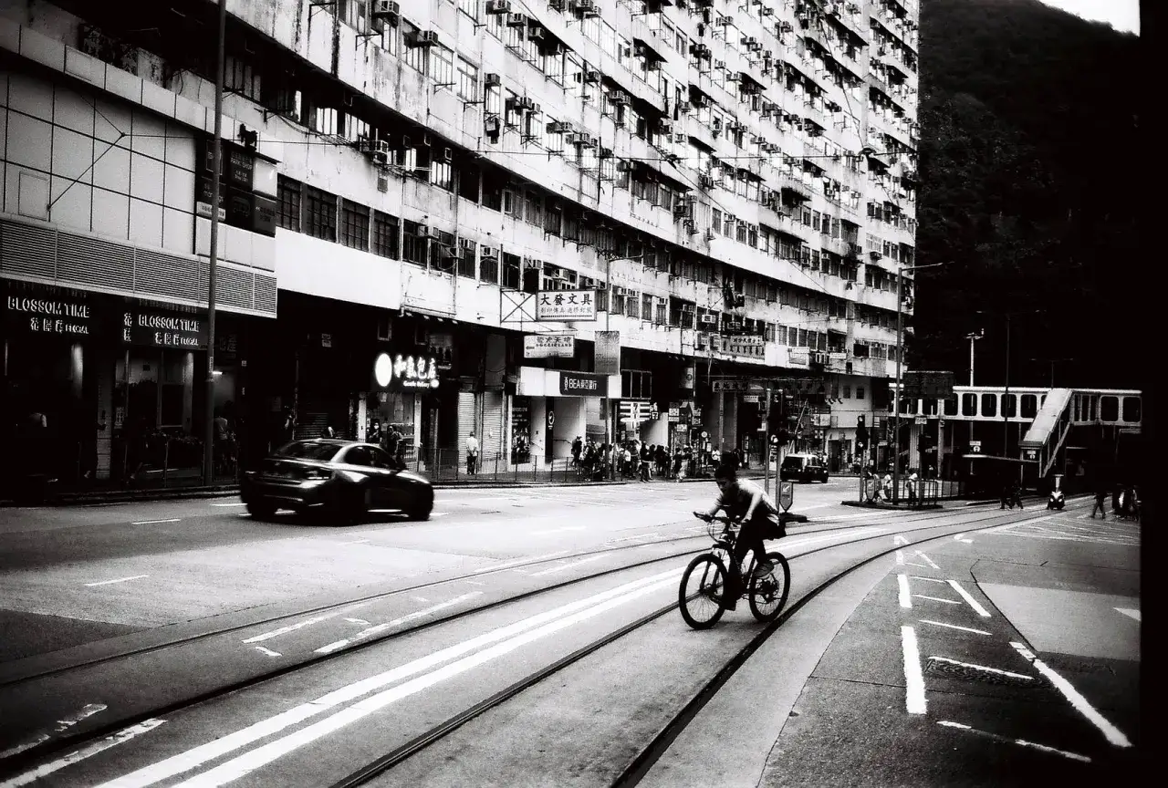
I reach for this film when the light already has shape in it. It likes structure, edges, and tonal separation. In street work, that means sidewalks, brick, railings, windows, and hard shadows. In landscapes, it tends to make clouds, ridgelines, tree lines, and distant layers stand apart with more bite than a softer film would.
That same trait is why it works well for architecture and urban detail. The film does not gently blur the world together; it draws a firmer line around it. If the scene has haze, the film can still hold its own surprisingly well, especially with an orange or red filter. That is one reason many photographers like it for mountains, skylines, and long-distance vistas.
Portraits are where I become more selective. It can absolutely make strong portraits, but it is not a forgiving skin-tone film in the way some people expect from a general-purpose 400-speed black-and-white stock. Texture shows up. Contrast shows up. If the light is harsh, it will not hide that for you. I see that as a feature when the subject and the light are strong enough to justify it, and a drawback when the goal is softness.
- Best case strong daylight, textured scenes, layered backgrounds.
- Very good street, architecture, documentary work, moody landscapes.
- Less ideal gentle portraits, low-contrast scenes that need a creamy tonal curve.
That practical personality is why exposure choices matter so much, because one stop can change the film from lively to overcooked very quickly.
How I would expose it in the field
My default advice is simple: start at box speed. If the light is normal and you want a straightforward negative, EI 400 is the sensible baseline. The film is already designed to give you strong separation and clean detail at that setting, so there is no need to outsmart it on the first roll.
When I want a little more shadow safety, I would rate it at EI 200. That is not because the film needs to be babied, but because a half-stop or one-stop of extra exposure can make the shadows easier to print or scan when the light is contrasty. If I’m shooting backlit street scenes, interiors with window light, or anything where shadow texture matters more than shutter speed, I lean in that direction.
For dimmer work, the manufacturer says it can be pushed to ISO 800, and that is a reasonable upper limit for real-world use. I would only do that when I need the speed. Pushed negatives are useful, but they are not as elegant in the highlights as correctly exposed ones. In practice, I treat EI 800 as a compromise, not a default.
| Scene | My starting exposure | Why |
|---|---|---|
| General daylight | EI 400 | Balanced starting point with predictable contrast |
| Clouds and bright sky | EI 400 with a yellow filter | Better cloud separation without making the negative too extreme |
| Haze, distance, skyline shots | EI 400 with an orange filter | Stronger separation and cleaner long-distance detail |
| High-contrast noon light | EI 200 | Gives the shadows more breathing room |
| Available light at the edge of comfort | EI 800 | Keeps shutter speeds usable when speed matters more than tonal subtlety |
Filter choice is where this film becomes more than a clean 400-speed negative. The data sheet notes that a yellow filter enhances cloud rendering, orange gives clearer long-distance vision, and red creates a more dramatic mood. A TTL meter usually handles the filter loss automatically, but if I’m using an external meter, I always compensate manually. In practice, yellow is the easy choice, orange is the useful choice, and red is the choice when I want the image to feel intentionally severe.
Development and scanning choices that matter more than people think
This is the part that usually separates a good roll from a disappointing one. The film is sensitive enough to develop cleanly in a wide range of developers, but the result changes a lot with agitation, dilution, and tank style. Rollei’s own guidance says that rotary processing typically needs 10 to 15 percent shorter times than hand agitation, and it also warns against development times shorter than three minutes. That sounds technical, but the practical takeaway is simple: do not guess wildly, and do not rush it.
I also think this film rewards a developer you already trust. The Massive Dev Chart lists a broad spread of working times, including roughly 10.5 minutes in D-76 stock, 12 minutes in Xtol stock, and 10.5 minutes in Rodinal 1+25 at 20°C. I would not treat those numbers as sacred, but they are useful as a reality check. They show that the film is not picky in a fragile way; it is picky in a contrast-and-style way.
If I want a conservative first development, I prefer a normal, well-known developer and standard agitation. If I want more bite, a sharper developer will lean into what the film already does well. If I want a slightly gentler tonality, I would choose a more restrained developer and keep the negatives from getting too dense. In other words, the developer is not fixing the film. It is steering the character that is already there.
- For balanced negatives use a familiar stock or 1+1 developer and keep the agitation consistent.
- For more edge sharpness choose a developer that keeps the film’s crispness intact rather than softening it away.
- For scanning watch your black point and midtones carefully, because the clear base can make highlights look thinner than they really are.
The clear PET base is a real advantage in scanning workflows. It usually makes the negative behave more cleanly on the scanner than older, denser bases do, and that is part of why this film feels more modern than its look might suggest. If you want to go further, the reversal option is a genuine creative path, not just a footnote. It is one of the few 400-speed black-and-white films that can convincingly serve two different workflows.
How it stacks up against the usual 400-speed black-and-white films
If you already shoot Tri-X, HP5 Plus, Delta 400, or T-Max 400, the real question is not whether this film is “good.” It is whether its particular kind of good matches the way you work. I think of it as the sharper, more graphic option in the group, with a stronger bias toward edge detail and contrast than the most forgiving all-rounders.
| Film | Overall look | Exposure tolerance | Best use | My read |
|---|---|---|---|---|
| Retro 400S | Sharp, contrasty, crisp | Good, but not the most forgiving | Street, architecture, landscape, haze-cutting | The most graphic of the group and the one I choose when I want the negative to have attitude |
| Tri-X 400 | Classic, textured, gritty | Very forgiving | Documentary, street, available light | More classic and rough-edged, less clinically sharp |
| HP5 Plus | Softly classic, flexible | Excellent | All-purpose work, learning, mixed light | The safest all-rounder if you want fewer surprises |
| Delta 400 | Smoother, more modern | Strong | Travel, portraits, general work | Cleaner tonality, less edge bite |
| T-Max 400 | Very fine-grained, clean | Strong | Detail work, scans, controlled lighting | Technically polished, but not as forceful in rendering |
If I had to compress that comparison into one line, I would say this: Retro 400S is the film I pick when I want the scene to feel more defined, while HP5 Plus is the film I pick when I want the scene to feel more forgiving. That is not a value judgment, just a workflow choice.
Where this film earns its place in a 2026 black-and-white kit
I would recommend this film to photographers who already know they like structure in their negatives. It works well for street, architecture, hard daylight, landscapes with atmosphere, and any subject where edge sharpness helps the image more than softness does. It is also a smart choice if you like to scan your own work and want a clear base that behaves predictably.
- Choose it if you want crisp detail, stronger separation, and a black-and-white negative with a more graphic feel.
- Choose it if you use filters intentionally and enjoy shaping skies, haze, and distance.
- Skip it if you want the most forgiving 400-speed film for mixed light, casual portraits, or “fix it later” exposure habits.
My practical starting recipe would be simple: shoot at EI 400, keep a yellow or orange filter in the bag, develop conservatively the first time, and judge the negatives by how well they separate important tones rather than by grain alone. That is where this film is at its best, and that is what makes it worth keeping around.