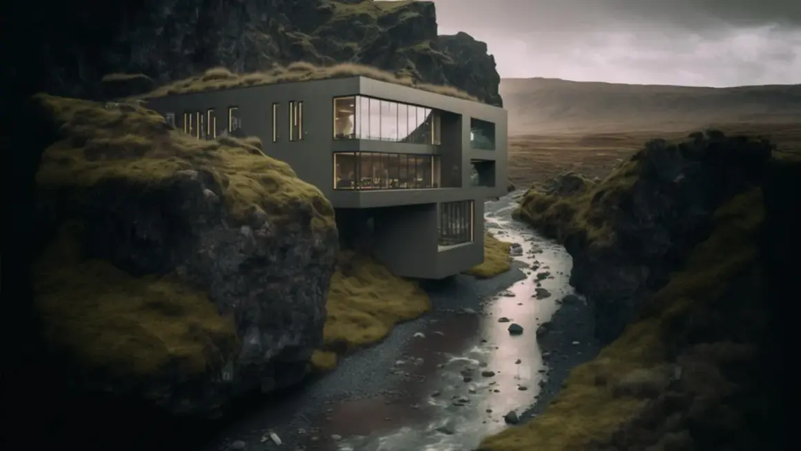
Buildings are unforgiving subjects: a slight tilt, a harsh reflection, or the wrong hour of daylight can change the entire read of a facade. This article breaks down what architectural photography is trying to communicate, how I control perspective and light, which subjects matter most, and how the work is usually delivered and priced in the U.S. market. I also cover the choices that separate a technically correct frame from one that feels intentional.
What you need to get right first
- Strong building images should clarify form, function, materials, and scale instead of just showing a structure.
- Keeping vertical lines straight matters more than owning the widest lens.
- Golden hour, blue hour, and overcast light each solve different problems.
- Interiors, exteriors, and detail shots play different roles in a complete set.
- In the U.S., pricing is often driven by licensing, location count, and post-production, not only shoot time.
- Recent work leans toward lived-in realism and human scale rather than sterile perfection.
What this style is meant to communicate
When I photograph a building, I am not just recording a facade. I am deciding whether the image should sell a vision, document a design, support a publication, or help a property market itself. That is why the same structure can need completely different treatment depending on who the image is for.
In practice, I think of the subject as a set of priorities, not a single shot. An architecture firm wants proportion, material choice, and design intent to read clearly. A hotel brand wants atmosphere and desire. An editorial client wants context and a point of view. A real estate team usually wants clarity and trust more than mood.
- Architecture firms usually need images that explain the design language.
- Developers and hospitality brands tend to care about polish, amenity, and atmosphere.
- Editorial work often benefits from context, people, and a stronger sense of place.
- Property marketing needs room truth, legibility, and enough detail to reduce doubt.
Once the job is clear, composition becomes much easier to judge, because you know what the frame is supposed to prove.
Why architectural photography depends on restraint
The cleanest frames usually come from restraint, not from cramming more into the picture. I start by asking whether the camera position helps the building read honestly. If the answer is no, I move. That one habit solves more problems than any preset or plugin.
Verticals and horizontals matter because buildings are geometric subjects. If the camera tilts up too far, the lines start to converge, and the image instantly feels less controlled. A shift lens helps here because it lets the lens move without tilting the camera body, which keeps vertical lines more parallel. If I do not have that lens with me, I prefer to level the camera and adjust my position before I touch heavy perspective correction in post.
- Keep the camera level whenever the geometry needs to look calm and believable.
- Use longer focal lengths when a wide lens starts exaggerating nearby edges.
- Let one clear idea lead the frame instead of filling every corner.
- Use symmetry only when the architecture genuinely supports it.
- Use foreground elements when they explain scale, access, or circulation.
I also watch for visual clutter. Signage, parked cars, stray reflections, and bad cropping can weaken even a well-built composition. Once the frame is under control, the next variable is light.
Light decides more than most people think
Light changes the personality of a building faster than any lens choice. A concrete shell can feel severe at noon, calm at dusk, and almost sculptural under cloud cover. I rarely treat lighting as background information; I treat it as part of the subject.
Golden hour is useful when I want warm edge light and a soft sense of volume. Blue hour works best when the building has interior lights that can create a balanced glow against a deepening sky. Depending on season and latitude, that window is often short, roughly 20 to 40 minutes, so timing matters more than enthusiasm. Overcast light is usually safer for glass-heavy exteriors because it reduces glare and keeps the facade even. Direct sun can still work, but I want it when shadows help the form read, not when they hide the structure.
For interiors, I often bracket three to five exposures at one-stop intervals when the window-to-room contrast is too wide for a single frame. That is not about making the image look artificial. It is about keeping the window view, the room, and the materials all readable at once. In larger spaces, I may blend ambient light with flash or LED fill if the room needs a little more shape.
The practical rule is simple: choose the light that supports the architecture, not the light that only looks dramatic in isolation. Once that is settled, the next question is which parts of the building deserve their own frame.
Which subjects to shoot first
A complete set usually needs more than one type of image because each subject does a different job. I like to think in layers: one image establishes the building, a few images explain how it works, and a handful of details make the materials and craftsmanship tangible.
Exteriors
Exteriors are the anchor. They show massing, entrance logic, facade rhythm, and how the building sits in its surroundings. A strong exterior image should answer the viewer’s first question quickly: what is this place, and how does it occupy space? When I shoot exteriors, I try to include enough context to feel grounded, but not so much that the architecture disappears into the neighborhood.
Interiors
Interiors need a different kind of discipline. Rooms are full of competing lines, furniture, reflections, and practical compromises. I tend to look for a view that explains circulation or use instead of simply flattening the room into a wide rectangle. A lobby, a staircase, a kitchen, or a lobby bar can each become a strong subject if the image shows how people are meant to move through it.
Read Also: Urbex Photography - Capture Decay with Impact & Safety
Details and materials
Details are where the craftsmanship becomes believable. Joints, textures, lighting fixtures, stair rails, glazing systems, and material transitions can all carry more visual weight than a broad room shot. These images are especially useful for portfolios, awards entries, and editorial stories because they let the audience understand what makes the project distinct.
I usually want a lean sequence rather than a random pile of angles: a hero exterior, a few supporting views, a small set of interiors, and details that explain the design language. Once the subject mix is set, the capture workflow has to support it.
Gear and workflow that keep the frame clean
I do not believe expensive gear automatically makes a better building image, but some tools make the work much more consistent. A tripod is the obvious one. It gives me alignment, repeatability, and the ability to bracket exposures cleanly. After that, lens choice matters more than camera branding. A moderate wide angle is useful, but I avoid making every room look stretched just because I can.
My practical kit usually includes a tripod, a remote release, a lens that does not distort heavily at the edges, and sometimes a polarizer when reflections on glass need to be controlled. A polarizer can help, but it can also create uneven skies or dark patches on ultra-wide frames, so I use it carefully. For interiors, flash or LED fill can help shape a room, but only if the added light still feels believable.
Post-production is where a lot of beginners overreach. I correct perspective, blend exposures, clean distractions, and balance color so the building looks true to life. HDR, or high dynamic range blending, is useful when a single exposure cannot hold both windows and shadowed interiors, but it fails quickly if the result turns crunchy or unreal. In 2026, AI tools can speed up masking, denoising, and object cleanup, but I still avoid edits that invent structural detail or misrepresent materials.
The best workflow is the one that preserves clarity without turning the image into a glossy exaggeration. That same discipline also shapes what clients are willing to pay for and license.
How pricing and licensing work in the US
In the U.S. market, pricing is rarely just about the time spent pressing the shutter. As a rough 2026 range, daytime images often sit around $150 to $350 per image, twilight frames can reach $750 to $850 or more, and a full commercial shoot can run anywhere from $1,500 to $15,000 depending on scope, travel, and post-production. Those numbers move a lot with project size, market, and usage rights.
What changes the price most is usually not the camera work itself but the business around it. I always pay attention to licensing, because broad advertising usage costs more than a one-time web gallery. Multiple locations increase travel and setup time. Heavy retouching takes real hours. Permits, assistants, staging, and twilight scheduling all add friction.
| Cost driver | Why it changes the budget | What to clarify early |
|---|---|---|
| Licensing | Broader usage usually raises the fee | Web only, editorial, campaign, or unlimited use |
| Location count | More sites mean more travel and setup | How many buildings and how far apart they are |
| Time of day | Twilight and blue hour require more planning | Whether the project needs day, dusk, or both |
| Retouching | Clean-up can take longer than the shoot itself | How much object removal or compositing is expected |
| Travel and permits | Logistics affect both cost and schedule | Parking, access, rooftops, or special permissions |
If I were briefing a client, I would define deliverables before I define style. That keeps expectations clean and prevents the common mistake of treating a licensing conversation like an afterthought. From there, the visual language itself is changing in ways worth paying attention to.
What stronger work looks like in 2026
The best contemporary building images feel less sterile than they did a few years ago. I am seeing more work that allows for human scale, a little more atmosphere, and a more honest sense of how spaces are actually used. That does not mean sloppy or overcast-by-default. It means the image is willing to show texture, context, and life without losing control.
- One clean daytime exterior that explains the form.
- One dusk frame that uses interior light intelligently.
- One interior that shows circulation, not just furniture.
- One detail sequence that proves the material story.
- At least one image that gives the viewer a sense of scale or occupation.
If I were building a portfolio now, I would keep the visual voice disciplined and the set varied enough to show range. That balance usually travels better than a string of overly polished frames that all feel technically perfect but emotionally flat.