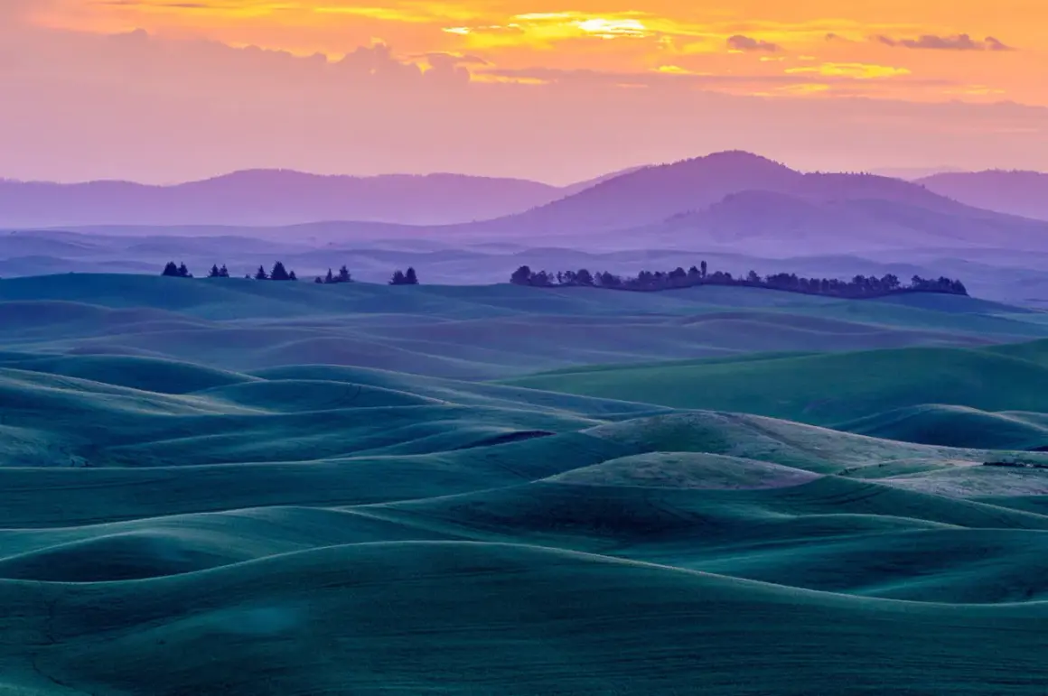
Fine art landscape photography works best when a scene gives you more than scenery; it gives you a mood, a shape, and a reason to frame it a certain way. In this article I break down how to choose subjects, work with light, compose with intent, edit with restraint, and prepare the image for print. The goal is simple: help you make landscapes that feel deliberate rather than merely descriptive.
What matters most is mood, restraint, and a print that can carry the idea
- Start with intent. A strong landscape image should express a feeling, not just document a view.
- Choose scenes with structure. Shapes, layers, and separation matter more than an impressive location name.
- Use light as the main subject. Weather and direction of light often decide whether the frame feels ordinary or memorable.
- Compose for clarity. A clean frame almost always beats one that tries to include everything.
- Edit with discipline. The best files keep atmosphere intact instead of chasing maximum drama.
- Think like a printer. A landscape that looks good on a screen can fail once it is enlarged and mounted on a wall.
What separates an art-led landscape from a standard scenic photo
At its core, fine art landscape photography is about interpretation. The camera still starts with a real place, but the final image is judged by mood, design, and personal viewpoint more than by whether it exhaustively records every tree and rock. That is the main difference: one image describes a location, the other says something about how that location feels.
| Aspect | Standard landscape | Art-led landscape |
|---|---|---|
| Primary goal | Show a beautiful place clearly | Express an emotion, idea, or atmosphere |
| Composition | Often broader and more descriptive | Often simpler, with stronger visual hierarchy |
| Editing | Usually natural and restrained | Still restrained, but more intentional about tone and color |
| Success test | “Was I there?” | “Would I want this on my wall?” |
This distinction matters because it changes every decision downstream. Once you stop trying to include everything, you start asking better questions: what is the subject, what is the feeling, and what needs to be left out. That leads naturally to the first real choice, which is where to point the camera in the first place.
How to choose scenes that already carry a visual idea
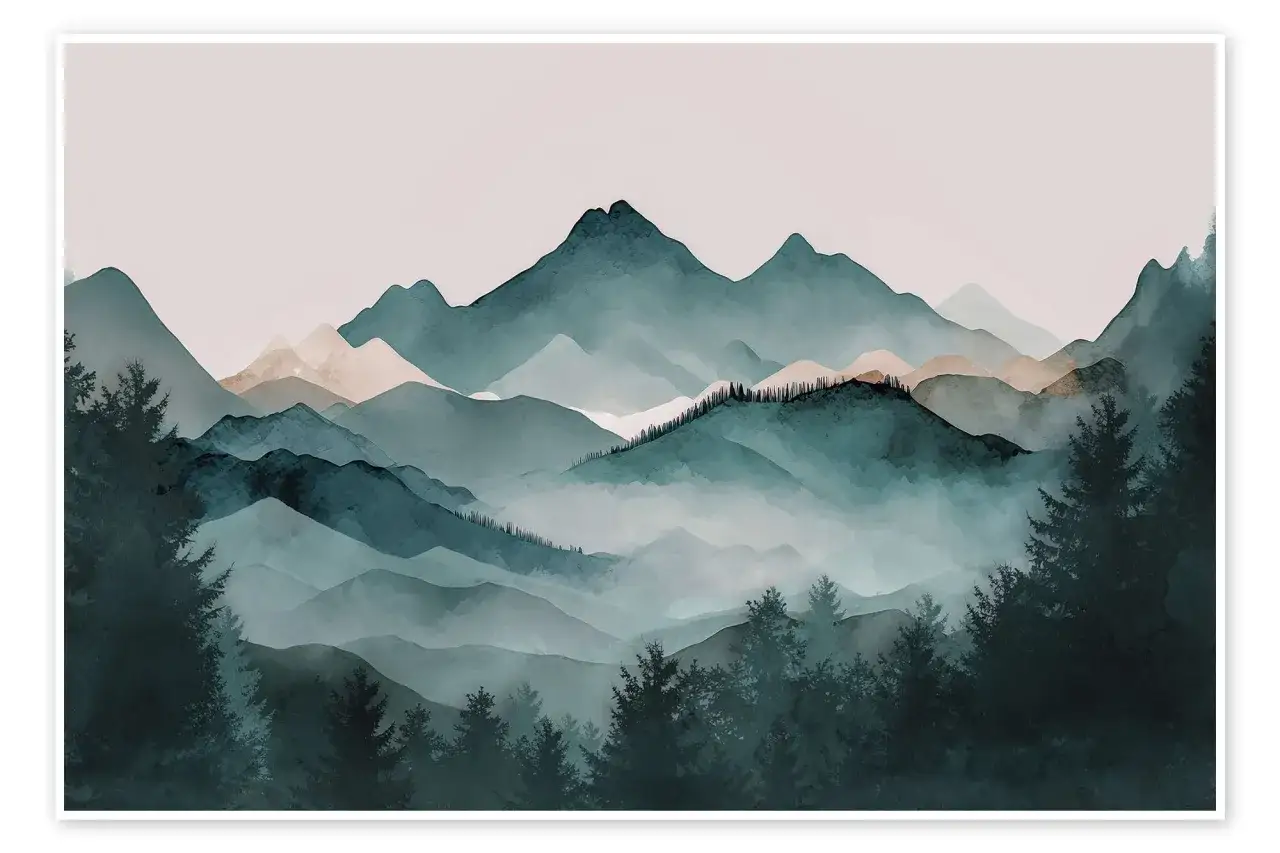
Not every pretty view becomes a strong image. I look for scenes that already have a built-in visual argument: a lone tree, layered mountains, a shoreline with a clear edge, a field of fog that hides more than it reveals, or a patch of desert with clean lines and enough empty space to breathe. These subjects work because they give the viewer something to settle on.
| Scene type | Why it works | Common trap |
|---|---|---|
| Lone tree or rock | Creates an anchor and a sense of scale | Centering it without considering balance |
| Fog, mist, or low cloud | Separates planes and adds mystery | Letting the frame become too soft and directionless |
| Coastlines and shore breaks | Natural lines guide the eye through the frame | Including too much busy shoreline detail |
| Layered ridges or hills | Creates depth and rhythm | Losing separation because the tonal values are too similar |
| Minimal winter or desert scenes | Strong negative space and simple geometry | Filling the frame just because the scene feels empty |
I also pay attention to what the scene is already doing before I touch the shutter. If the place feels loud, I may simplify it with a tighter crop or a longer lens. If it feels quiet, I may keep more negative space and let the image stay open. The better the subject choice, the less the file has to fight for attention later, which is why light becomes the next major piece of the puzzle.
Why light and weather do most of the emotional work
In landscape work, light is not a finishing touch. It is the structure. Soft overcast conditions, backlight, side light, fog, and the last minutes of sunrise or sunset can completely change the mood of the same place. I often find that the strongest window is short, sometimes only 10 to 30 minutes, which is why patience matters more than luck.
| Condition | What it gives you | When it can fail |
|---|---|---|
| Low golden light | Warmth, texture, and long shadows | Can make the frame feel predictable if the composition is weak |
| Overcast sky | Soft tonal transitions and even color | Can flatten the image if the subject has no clear shape |
| Fog or mist | Depth, separation, and atmosphere | Can erase too much detail if you do not leave a strong anchor |
| Post-storm light | Drama without needing heavy processing | Changes quickly and often requires fast repositioning |
The practical rule I use is simple: if the light already strengthens the scene, I keep the edit subtle. If the light is flat, I either wait longer or move on. Too many photographers try to manufacture mood later that should have been captured in the field. Once the light is working, composition decides whether the image feels intentional or merely observed.
Compose for shape, not coverage
Landscape images often become stronger when you stop trying to show everything. I prefer to think in terms of shape, separation, and visual flow. A frame needs a subject, a path for the eye, and enough breathing room that the viewer can understand the scene without feeling trapped inside it.
As a starting point, these focal-length ranges are useful:
- 16-24mm for expansive scenes, strong foregrounds, and dramatic perspective.
- 35-50mm for balanced compositions that feel closer to how the scene was experienced.
- 70-200mm for layering, compressed ridgelines, isolated details, and quieter abstractions.
I usually begin around f/8 to f/11 with ISO 64 to 200, then adjust only when the scene demands it. That range is a good practical starting point because it keeps the file clean while leaving enough depth of field for most landscapes. If the foreground is very close and the background still needs to stay sharp, focus stacking can be cleaner than stopping down too far.
Three compositional habits make a noticeable difference:
- Use a clear anchor. The viewer should know where to enter the frame.
- Protect the edges. Small distractions at the border can weaken an otherwise strong image.
- Crop with purpose. If a scene becomes stronger after cutting half of it away, that is a good sign, not a compromise.
Once the frame is built with clarity, the edit should deepen that idea rather than trying to invent it.
Edit for atmosphere, not rescue
This is where a lot of otherwise good landscapes lose their edge. It is tempting to push clarity, saturation, contrast, and dehaze until the file looks “finished,” but that often drains the subtlety that made the scene interesting in the first place. My rule is that editing should reveal the mood already present in the frame, not replace it.
| Edit move | Use it for | Common mistake |
|---|---|---|
| Local contrast | Separation in rocks, ridges, or tree detail | Making texture look crunchy or brittle |
| Dodge and burn | Guiding the eye and refining hierarchy | Painting in obvious light that never existed |
| Color grading | Strengthening the emotional tone | Pushing color into a palette that feels disconnected from the scene |
| Black-and-white conversion | Emphasizing form, contrast, and texture | Using monochrome only because the color file was weak |
| Cleanup and retouching | Removing small distractions | Scrubbing the image until it looks sterile |
When I am unsure, I look at the file in black and white for a minute. If the structure disappears, the image is probably relying too much on color or surface detail. That is useful feedback because art-led landscapes should still read clearly when the palette is simplified. From there, the final image needs to survive a different kind of test: print.
Print choices and presentation change the photograph
A landscape that looks strong on a bright monitor can still fail on paper. Print reveals weak tonal transitions, careless edges, and overworked color much faster than a screen does. That is why I think about output early, not after the editing is done.
For wall-sized work in the U.S., common print dimensions like 16x20, 20x30, and 24x36 inches are useful reference points, but the image should decide the final size, not the other way around. A quieter, more minimal frame often benefits from a larger print because the extra scale gives the viewer time to enter the image. Busy compositions can fall apart when enlarged if the visual hierarchy is weak.
Paper choice matters just as much:
- Matte fine art paper works well for mist, snow, soft light, and low-glare presentation.
- Baryta or luster papers usually give deeper blacks and more apparent detail, which helps with dramatic skies, rocks, and layered terrain.
- Glossy surfaces can look rich, but reflections often fight the quiet mood that many landscapes need.
If the work is meant for a portfolio or site gallery, I like to keep the series visually coherent. That does not mean every frame needs the same color grade. It means the prints should feel like they belong together through subject, tone, or atmosphere. When the presentation is consistent, the body of work feels stronger than the individual pictures alone. The last step is deciding whether the image actually deserves that level of presentation.
What I check before I call a landscape finished
Before I release a file, I ask a few direct questions. They are simple, but they save me from finishing an image that only works at a distance or only works on one screen.
- Is there one clear idea? If the image is about mist, stillness, scale, or isolation, that idea should be obvious quickly.
- Does the frame still work if I crop it slightly tighter? If the answer is yes, the composition usually has enough structure.
- Are the brightest highlights controlled? In landscapes, blown snow, water, or cloud edges can become the first distraction.
- Do the edges stay clean? A small branch, bright rock, or half-cut shape near the border can weaken the whole image.
- Would I hang it as a print? If the answer is no, I usually know the file is still trying to do too much.
That is the practical heart of this style: choose a scene with a point of view, let light and weather do real work, compose with restraint, and edit for a print rather than for a thumbnail. When those parts line up, the landscape stops feeling generic and starts feeling authored.