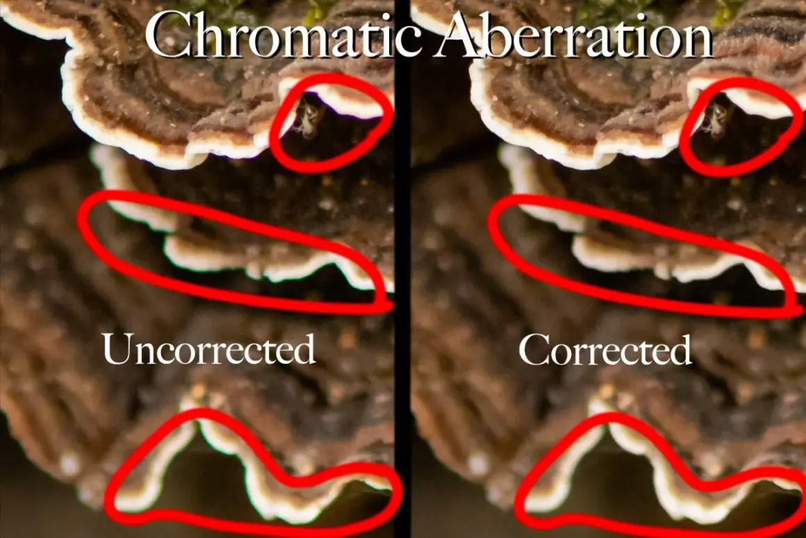
Color fringing at the edges of a frame is usually a sign that the lens is not bringing every wavelength of light to the same focus. That matters in stills and video alike, because it can make a clean image look cheap, soft, or harder to grade than it should be. In this article, I break down what causes the problem, which lenses and filters actually help, and what I would do on set or in post to keep it under control.
The practical takeaway is simple: lens choice matters more than filters, and technique matters more than luck
- Color fringing usually shows up on high-contrast edges, especially against backlit skies, windows, metal, or white objects.
- There are two common behaviors: lateral fringe near the frame edges and axial fringe that appears in front of or behind the focus plane.
- ED, fluorite, and apochromatic designs help most because they are built to tame dispersion at the optical level.
- Front filters do not correct the defect; a poor filter can make flare and edge artifacts look worse.
- Stopping down often helps, but it is not a cure-all for every lens or every kind of fringe.
- Modern raw editors can clean up a lot, especially when lens profiles and defringe controls are used carefully.
What the defect is doing to your image
At its core, the issue is simple: different colors bend by different amounts as they pass through glass. When a lens cannot reunite those colors at exactly the same point, you get a visible fringe, usually purple, green, red, blue, or a mix that changes with the scene. I treat it as an optical mismatch first and an editing problem second, because understanding the cause tells you which fix will actually work.
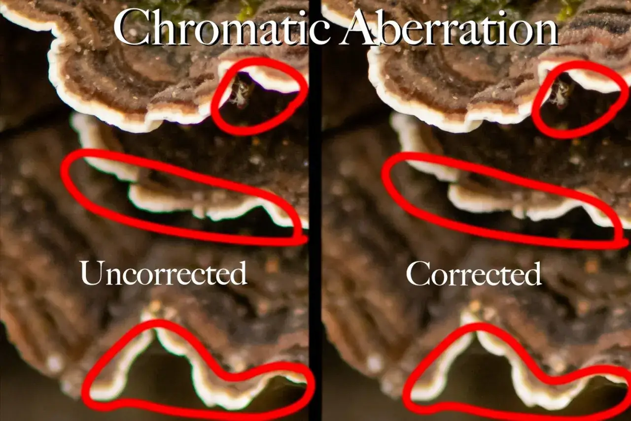
There are two behaviors I watch for. Lateral fringing tends to show up toward the edges of the frame and often looks like red/cyan or blue/yellow outlines that get stronger as you move away from the center. Axial fringing appears around out-of-focus highlights and high-contrast transitions, and it often gets worse when the lens is used wide open. Adobe’s current guidance on lens corrections reflects that split, which is useful because the two problems respond differently to fixes.
That distinction matters because not every fringe is a sign of a bad lens. Some is a side effect of design trade-offs, some is made more visible by lighting, and some is amplified by the sensor and flare. Once you can tell which pattern you are looking at, the next question becomes obvious: when does it show up most?
When it becomes visible in real shoots
In practice, the problem is usually easy to miss until a scene gives it contrast to work with. I see it most often around tree branches against a bright sky, polished edges on products, windows in architecture, hair rim-lit by the sun, and glossy metal on vehicles or gear. The more abrupt the brightness change, the easier it is for the fringe to stand out.
A few shooting situations deserve extra attention:
- Wide apertures often make axial fringing easier to see because depth of field is shallow and the lens is working harder.
- Long focal lengths can exaggerate the effect on white subjects and fine detail, especially in telephoto zooms.
- Wide-angle frames make edge behavior more obvious, since lateral fringe usually strengthens near the borders.
- Backlit scenes are a trap, because flare and fringe can stack together and make the image look less controlled.
- Macro and close-focus work expose small optical weaknesses very quickly, which is why product and detail work can be unforgiving.
My rule is to test the lens where it is most likely to fail, not where it looks its best. That leads naturally into the gear question, because some lenses are simply built to handle this better than others.
How lens design and filters affect the result
Lens design is the biggest factor. If the glass is engineered to control dispersion well, the fringe will usually be weaker before you even start editing. Nikon’s ED glass is a good example of this idea in practice: the design uses special low-dispersion elements to reduce secondary spectrum, which is exactly the optical behavior that produces visible color separation. That is why better lenses often cost more; you are paying for tighter control, not just sharper marketing copy.
| Option | What it changes | What it does for fringing | Best use | Main trade-off |
|---|---|---|---|---|
| ED or fluorite elements | Uses glass with lower dispersion | Strong reduction, especially in difficult contrast | Telephoto, portrait, wildlife, product work | Higher cost and heavier lens designs |
| Apochromatic design | Brings multiple wavelengths closer to the same focus | Usually the best optical control | Critical work where edge quality matters | Premium pricing and sometimes more weight |
| Aspherical elements | Helps correct several aberrations at once | Indirect help, not the main cure | Compact zooms and fast primes | Can improve overall correction without eliminating fringing alone |
| Multi-coated protective filter | Adds another piece of glass in front of the lens | No real correction; may preserve clarity if the filter is good | Dust, salt spray, physical protection | Poor filters can increase flare and reduce contrast |
| Diffusion filter | Softens highlights and lowers micro-contrast | Can hide the look a little, but does not solve it | Creative portraits, music video, mood work | Reduces sharpness by design |
That table is the part many people get wrong: filters are usually not a cure. A protective or creative filter may be useful for other reasons, but it does not correct dispersion in the lens itself. In bad cases, extra glass can make flare and edge color artifacts easier to notice, which is why I remove unnecessary filters before testing a difficult lens.
If the gear is only part of the answer, the next move is to control the image before it ever reaches post.
How I would reduce it before the edit
The easiest gains come from disciplined shooting, not heroic cleanup later. When I want cleaner edges in-camera, I start with the aperture and the lighting angle, then I decide whether the front of the lens needs to stay as bare as possible.
- Stop down one or two stops when the lens is soft around highlights or when the fringe is strongest wide open.
- Reframe slightly to avoid placing bright edges directly against very dark areas.
- Use a lens hood to cut stray light that can make the defect look worse than it really is.
- Remove cheap or unnecessary front filters when you are shooting backlit scenes or testing lens quality.
- Shoot raw if you can, because the edit room gives you better tools for precise correction.
- Check corners at 100% on a test frame before committing to a critical setup.
The one limitation I keep in mind is that stopping down does not help every type of fringe equally. It often improves axial color bleed, but edge-related fringing can remain visible if the lens design is the real bottleneck. That is why a shooting fix and a lens choice often need to work together, not replace each other.
How I would clean it up in Lightroom or Photoshop
If I see chromatic aberration in a test shot, I do not jump straight to manual tweaking. I start with automatic lens correction, because current software is surprisingly good at removing the common red-green and blue-yellow fringes that show up along edges. Adobe Lightroom and Camera Raw both offer automatic removal tools, and they are worth using before I spend time on more detailed cleanup.
My workflow is simple:
- Zoom in on a clear high-contrast edge, not on a flat area.
- Turn on the automatic aberration correction first.
- If purple or green residue remains, use the manual defringe controls.
- Check the result at the same zoom level you would use for delivery review.
- Watch for collateral damage, especially on purple clothing, foliage, or signage that can be mistaken for fringing.
What I like about the manual tools is that they let me protect a usable image instead of forcing an all-or-nothing decision. The downside is obvious: aggressive defringing can eat into genuine color detail if you overdo it. I prefer a controlled correction that leaves a little residual fringe over a fix that makes the whole edge look waxy or desaturated.
That is also why I do not rely on software as a substitute for the right lens. The cleanest file is still the one that needed the least repair.
What I would buy if this keeps slowing production
When this problem keeps showing up in my workflow, I do not chase a magical accessory. I buy for the way I actually shoot. For high-contrast portrait, product, landscape, or wildlife work, I would prioritize a lens with good low-dispersion elements, strong reputation for edge control, and reliable profile support in editing software. That gives me the highest chance of getting a clean file without adding a lot of time in post.
Here is the buying logic I use:
- Need the cleanest optics: choose an apo or ED-based lens first.
- Need flexibility: a better zoom with strong lens profiles may be smarter than a cheap zoom plus a filter.
- Need protection: use a coated filter only when you genuinely need physical shielding, not as a quality upgrade.
- Need a softer look: use diffusion for style, but do not confuse softness with optical correction.
The practical reality is that good filters protect glass, good lenses prevent dispersion, and software cleans up what slips through. Mixing those roles up is where budgets get wasted. Once you separate protection, creative look, and optical correction, choosing gear becomes much easier.
The checklist I keep for clean edges on real jobs
My final rule is straightforward: I look at the edge behavior before I judge the lens by center sharpness alone. A lens that looks great in the middle but falls apart around high-contrast edges can still be fine for some work, but it is a liability for product, architecture, and any frame where detail matters across the whole image.
So the checklist I trust is this: test the lens wide open, test it stopped down, test it against backlight, and test it with and without any front filter attached. If the fringe changes a lot, I know lighting and aperture can help. If it stays stubborn, I know the lens design is the limit and I plan around that instead of fighting it later. That approach saves more time than any single plugin or filter ever will.